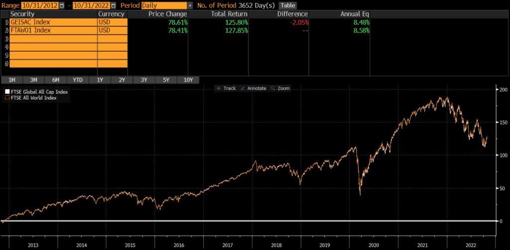
Hedge Fund Hurdle Rate (and High Water Marks)

A hedge fund’s hurdle rate is an important consideration when investing in hedge funds, especially since it has many variations. At the highest level, investors should understand what a hedge fund hurdle is, whether it is a hard hurdle, soft hurdle, or blended. Additionally, investors should evaluate whether the hedge fund hurdle rate is compounding or non-compounding as well as the existence and structuring of a high water mark mechanism.

Performance fees are also known as carry, carried interest, performance allocation, incentive allocations, or incentive fees (among other terms) and I’ll be using these term interchangeably. It is important to note that fees and hurdles can be assessed monthly, quarterly, annually, or longer. The below information and examples are just examples and investors are encouraged to carefully read the legal documents of any prospective investment.

Hedge Fund Hurdles

Hard Hurdle

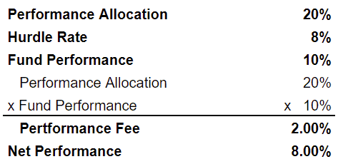
A hard hurdle means that the manager only collects a fee on the performance above the hurdle rate. This arrangement is more investor-friendly than a soft hurdle. Below is a detailed exampled of a hedge fund with a hard hurdle:

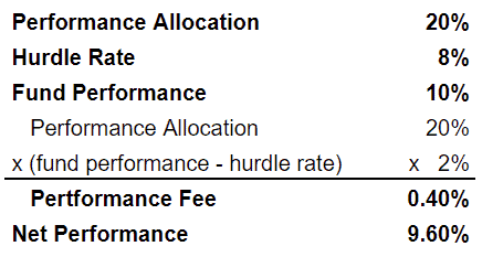
In the above example, the manager charges a 20% performance fee above an 8% hurdle. Since the fund returned 10%, the performance fee is .4% (20% multiplied by 2%).

Soft Hurdle

A soft hurdle means that the manager collects fees back to the first dollar of performance, assuming that gross performance exceeds the hurdle rate. This arrangement is more manager-friendly than a hard hurdle. Below is a detailed example of a hedge fund with a soft hurdle:

In the above example of a soft hurdle, the manager also charges a 20% performance fee above an 8% hurdle. However, the fee is applied on all returns (assuming fund performance exceeds the hurdle rate). So the performance fee is 2% (20% multiplied by 10%).

Blended Hurdle

A blended hurdle is similar to a soft hurdle in that a manager can collect fees back to the first dollar of performance (assuming that gross performance exceeds the hurdle rate). However, the performance fee is reduced if it would cause net returns to be lower than the hurdle rate. Below is a detailed example of a hedge fund with a blended hurdle.

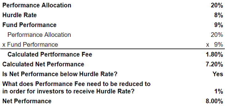
Blended hurdles allow the manager to capture upside, while somewhat protecting investors.

Graduated Hurdle Rates

Similar to how a hedge fund with a blended hurdle allows a manager to have more upside than a hard hurdle, a graduated hurdle allows a manager to capture even more upside as performance increases.

Consider the following example of a hedge fund with a graduated hurdle. The performance fee may be 20% over an 8% hurdle, 30% over a 12% hurdle, and so on. Again, the hurdle can be structured to only apply to returns above the hurdle or to go back to the first dollar of returns. So an investor may pay a 20% performance fee up to 12% and a 30% performance fee on returns above 12%. Or they might pay 30% on all returns if the performance is above 12%.

Some investors believe graduated here fund hurdle rates improve the alignment of interests between managers and investors, while others believe that it incentivizes reckless risk taking.

Hedge Fund Hurdle Rate: Compounding vs Non-Compounding

Regardless of whether a fund has a hard hurdle or a soft hurdle, it is important to note whether the hedge fund hurdle rate is compounding or non-compounding. If it is non-compounding, investors should determine whether the performance fee is subject to a high water mark (see below).

Compounding

A compounding hurdle rate means that the hurdle rate compounds over time. Here is an example of a hedge fund with a compounding hurdle rate. If the hurdle rate is 6%, then the fund must return at least 12.36% over a 2 year period (since a 6% return compounded for 2 years is 12.36%). A hurdle rate could also be a benchmark index like the S&P 500 or a benchmark plus a spread (such as 3-month T-bills plus 200 basis points). Using these types of benchmarks could result in a negative hurdle rate, so the hurdle rate often has a floor of 0%.

Non-Compounding

If the hurdle rate is non-compounding, then it resets periodically. In other words, the hurdle rate will reset regardless of the prior periods performance. This is obviously manager-friendly (and unfavorable to investors).

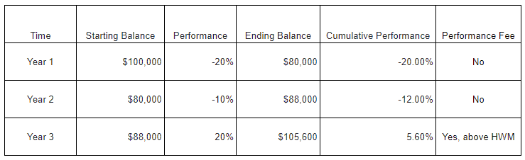
Consider this example of a hedge fund with a non-compounding 8% hurdle rate that loses 20% in Year 1 and gains 10% in Year 2. No performance fee would have been charged in Year 1, but it would have been charged in Year 2 (since the Year 2 performance exceeded the hurdle rate). Investors would be down 12% and yet still have to pay a performance fee! This example is detailed in the table below.

High Water Marks

A high water mark (or high-water mark or high watermark) is a tool frequently used to address the problems with non-compounding hurdle rates. A high water mark simply ensures that a performance fee cannot be charged until cumulative performance is positive.

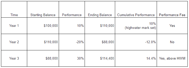
Continuing from the previous example, below is an example of how a high water mark would prevent the manager from collecting performance fee in Year 2 (even though the hurdle rate is non-cumulative) because the cumulative performance is still negative. However, if the cumulative performance exceeded 0%, then the manager would be entitled to the performance fee.

It is easy to think of other examples where a high water mark would protect investors. A common risk would be paying the performance fee twice on the same performance.

In the table below, we see an example of how a high water mark protects investors from paying fees on the same performance twice. Assume a fund returns 10% in Year 1 and -20% in Year 2 and then 30% in Year 3. The investment would have gone from 100,000 to 110,000 in Year 1 and again in Year 3 and investors would not want to pay for that twice. A high water mark ensures that they only pay a performance fee on the gains from 110,000 to 114,400 in Year 3.

Problems with High Water Marks

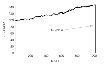
High water marks are a mechanism to protect investors. However, it can backfire in cases where managers severely underperform. If a fund is loses 50% from its high water mark, then the fund must return 100% to get back to even and qualify for performance fees again. Some managers may be de-motivated by this and decide to shut the fund down rather than continue without the near-term prospect of performance fees. Of course, if the manager launches a new fund, they can begin collecting performance fees immediately on any positive performance. There was a high profile example of this recently when the “meme stock” craze crushed Melvin Capital. First the hedge fund manager floated the idea of modifying the hurdle rate and high water mark, before ultimately deciding to shut down and reopen. This example highlights why hedge funds are infamous for playing a game where “heads I win, tails you lose.”

Conclusion

Ultimately, hedge fund hurdle rates, performance fees, and high water marks are designed to align the interests of managers and investors. The structure of these terms varies from fund to fund, depending on factors like manager size, asset class, and so on. There is no “best” set of terms, but investors should ask whether the terms create alignment in a variety of good and bad scenarios. This is also true when investing in real estate, private equity, and many other alternative investments beyond hedge funds.

Further Reading

The above primarily relates to hedge funds and vehicles structured similarly to hedge funds. However, a very similar set of concepts can be found in private equity preferred returns, catch-ups, and waterfalls.

What Thanksgiving Teaches About Risk (Taleb’s Turkey Chart)

The life of a Thanksgiving turkey can teach us a lot about risk. I believe Nicholas Nassim Taleb’s turkey chart and accompanying quote (from The Black Swan) sums it up best:

Consider a turkey that is fed every day. Every single feeding will firm up the bird’s belief that is the general rule of life to be fed every day by friendly members of the human race “looking out for its best interests,” as a politician would say. On the afternoon of the Wednesday before Thanksgiving, something unexpected will happen to the turkey. It will incur a revision of belief.

The Black Swan, by Nicholas Nassim Taleb
"A turkey before and after Thanksgiving. The history of a process over a thousand days tells you nothing about what is to happen next. This naive projection of the future from the past can be applied to anything."
Source: The Black Swan, by Nicholas Nassim Taleb; Wikimedia Commons
“A turkey before and after Thanksgiving. The history of a process over a thousand days tells you nothing about what is to happen next. This naive projection of the future from the past can be applied to anything.”
Source: The Black Swan, by Nicholas Nassim Taleb; Wikimedia Commons

The Taleb turkey chart and story is entertaining, but also offers much wisdom about risk-management.

The past does not predict the future

In Taleb’s story, nothing in the turkey’s life had indicated what would occur on Thanksgiving Day. The past had no predictive power in forecasting the future. On Taleb’s turkey chart, the days 1 through 1,000 are completely different than day 1,001 and beyond.

Similarly, we humans often assume the future will be similar to the past.

  • We believe that stability will continue. For instance, who predicted that a suicide in Tunisia would lead to the Arab Spring and the downfall of decades-long dictatorships in Egypt and Libya?
  • We believe that good times will continue. In 2019, who predicted that someone eating a bat or a lab leak would lead to a global pandemic that would reshape our society and economy for years?
  • We believe that bad times will continue. I find this assumption less common (because humans are generally optimistic, I think), but why do we call the modernization of Singapore or Oman a miracle? Perhaps because we believe it is improbable to go from mud and bricks to steel and glass in such a short-time.

In addition to the above, Taleb notes that investors often layer on and are deluded by confirmation bias. Many investors mistake their results for skill rather than luck not realizing that “a high tide lifts all boats.” In bull markets and bubbles, terrible decisions are often rewarded handsomely as hot assets soar in price. Investors double down on bad decisions until something changes, the tide goes out, and (in Buffett’s words) we find out who has been swimming naked. Unfortunately, in every market cycle some investors own assets that look like the Taleb turkey chart.

As Howard Mark’s says,”…trees don’t grow to the sky, and few things go to zero.” Understanding that the today’s conditions are likely to change is the key to not being a turkey. This is why investor protection rules have resulted in this disclaimer on nearly every piece of investment marketing : “Past performance is no guarantee of future results.”

Despite what we believe and despite how strong we believe it, the future is unknown.

Risk is difficult to model

Risks are difficult to model for many reasons, but one reason is that rare events are rare! We do not have sufficient data to estimate their probability or impact. Taleb’s turkey had never experienced what was about to happen.

We cannot predict earthquakes or their magnitudes. Nobody could have predicted what would happen if a strong earthquake occurred in the Pacific Ocean, generated an enormous tsunami, which destroyed a nuclear power plant (as well as its backup safety features), or what impact that would have on energy policy in Europe and geopolitical issues between the EU and Russia. I don’t believe anyone was even aware of these risks before the Fukushima earthquake/tsunami, much less modeled it. The events are rare and the sequential scenarios too numerous and complex to model.

Our record is not much better even when we’re aware of the risk. For instance, there have been many pandemics throughout history, but we were not well prepared for covid. Our leaders did not appreciate the scientific and/or behavioral nuances of pandemic planning. Furthermore, nothing like covid has ever occurred in such a globalized world. Previous plagues spread across cities and continents over months, years, and decades. Covid spread around the globe within weeks. The 2020 pandemic was unlike any past pandemic.

Ignorance is bliss

Since we do not know what risks exist and/or how probable they are, we often ignore the risks. We may think they don’t exist or are too improbable to worry about. That was certainly the case with covid. I recall debating with a family member who said the covid pandemic was abnormally rare even though pandemics occur with some regularity. It is just that there are rarely mulitple pandemics in single generation, so we forget.

There is also the issue of human memory and recency bias. There have not been any major airborne pandemics in the US within a generation or two and so we took the risk less seriously. We believe that we are smarter, more advanced, with better healthcare than past generations. Yet, we were still caught flat-footed during covid.

Information asymmetry

As Taleb notes in his book, the turkey’s surprise is not a surprise to the butcher. This is because the turkey does not have all of the information. If the turkey had a copy of Taleb’s chart for other turkeys, it might have known.

Unfortunately, we humans do not have complete information either and we rarely acknowledge it. In his famous book “Thinking, Fast and Slow,” Daniel Kahneman discusses his abbreviation WYSIATI or “what you see is all there is.” The concept of WYSIATI describes our tendency to create narratives based on the information that we have rather than admitting that there is a lot of information that we do not have.

What we see is not all that there is and our observations lead us to mistake the odds.

Note: Narratives can lead us astray in many areas of our life, even our giving! Here’s an example from the holiday season: Is Operation Christmas Child good or bad?

We think we know black swans to expect, but we miss the real ones

The bottom line is that we consider, anticipate, and worry about risks that we can imagine. Yet we often miss the risks that end up occurring. As Josh Wolfe says, “Failure comes from an a failure to imagine failure.” We cannot always imagine black swans, but we should try to avoid the common mistakes that Taleb’s turkey made.

FTSE Global All Cap ex US Index vs FTSE All-World ex US Index

The FTSE Global All Cap ex US Index and the FTSE All World ex US Index are two international stock indices, covering a majority of the world’s non-US investable stocks. Many investment strategies and vehicles benchmark to either one of these indices. The primary difference between the FTSE Global All-Cap ex US vs FTSE All World ex US is that the Global All Cap ex US Index broader than the All World ex US. However, performance is fairly similar, as is sector and geographic exposure.

A quick note that investors cannot invest directly in an index. These unmanaged indexes do not reflect management fees and transaction costs that are associated with an investable vehicle, such as the Vanguard FTSE All-World ex-US ETF (symbol: VEU) or the Vanguard Total International Stock ETF (symbol: VXUS). A reminder that these are simply examples as this site does NOT provide investment recommendations.

Historical Performance: FTSE Global All-Cap ex US vs FTSE All World ex US

Both indices were launched in the early 2000s. Since the FTSE Global All Cap ex US Index’s launch, it has trailed the FTSE All-World ex US Index by nearly .90% annually.

However, when comparing the FTSE Global All-Cap ex US vs FTSE All World ex US over the past 10 years, then the performance differential narrows to less than .20% annually. The FTSE All World ex US still outperforms the FTSE Global All-Cap ex US, but the chart shows performance is pretty close.

Differences between FTSE Global All-Cap ex US and FTSE All World ex US

These two indices are both provided by FTSE and they are nearly identical in many respects. The primary difference is that the Global All Cap ex US is more of a total market index. The Global All-Cap ex US has 7,719 constituents, while the All-World ex US “only” has 3,563 constituents (all data as of 9/30/2022)

Geographic Exposure

Country Exposure

As their names imply, each index excludes US stocks. The top five countries are identical and the weightings are very close too. Data as of 9/30/2022.

Market Classification

The only difference in developed and emerging market exposure when comparing FTSE Global All-Cap ex US vs FTSE All World ex US seems to be a rounding error!

Market Cap Exposure

As its name suggests, the FTSE Global All Cap ex US covers more mid- and small-cap stocks primarily since it has more than double the number of constituents, as of 9/30/2022.

Sector Weights

The market cap differences do not translate into any material differences in sector exposure. As the table below shows, the sector weightings of the two indices are nearly identical as of 9/30/2022.

Final Thoughts

These two indices are quite different in some ways, but not in ways that matter very much. The FTSE Global All-Cap ex-USA Index is a much broader index than the FTSE All World ex-USA Index (with more than double the number of constituents!). However, due to the market cap weighting methodology of both indices, the additional constituents do materially impact the geographic exposure, sector weights, or performance. This is very similar to the dynamic we find with the Russell 1000 and Russell 3000 where one index is essentially a subset of another.

These two indices are very similar and recent performance has very close. Investment vehicle details like expenses, fees, taxes, and liquidity in small cap names (which the Global All-Cap ex US owns a lot of!) may be more consequential than differentials in index performance. Investors cannot invest in indices directly and should do their own research before deciding to invest in a fund that tracks either index.

Further Reading

Investors looking for global exposure that includes the US may want to read our comparison of these indices’ parents, the FTSE Global All Cap Index and FTSE All World Index.

Of course, readers can also compare the differences between the flagship MSCI “ex-USA” indices, the MSCI ACWI ex-USA and MSCI World ex-USA.

FTSE Global All Cap vs FTSE All World

The FTSE Global Cap Index and the FTSE All World Index are two global indices, covering a majority of the world’s investable stocks. Many investment strategies and vehicles benchmark to either one of these indices. FTSE Global All Cap covers many more constituents and market caps than the FTSE All World, but there is little difference in performance.

A quick note that investors cannot invest directly in an index. These unmanaged indexes do not reflect management fees and transaction costs that are associated with an investable vehicle, such as the Vanguard Total World Stock ETF (symbol: VT) or the Vanguard FTSE All-World UCITS ETF (symbol: VWRL) which is available in the UK. Interestingly the former fund (VT) changed benchmarks from the FTSE All-World Index to the FTSE Global All Cap Index in 2011. A reminder that these are simply examples as this site does NOT provide investment recommendations.

Historical Performance: FTSE Global All-Cap vs FTSE All World

Both indices were launched in the early 2000s. Since the FTSE Global All Cap Index’s launch, it has trailed the FTSE All-World Index by nearly .50% annually. Not a huge amount, but it has added up over time.

Readers know that I like to examine different time periods as the results often change. Sure enough, the FTSE Global All-Cap vs FTSE All World chart shows performance is nearly identical. Over the past 10 years, the All-World has only outperformed by .10% annually.

Differences between FTSE Global All-Cap vs FTSE All World

These two indices are both provided by FTSE and they are nearly identical in many respects. The primary difference is that the Global All-Cap is more of a total market index. The Global All-Cap has 9,527 constituents, while the All World “only” has 4,172 constituents (all data as of 9/30/2022)

Geographic Exposure

Country Exposure

The top five countries are identical and even the weights are nearly identical, as of 9/30/2022.

Market Classification

The market classification split between developed and emerging markets is also identical! Data as of 9/30/2022.

Market Cap Exposure

Interestingly, the market cap data reveals some differences. As its name suggests, the FTSE Global All Cap covers more mid- and small-cap stocks (as of 9/30/2022)

Sector Weights

The sector weights between the two indices are also nearly identical, as of 9/30/2022.

Final Thoughts

These two indices are quite different in some ways, but not in ways that matter very much. The FTSE Global All-Cap is a much broader index than the FTSE All World (with more than double the number of constituents!). However, these indices are market-cap weighted, so the thousands of additional constituents does materially impact the geographic exposure, sector weights, or performance. This is very similar to the dynamic we find with the Russell 1000 and Russell 3000.

If I was deciding between these two indices as a benchmark, I’d be indifferent. That being said, US investors will be hard-pressed to even find a fund benchmarked to the FTSE All World. So the FTSE Global All-Cap may be the default choice in the US. For investors in the UK and other regions with both choices, factors like expenses, fees, taxes, and liquidity in small cap names (which the Global All-Cap owns a lot of!) may be the deciding factors. These factors are likely much more important than performance, since the two indices have very similar performance. Investors cannot invest in indices directly and should do their own research before deciding to invest in a fund that tracks either index.

Further Reading

Investors looking for global exposure from a non-FTSE index may want to look at the MSCI World or MSCI ACWI.

Of course, readers can also compare the differences between the FTSE Global All-Cap and MSCI ACWI.

NASDAQ Composite vs NASDAQ 100

The Nasdaq Composite Index and the Nasdaq 100 Index are two widely watched indices. Despite their popularity, people often confuse the two. “The NASDAQ” Composite Index is referred to in the news and displayed on websites/TV, while the NASDAQ 100 Index seems to be the benchmark for more investable funds and strategies. Despite their similar names, a comparison of the NASDAQ Composite vs NASDAQ 100 reveals some major differences.

The NASDAQ 100 and Composite have very different compositions, slightly different weights and exposures, and performance differences have reflected that.

A quick note that investors cannot invest directly in an index. These unmanaged indexes do not reflect management fees and transaction costs that are associated with an investable vehicle, such as the Fidelity NASDAQ Composite Index ETF (symbol: ONEQ) or the Invesco NASDAQ 100 ETF (symbol: QQQ). Readers who want to compare these investment vehicles rather than these indices should check out our ETF comparison of ONEQ vs QQQ.

A reminder that these are simply examples as this site does NOT provide investment recommendations.

Historical Performance: NASDAQ 100 vs NASDAQ Composite

The NASDAQ Composite Index is much older with an inception date of 1970. The NASDAQ 100 Index was launched 15 years later in 1985. Since that time, the NASDAQ 100 has outperformed the NASDAQ Composite by a wide margin.

I reviewed NASDAQ Composite vs NASDAQ 100 charts from different timeframes and found the same results. The Composite has generally performed equal to or better than the 100 over all of the timeframes that I examined.

Differences between NASDAQ Composite and NASDAQ 100

Overall, the two indices are very similar, since they are both based on the same universe of stocks. The Composite includes all securities listed on the NASDAQ exchange (over 3,700 as of Q3 2022!) , while the NASDAQ 100 includes the largest 100 stocks (technically 103 as of Q3 2022) after excluding financial stocks. The NASDAQ site publishes the index methodologies for both the Composite and 100.

Geographic Exposure

Substantially all (95%+) of each index is composed of US-based companies, so I will not include the usual tables of countries, market classification, and so on.

Market Cap Exposure

The NASDAQ 100 in composed of the 100 largest stocks on the NASDAQ exchange (excluding financials), so it has a much larger weighting to large-caps than the Composite. However, both indices use methodologies based on market-cap weighting, so large-caps dominate each index.

Below is an estimate of the market cap exposure as of 9/30/2022.

Sector Weights

Given that the NASDAQ Composite is a much broader index versus the NASDAQ 100, it is not surprising that the Composite covers more sectors and is less concentrated that the 100. Below are the sector weightings of the two indices, as of 11/2/2022.

Final Thoughts

Despite “The NASDAQ” Composite’s popularity, there are relatively few investment vehicles benchmarked to it, so many investors may just default to the NASDAQ 100 because its easier. This reminds of “The Dow” Jones Industrial Average which seems to be more popular with the general public, but is dwarfed by the S&P 500 in terms of benchmark use. Investors cannot invest in indices directly and should do their own research before deciding to invest in a fund that tracks either index.

Further Reading

Investors looking for large-cap exposure in the US may also want to consider the Russell 1000 or the S&P 500 or even the MSCI USA Index.

An international example of a widely followed index without a ton a vehicles benchmarked to it is the MSCI World ex-USA Index, while pales in comparison to the MSCI ACWI ex-USA Index.

Near-Term Forward Yield Spreads

Near-term forward yield spreads are an important indicator and one that investors, economists, and policymakers monitor closely. Even the Federal Reserve Chair, Jerome Powell, has indicated that he considers near-term forward yield spreads to be better than traditional yield curve indicators (such as the 2s10s yield spread).

What is a near-term forward yield spread?

Near-term forward yield spreads are calculated by looking at what a short-term yield is expected to be minus what what the short-term yield is today. For example, the rate that a 3-month Treasury bill is expected to yield in 18 months minus the rate on a 3-month Treasury bill today. The “implied” future yield in the first half of the equation is made by extrapolating other Treasury and fixed-income data and yields.

Do near-term forward yield spreads predict recessions better?

In a blog post and press conferences, members of the Federal Reserve have argued that near-term forward spreads may be better predictors of recessions and other economic indicators than more traditional yield curve spreads. If we focus on recessions, I do not think this is true.

The 3m forward spread has a decent record of predicting recessions. It has inverted just before the last three recessions, although it also inverted in 1998 (a few years before any recession). So it does have one false positive recession signal since inception.

Below is a near-term forward spread chart from a couple of months ago:

However, the next chart (below) of the 3-month 10-year yield spread shows no false positives. This curve has only inverted just before the onset of a recession. Thus, I continue to believe that the 3m10y curve is the best recession indicator.

At the moment, the near-term forward spreads are not inverted, while the traditional yield curve spreads are. If the near-term spreads do not invert in the next years, we’ll have one more data point in the battle for best recession indicator!

Alpha and Beta for investors

Alpha and beta are two of the most common words used in investing conversations. Interestingly, each has a technical finance definition as well as a more common meaning. However, it can be difficult to distinguish between alpha and beta in real life. Furthermore, several famous investors believe that a framework that relies of things like alpha and beta are flawed at best and dangerous at worst.

The definition of beta (β)

At it’s simplest, beta can be defined as the volatility of an asset relative to a benchmark. The benchmark could be an of index an entire asset class, a specific sector, or something else entirely. For example, a US large-cap stock that is 20% more volatile than the S&P 500 index has a beta of 1.2. Or if the volatility is 20% less than the index, it’s beta is .8. Beta is a measure of relative volatility.

The common meaning of beta

When used colloquially, the word beta usually has a different meaning than it’s technical definition. Beta often refers to the risk and return characteristics of a benchmark. Some examples:

  • US large-cap beta may refer to the Dow Jones Industrial Average or the S&P 500.
  • Investment grade bond beta is often synonymous with the Bloomberg Barclays Aggregate Index.
  • Tech beta may simply refer to a tech-sector ETF.
  • International beta could be the MSCI EAFE Index or MSCI ACWI ex-USA Index.

I often refer to index ETFs as cheap, liquid beta. Some may compare large-cap beta to small-cap beta or consumer staple beta to consumer discretionary beta, when discussing risk and returns. Below are some examples of how someone might refer to beta:

  • Utility sector beta is sensitive to interest rates.
  • An index fund may be called beta exposure.
  • An investor holds investment grade bonds and reports a -1% return while the Bloomberg Barclays Agg return is -3%. Some might say that the beta return was -3% (and alpha was positive 2%).
  • The Russell 1000 index is large-cap beta, while the Russell 2000 index is small-cap beta, and the Russell 3000 is total market beta (read our explainer on the differences between the Russell 1000, 2000, and 3000).

The definition of alpha (α)

Within the Capital Asset Pricing Model (CAPM), beta (as technically defined) is used to forecast returns. Under CAPM, higher beta leads to higher returns and lower beta results in lower returns. In other words, an asset with more volatility should have higher returns and an asset with lower volatility should have lower returns. Reality rarely unfolds as modeled, so another CAPM equation was created to account for the difference between reality and modeled outcomes. It adds a variable called alpha to account for the difference between an asset’s actual return and it’s expected return (which CAPM predicts to be the benchmark return, adjusted for volatility). Below are a couple of examples on calculating alpha:

  • An investor invests in large-cap domestic stocks and reports a 10% return, while the Russell 1000 returns 7%. The investor has produced 3% alpha.
  • An investor invests in global equities and reports a 9% return, while the MSCI All Country World Index returns 13%. The investor has (negative) alpha of -4%.

Distinguishing alpha from beta-rotation

One of the challenges for alpha is that it is difficult to prove. in fact, most alpha can be explained away. Consider the following three scenarios:

  • If an investor beats the market with a portfolio of anything besides an index, observers argue that the investor took more risk or different risks. They will explain that higher returns are not from alpha, but from different factors, higher beta, or what I call beta combinations.
  • If an investor beats the market by rotating sectors or adjusting duration, people will say, “That not alpha, that’s just beta rotation.”
  • If an investor buys assets at the lows or sells at the highs, academics will explain that the resulting outperformance is due to timing the market and exposure to systematic risk.

Generating alpha through any of the above activities can be explained away generally as beta rotation, but that does not negate the skill required and/or benefits gained. The much more important question is whether the actions and benefits can be consistently repeated to generate a material risk-adjusted return (net of expenses and taxes). Thus, finding that marginal return is much more difficult than labeling it as alpha or beta.

A side note that this is partially why hedge fund hurdle rates exist, to compensate managers for alpha above some defined level.

“Beware of geeks bearing gifts”

"Investors should be skeptical of history-based models. Constructed by a nerdy-sounding priesthood using esoteric terms such as beta, gamma, sigma and the like, these models tend to look impressive. Too often, though, investors forget to examine the assumptions behind the symbols. Our advice: Beware of geeks bearing formulas." -Warren Buffett

As usual, Buffett says it best. In his 2008 shareholder letter in the midst of the Global Financial Crisis, he wrote:

“Investors should be skeptical of history-based models. Constructed by a nerdy-sounding priesthood using esoteric terms such as beta, gamma, sigma and the like, these models tend to look impressive. Too often, though, investors forget to examine the assumptions behind the symbols. Our advice: Beware of geeks bearing formulas.”

Warren Buffett, 2008 Berkshire Hathaway shareholder letter

A few years later, he expanded on the idea and closed with joking nod to antiquity.

“…they had advanced degrees, and they look very alert, and they came with these — they came with these things that said gamma and alpha and sigma and all that. And all I can say is beware of geeks, you know, bearing formulas.”

Warren Buffett, CNBC interview

Summary of alpha & beta in investing

  • Beta is an asset’s volatility, relative to another asset or benchmark.
  • Alpha is an asset’s return above or below it’s benchmark, after controlling for differences in volatility.
  • Technical definitions notwithstanding, the term beta is often shorthand for a benchmark or may refer to the benchmark’s risk and return characteristics. 
  • It is often difficult to distinguish between alpha and beta-rotation or beta-combinations.
  • Investors should be knowledgeable about beta and alpha, but I do not believe they should become too reliant on these measures. To learn more about the the challenges of risk measurement, investors should read Taleb’s story about the Thanksgiving turkey.

MSCI World ex-USA vs MSCI ACWI ex-USA

The MSCI World ex-USA Index and the MSCI ACWI ex-USA Index may sound very similar, but they are quite different. MSCI ACWI ex-USA is fairly popular index, while the MSCI World ex-USA is relatively unknown. When comparing MSCI ACWI ex-USA vs MSCI World ex-USA, the primary difference is that ACWI ex-USA includes emerging market stocks while World ex-USA does not. This is consistent with the ACWI and World parent indices (which include the USA).

A quick note that investors cannot invest directly in an index. These unmanaged indexes do not reflect management fees and transaction costs that are associated with an investable vehicle, such as the iShares ACWI ex-USA ETF (symbol: ACWX). A reminder that these are simply examples as this site does NOT provide investment recommendations.

Historical Performance: MSCI World ex-USA vs MSCI ACWI ex-USA

Since the MSCI ACWI ex-USA Index’s inception in 2001, it has outperformed by an ever-so-slight .20% annually. Given that the primary difference between the indices is their exposure to emerging markets, it is no surprise that ACWI ex-USA outperformed during the first decade.

Given that emerging markets have underperformed for the last decade, it is no surprise that the MSCI ACWI ex-USA vs MSCI World ex-USA chart of the last 10 years indicates the reverse. Over this time period, the MSCI World ex-USA has outperformed by nearly 1% per year.

Current Index Composition: MSCI ACWI ex-USA vs MSCI World ex-USA

The main difference between the two indices is their inclusion/exclusion of emerging markets. However, the market cap exposure and sector weights are fairly similar, which partially explains why performance has been so similar.

Geographic Exposure

ACWI stands for All Country World Index and so the MSCI ACWI ex-USA includes stocks from a broader set of countries than the World ex-USA Index. The primary difference is the inclusion and exclusion of emerging markets.

Below are the top five country weights of the two indices, as of 9/30/2022. Note that China is not included in the World ex-USA’s top holdings.

Market Cap Exposure

The ACWI ex-USA is a much broader index with 2,274 constituents vs World ex-USA’s 887 constituents (as of 9/30/2022). Not surprisingly, the mean and median market cap of ACWI ex-USA constituents is roughly half of World ex-USA’s. However, both indices are market cap weighted, so they up both being large-cap indices (which helps explain their very similar performance).

Sector Weights

As of 9/30/2022, the sector weights on the two indices are very similar.

Concluding Thoughts

Investors cannot invest in indices directly and should do their own research before deciding to invest in a strategy that tracks either index. Below are a my personal thoughts on this comparison of MSCI World ex-USA vs MSCI ACWI ex-USA:

  • The comparison might not even matter that much, since the MSCI World ex-USA Index is not a common benchmark. This is reminiscent of the NASDAQ Composite Index, which is widely followed but has relatively few vehicles benchmarked to it (versus the NASDAQ 100)
  • Selecting the MSCI ACWI ex-USA Index over the MSCI World ex-USA Index is simply a bet on emerging markets. That is main difference between the indices as the other weights and exposures are quite similar.
  • The performance differences have not been that wide and the resources used to select the “best” benchmark might be better spent on considering differences in the investment strategy (such as expenses, transaction costs, tax efficiency, and so on.

Further Reading

Investors who want to evaluate non-MSCI global indices may want to read my comparison of the FTSE Global All Cap ex US vs FTSE All World ex US indices.

Investors who want a global benchmark with US exposure should read my comparison of the MSCI ACWI vs MSCI World (the parent indices of the two compared in this post) or my comparison of the FTSE Global All Cap Index vs MSCI ACWI.

Review: Is Operation Christmas Child good or bad?

Operation Christmas Child is a program that has millions of participants, nearly 500,000 dedicated volunteers*, and a sizable number of vociferous critics. It is a program that I hear about every single November from friends, colleagues & acquaintances, church contacts, and so on.

Many smart, well-intentioned people that I know choose to participate in Operation Christmas Child each year, mention it in conversation, or invite me to participate. Many other smart, well-intentioned people that I know have nothing good to say about Operation Christmas Child and criticize it each year. Hopefully this post can also be a resource for those caught between Operation Christmas Child’s promoters and it’s critics, both of whom appear to overstate their positions.

I’ll start with a disclaimer that most organizations and projects have some “hair” on them (including the ones that I support and donate to!) and I don’t want to discourage anyone from doing good. We each do our best to weigh the pros and cons and unknowns through the lens of our judgement, priorities, and values. 

What is Operation Christmas Child?

Operation Christmas Child is an annual campaign that rallies millions of people to fill shoeboxes with gifts which are then distributed to kids around the world through a network of churches. It is sponsored and administered by a faith-based non-profit called Samaritan’s Purse.

Is Operation Christmas Child good (or helpful)?

I participated in Operation Christmas Child one year, but hesitated to volunteer again until I could find an answer to my question of whether Operation Christmas Child was even helpful.

One of my concerns was that Operation Christmas Child seemed like a misguided way to deliver aid. However, to Samaritan’s Purse’s credit, they do not claim to provide aid. Interestingly, Operation Christmas Child does not claim that the Christmas shoeboxes meet needs or are beneficial in any material way. Operation Christmas Child’s website is quite clear that the purpose is evangelism and that the Christmas shoeboxes are tools to that end.

So why do Operation Christmas Child’s promoters and participants communicate the idea that the boxes are providing for needs? I am not sure. I can only assume that they are reading too much into the oft-repeated Operation Christmas Child refrain that the Christmas shoeboxes will be delivered to “needy children.”

So the answer to whether Operation Christmas Child is good or not depends on whether the goal is to meet material needs or facilitate Christian evangelism.

Is Operation Christmas Child bad?

In addition to considering whether a program meets a donor’s objectives, donors should also consider what adverse consequences or externalities are produced. In other words, we should be mindful of the costs and consequences of our actions. The below are some questions I had when evaluating whether the program:

Is Operation Christmas Child an efficient and/or cost-effective way to distribute goods?

The cost of purchasing items in the US, collecting and processing them, and then shipping them overseas is much more expensive than simply buying and distributing goods locally. Imagine buying a pair of socks that was made in China, shipped to a US retailer, purchased at American prices, and then shipped back to India. It would be cheaper and more efficient to simply buy socks in bulk from an Indian company, which would be both lower cost and supportive of the local economy. I am not saying we need to boil everything down to dollars and cents and efficiencies, but stewardship of financial and environmental resources should be a consideration.

Do the contents of the shoe boxes meet actual needs?

Suggested shoebox items include: “a ‘wow’ item (such as a toy or clothes), personal care items, school supplies, clothing and accessories, crafts & accessories, toys, and personal notes.”

Operation Christmas Child critics point out that it is either naïve or arrogant to think we can give a gift to someone without knowing anything about them. Apologists contend that many of the suggested contents are basic necessities, such as toothbrushes or school supplies. I can see both sides, but ask myself:

Are the items actually needed?

For instance, Operation Christmas Child suggests socks as a possible gift. I’ve been to a ton of places where kids do not typically wear socks. This is not to mention other Operation Christmas Child-suggested items such as scarves, mittens, things that require batteries, or articles of clothing. It is difficult to understand wants/needs with no context and Operation Christmas Child does not let donors know their box’s destination ahead of time.

Are the items meeting a need?

What I mean by this is that toothbrushes might be a necessity, but are also not difficult or cost-prohibitive to procure (especially relative to effort and cost of buying one in the US and shipping it to Africa). So toothbrushes are needed by the recipients, but sending a toothbrush might not be meeting a need.

Does helping hurt in the case of Operation Christmas Child?

In other words, does the importing of free goods undercut local businesses and economies? Donors do not know where their boxes will end up, so it is difficult to say whether boxes will negatively impact their respective destination. I’m sure some boxes have a neutral economic impact, while others will have a more negative economic impact. Personally, a range of outcomes that is neutral to negative sounds pretty bad to me.

The Operation Christmas Child apologists make a valid claim that we do not know the economic impact of each box and that the quantities may be too little to do much harm. Yet, Operation Christmas Child advertises that they will deliver 11 million shoeboxes in 2022*. In light of these figures, I believe it is hard to argue that the aggregate economic impact is unknown or marginal. The questions above are about whether the program provides benefits and/or whether those benefits can be achieved more efficiently. The final question is entirely different in that the answer may be that Operation Christmas Child has a negative impact. Other methods of relief/development has costs and negative externalities as well, so just pointing out that these factors should be taken into account and weighed against any potential benefits.

Why is Operation Christmas Child bad? A personal story…

Back in 2008, my wife and I volunteered at a couple of orphanages in Cambodia (today, I’d have reservations about doing something similar again). One day, a staff member led me to a closet to grab some office supplies. When he opened the closet doors, I saw both school supplies and shelves and shelves stacked with winter sweaters. The sweaters looked new and I could not imagine them ever being worn in tropical Phnom Penh (especially thick, holiday-themed ones). I asked the guy, “What the heck are all these sweaters?!”

Laughingly, he replied, “Americans keep sending us sweaters every year.”

I asked, “Why don’t you tell them to stop sending sweaters?”

“We don’t want to make them feel bad.”

It is very difficult to provide aid or give gifts when you know nothing about a person or their context. I am sure some boxes meet some needs, many boxes fulfill wants, and others bring joy. With 11M boxes delivered, I don’t think that is debatable. However, it seems that many more needs and wants could be met and more joy delivered if the program was run differently. 

Operation Christmas Child’s promotional videos highlight success stories. This is what marketing, sales, and fundraising is all about. It is not deceptive in any way, but any action or program will result in a range of outcomes. Operation Christmas Child sends 12 million boxes, so there should be an ample number of success stories.

The question is not whether there are some successes, but what does the distribution of outcomes look like and what are the costs? What is the mean and median outcome? What do the tails look like? How does the skew look? And, of course, how does Operation Christmas Child’s distribution compare to those of its peers and other similar organizations?

Conclusions: It Depends

If your goal is to provide for needs and/or deliver aid/relief, then Operation Christmas Child is not the program for you. Firstly, because they do not aim or claim to do these this. Secondly, even if they did, it is not an efficient way to do it.

If your goal is to support the evangelism activities of Samaritan’s Purse, then Operation Christmas Child may be for you. The next question is whether participating in Operation Christmas Child or simply donating money is a better way to support Samaritan’s Purse.

Is Samaritan’s Purse a good charity?

As mentioned, I do not personally support Operation Christmas Child or Samaritan’s Purse for that matter. This post is focused on Operation Christmas Child, but I also have questions and concerns about Samaritan’s Purse. To be brief:

  • If Samaritan’s Purse sponsors and runs Operation Christmas Child, what do their other projects and operations look like?
  • Is Operation Christmas Child indicative of a larger problem of viewing evangelism through a Western-centric lens of consumerism and providing “stuff?” Conversations with other Christians in the non-profit sector lead me to believe the answer is yes. I’d dig deeper if I was interested in supporting Samaritan’s Purse, but am not.
  • Samaritan’s Purse is led by Franklin Graham. I have a lot of respect for Franklin’s parents, the late Ruth Graham and the famous Billy Graham (who was a close friend of my grandparents). However, Franklin has a history of questionable financial moves and is overtly (and overly IMO) political.
    • In 2009, Graham was publicly questioned about his combined salary of $1.2M and then immediately decreased his salary to nearly nothing. He has since raised it back up, albeit less publicly. There is nothing illegal about this, but why was he taking a salary so high that it was reduced when publicly disclosed? And why reduced to zero and raised back up? Why not simply adjusted to a reasonable level? And why all of this in the midst of revenue declines and layoffs at his organization?
    • According to public filings, Graham’s 2019 compensation from Samaritan’s Purse was over $661k. Not a huge amount for the president of a large non-profit (especially for someone with a recognizable name that can bring in donor dollars), but quite high for: an organization of its size and especially for a Christian/religious organization. Of course, perhaps Samaritan’s Purse would not do as well with another leader. Again, nothing illegal here, but it raises eyebrows and elicits questions of board independence and stewardship.
    • In addition to his Samaritan’s Purse salary, Graham receives an additional $250k for his work with the Billy Graham Evangelistic Association (BGEA).
    • BGEA recently changed its IRS status from a “non-profit” to an “association of churches.” Samaritan’s Purse has also requested to be reclassified. Coincidentally, “association of churches” do not need to report financial or compensation data. Its a curious move to seek a change to your IRS status after compensation/stewardship controversies, especially after operating as a non-profit for decades.
    • I can deal with someone being far-left or far-right, but Graham was proponent of the Obama “birther” conspiracy theory (among others) and has said ridiculous and hateful things about Muslims and immigrants. Hearing Christian leaders take political positions is bad enough, but some of his extra-political comments just make me sick.
    • Perhaps Samaritan’s Purse is insulated from Graham’s personal views and financial issues, but he is the president of the organization. He has influence. I’m sure he has many positive qualities too, but there are enough questionable things that I don’t personally feel comfortable supporting Operation Christmas Child or Samaritan’s Purse.

My Personal Decision

All of the above is simply my personal view, based on speaking with Operation Christmas Child participants, browsing the Operation Christmas Child website, and speaking with other development professionals. Not deep due diligence, but enough for my personal decision on this. Of course, there’s multiple sides to every issue and I’m open to learning more, being proven wrong, or simply continuing the conversation as we all find our way. Merry Christmas!

Sources:

*https://www.samaritanspurse.org/operation-christmas-child/fact-sheet-occ/

Evergreen Private Equity Funds

Evergreen private equity funds offer investors many benefits.

There is a growing number of open-ended evergreen private equity funds. The overwhelming majority of private equity funds are closed-end vehicles with finite lives. Private equity evergreen funds are a new development that offer investors a different set of tradeoffs than traditional private equity funds. I view this development as part of the larger democratization of alternative investments and we can find new evergreen vehicles in private equity, credit, venture, real estate and so on. A reminder that these are simply examples as this site does NOT provide investment recommendations.

Challenges of Drawdown Funds

Perhaps the biggest difference between evergreen private equity funds and traditional private equity funds is the structure. Traditionally, private equity funds have been “drawdown funds.” Funds with this “private equity structure” have a “drawdown” where they call capital over time (rather than calling 100% of committed capital immediately). So an investor who commits $1 million may only invest $100,000 in year one, $300,000 in year two, and so on. A similar dynamic occurs when these types of funds wind down, distributing say 6% of the fund in year seven, 18% in year eight, 34% in year nine, and so on. So investors slowly invest capital and slowly receive it back.

The above dynamics present several challenges to the investor:

  1. The pace of capital calls is unknown and investors must be ready to fund capital calls with only a week’s or two’s notice (generally). Therefore, investors with uncalled commitments need to maintain sufficient liquidity. Whether that liquidity comes in the form of lower-returning liquid assets or a credit line, there is often either an opportunity or explicit cost for this liquidity.
  2. Oftentimes, investor commitments are not fully called. A fund may only call 60% of commitments or 95% of commitments or some other number.
  3. Given the closed-end structure of private equity funds and the capital call and distribution activity, PE investors usually develop a “recommitment strategy” where expected distributions from older funds are earmarked for expected capital calls from newer funds.
  4. Given the above three challenges, investors cannot easily project how much they will have invested at any point in time. Consequently, many investors practice an “overcommitment strategy” in which they commit more capital than they have. This mitigates the risk of cash drag from uncalled commitments and inefficient cash flow management. However, overcommitting requires careful planning to ensure the investor does not default on a capital call.

The above challenges are routinely addressed by institutional investors, but can be problematic for individual investors.

Performance Reporting

Traditional PE: Fund performance is typically quoted as an internal rate of return (IRR). There is a famous saying that “you can’t eat IRR,” which is a way of saying that IRR is an academic metric that may not accurately measure the economic return to investors. Investors should always evaluate both IRR and “multiple of invested capital” (MOIC also called “total value to paid-in capital” or TVPI). I cannot count the number of times I’ve seen pitchdecks with eye-popping IRRs before learning that the multiples are disappointing. Understanding, negotiating, calculating, and verifying private equity waterfalls can be a job unto itself.

Evergreen PE: Rather than IRRs, performance is reported in time-weighted returns (like publicly-traded funds). Low returns are more difficult to obscure through financial engineering.

Opportunity Costs

Traditional PE: Fund performance calculations are based on the capital that is called, which may or may not be a material amount. The opportunity cost of uncalled capital is not included in a fund’s returns. As an example, consider an investor who wants to keep sufficient liquidity for expected capital calls. The investor decides to hold $100,000 of uncalled capital in bonds earning 4% rather than an illiquid investment yielding 10%. At the portfolio level, there is an opportunity cost of 6%, which is not reflected in a fund’s performance reporting. This is why many investors practice the aforementioned overcommitment strategy.

Evergreen PE: Capital is invested immediately and return-generation begins immediately. Investors know how much they are investing and when.

Liquidity

Traditional PE: Many private equity funds have a 10-year life, plus optional extensions. So many private equity investors don’t get their last dollar out until 10-15 years have passed. 

Evergreen PE: Evergreen funds are often open-ended, which means that the funds accept capital on an ongoing basis. Additionally, many have liquidity features that provide investors the option to tender or redeem their investment on a periodic basis.

Investment Minimums & Investor Qualifications

Traditional PE: Many private equity funds require investors to be a qualified client or a qualified purchaser. Minimum ticket sizes generally start at $250,000, but can be $20M+. Thus, it is difficult for many individual investors to diversify within private equity unless they have a few million dollars (on the low end).

Evergreen PE: Since many evergreen vehicles are designed to alleviate the challenges of traditional PE for individual investors, the minimums and qualifications are generally lower.

Portfolio Management

Traditional PE: Many private equity sponsors launch a new fund (also called a vintage) every 1-3 years. So an investor may commit to Fund I and have their capital called over a number of years. Once the majority of capital is called, the sponsor launched Fund II. Again, capital is called over a number of years for Fund II. The investor then commits to Fund III just as Fund I begins to distribute capital back to the investor. This is perfect because the investor can use the Fund I distributions to cover the Fund III capital calls. This example is overly simplistic, but it illustrates that allocations to a manager often remain relatively constant even if there is a lot of committing, contributing, and distributing going on. 

Evergreen PE: Rather than distribute all proceeds to investors, an evergreen private equity fund can reinvest a portion of the proceeds that it receives. So investors can make a single investment and upsize or redeem as needed, rather than embarking on a recommitment strategy of continually recycling capital into subsequent vintages.

‘40 Act Funds

There are an increasing number of evergreen private equity vehicles that are registered with the SEC under the 1940 Investment Company Act. The funds are often referred to as ’40 Act funds or registered funds. The ’40 Act structure often provides additional investor protections and efficiencies.

Tax Reporting: ’40 Act vehicles tax reporting is typically via a 1099, which is much simpler than a K-1. While this may marginally increase fund expenses (and possibly limit tax benefits), it often reduces individuals’ tax prep complexity and costs.

Minimums: Many ’40 Act vehicles have investor requirements that are even lower than accredited investor requirements.

Diversification: While some ’40 Act fund sponsors view registered funds as a distribution channel and/or stuff their evergreen vehicles with their own assets, an increasing number of funds contain assets of other managers.

Traditional Private Equity vs Evergreen Private Equity

I believe there is room for both types of vehicles. Traditional private equity has many benefits for institutional investors (and even some individual investors). However, permanent capital vehicles in the form of evergreen fund structures alleviate many of the challenges that private equity investors face. Based on the rapid growth of evergreen vehicles, it seems that individual investors (without teams of investment professionals) find these funds attractive.

Scroll to Top