Index Comparisons

MSCI ACWI vs MSCI ACWI IMI (Investable Market Index)

The MSCI ACWI Index and the MSCI ACWI IMI (Index Investable Market Index) are two of the most followed global stock indices. Many portfolios and investment vehicles are benchmarked to each index.

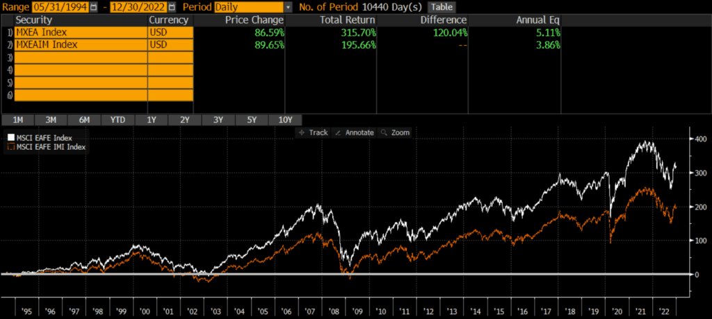
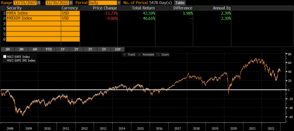
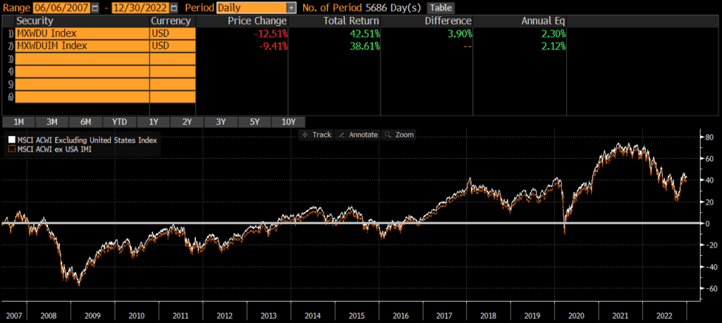
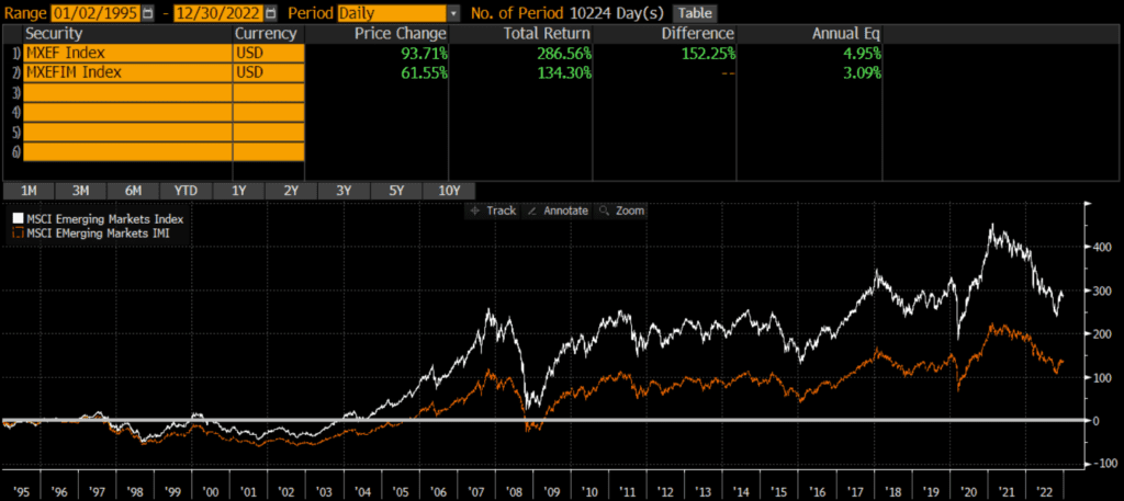
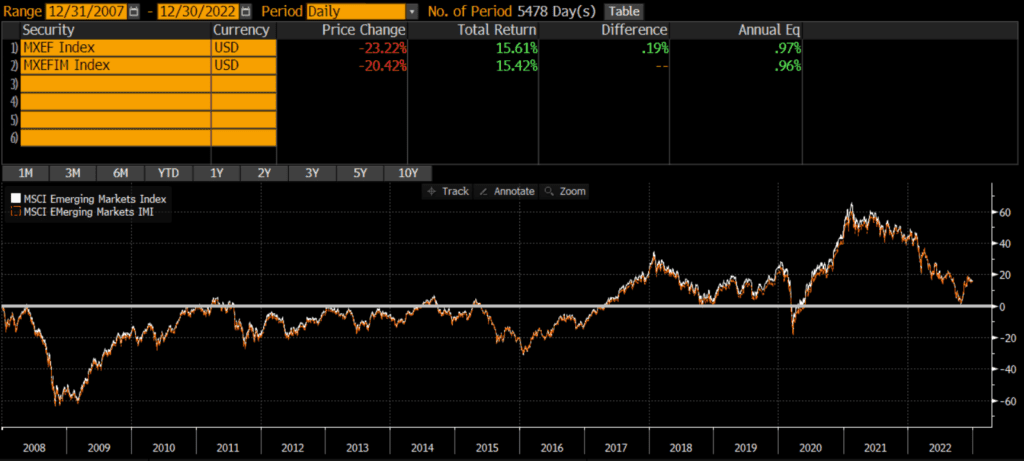
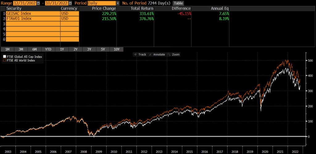
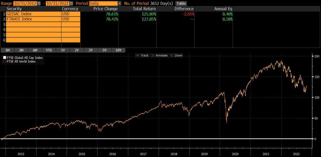
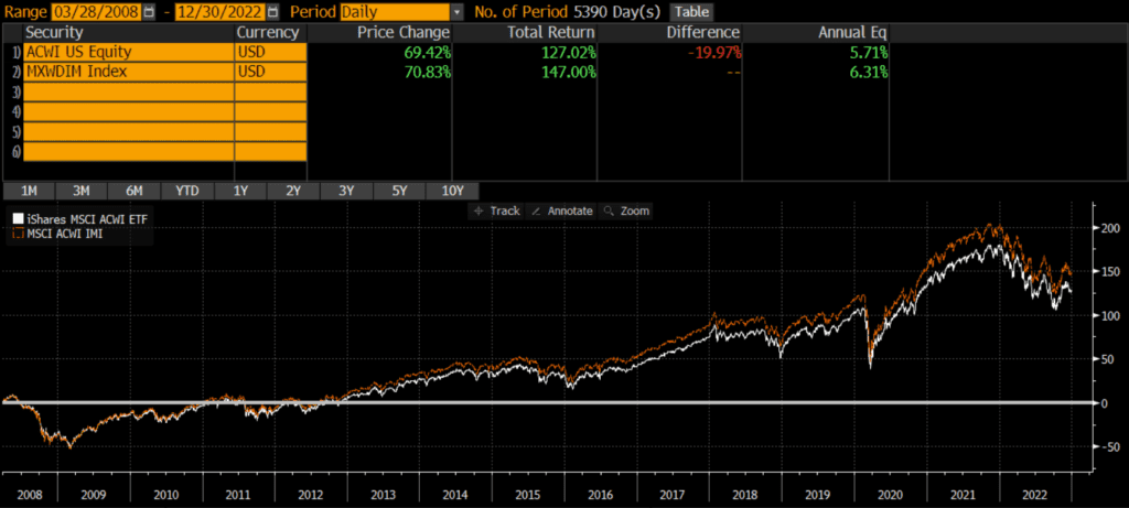
The MSCI ACWI Index and the MSCI ACWI IMI have some slight differences, but performance has been nearly identical. The below performance chart of the MSCI ACWI and MSCI ACWI IMI illustrates that the MSCI ACWI Index has outperformed the IMI version on a backtested basis. However, returns since the MSCI EM IMI’s inception have been nearly identical. This similar to the findings in my analysis of the Russell 1000 vs S&P 500 and MSCI EM vs MSCI EM IMI.

A quick note that investors cannot invest directly in an index. These unmanaged indexes do not reflect management fees and transaction costs that are associated with an investable vehicle, such as the iShares ACWI ETF (symbol: ACWI) or the State Street SPDR Portfolio MSCI Global Stock ETF (symbol: SPGM). A reminder that these are simply examples as this site does NOT provide investment recommendations.

What is the difference between MSCI ACWI and MSCI ACWI IMI?

The MSCI ACWI IMI (Investable Market Index) is similar to the traditional MSCI ACWI Index (non-IMI), but it has many more constituent stocks and includes more exposure to mid-caps and small-caps.

What does MSCI ACWI IMI mean?

The IMI in “MSCI ACWI IMI” stands for “Investable Market Index” and connotes that it includes more stocks than the original ACWI index.

Historical Performance: MSCI ACWI vs MSCI ACWI IMI

The MSCI ACWI Index was launched in 2001, while the MSCI ACWI IMI Index was launched a few years later in 2007. Since inception, the MSCI ACWI IMI has outperformed the original MSCI ACWI Index by .60% per year (5.71% vs 6.31%, respectively). The cumulative performance differential over that time period has been over 20%!

Composition Differences: MSCI ACWI vs MSCI ACWI IMI

Both the MSCI ACWI vs MSCI ACWI IMI indices are broad-based indices that represent the equity markets of developed nations. As of 12/31/2022, the indices have similar geographic exposures, similar sector weights, and slightly different market cap exposures.

Geography

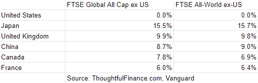
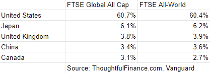
The MSCI ACWI index and the ACWI IMI have identical country constituents, although the weight vary ever so slightly. Below are the weights of the top five countries.

MSCI ACWI IndexMSCI ACWI Investable Market Index
US60.37%59.35%
Japan5.56%6.1%
United Kingdom3.87%3.98%
China3.63%3.35%
Canada3.06%3.12%
Source: ThoughtfulFinance.com, MSCI

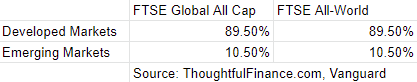
Both indices include both developed and emerging markets, which helpful since each have had periods of outperformance.

Market Capitalization

One of the main differences between the two indices is that the MSCI ACWI Investable Market Index (IMI) has many more constituents that the original MSCI ACWI Index. According to MSCI, the number of constituents is as follows:

MSCI ACWI IndexMSCI ACWI IMI Index
Constituent Stocks2,8859,154
Source: ThoughtfulFinance.com, MSCI (data as of 12/30/2022)

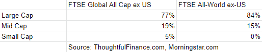
Additionally, the two indices have slightly different market cap exposures. Using the iShares ACWI ETF (which tracks the MSCI ACWI Index) (symbol ACWI) and the State Street SPDR Portfolio MSCI Global Stock ETF (which tracks the MSCI ACWI IMI Index) (symbol SPGM) as proxies, we can infer the below market cap weights of each index.

MSCI ACWI IndexMSCI ACWI IMI Index
Large Cap85%81%
Mid Cap16%14%
Small Cap0%6%
Source: ThoughtfulFinance.com, Morningstar.com (as of 11/30/2022)

Sector Weights

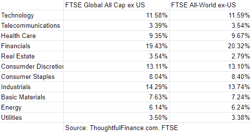
Again, using ACWI and SPGM as proxies, we can infer the index weights are very similar.

MSCI ACWI IMIMSCI ACWI Index
Basic Materials5.01%4.86%
Consumer Cyclical10.50%10.43%
Financial Services16.50%15.49%
Real Estate2.74%3.28%
Communication Services7.14%7.25%
Energy5.49%5.62%
Industrials10.19%12.21%
Technology18.81%18.46%
Consumer Defensive7.67%7.18%
Healthcare12.93%12.90%
Utilities3.02%2.32%
Source: ThoughtfulFinance.com, Morningstar.com (as of 1/18/2023)

Final Thoughts on MSCI ACWI Index vs ACWI IMI

Investors cannot invest in indices directly and should do their own research before deciding to invest in a fund that tracks either index. That being said, these two indices appear nearly identical in terms of geographic, market cap, and sector exposure. For all intents and purposes, I would argue that these two benchmarks are interchangeable.

With such a small performance difference, the costs of actual investment strategies/vehicles may be a larger consideration than which benchmark to select. Sometimes benchmark selection matters quite a bit, although that does not appear to be the case between these two indices. Interested readers may want to read my review of ACWI, the best known MSCI ACWI index fund.

MSCI EAFE Index vs MSCI EAFE IMI (Investable Market Index)

The MSCI EAFE Index and the MSCI EAFE IMI (Index Investable Market Index) are two of the most followed international stock indices. Many portfolios and investment vehicles are benchmarked to each index.

The MSCI EAFE Index and the MSCI EAFE IMI have some slight differences, but performance has been nearly identical. The below performance chart of the MSCI EAFE and MSCI EAFE IMI illustrates that the MSCI EAFE Index has outperformed the IMI version on a backtested basis. However, returns since the MSCI EAFE IMI’s inception have been nearly identical. This similar to the findings in my analysis of the Russell 1000 vs S&P 500 and MSCI EM vs MSCI EM IMI.

A quick note that investors cannot invest directly in an index. These unmanaged indexes do not reflect management fees and transaction costs that are associated with an investable vehicle, such as the iShares EAFE ETF (symbol: EFA) or the iShares Core EAFE ETF (symbol: IEFA). A reminder that these are simply examples as this site does NOT provide investment recommendations.

What is the difference between MSCI EAFE and MSCI EAFE IMI?

The MSCI EAFE IMI (Investable Market Index) is similar to the traditional MSCI EAFE Index (non-IMI), but it has many more constituent stocks and includes more exposure to mid-caps and small-caps.

What does MSCI EAFE IMI mean?

The IMI in “MSCI EAFE IMI” stands for “Investable Market Index” and connotes that it includes more stocks than the original EAFE index.

Historical Performance: MSCI EAFE Index vs MSCI EAFE IMI

The MSCI EAFE Index was launched way back in 1986, while the MSCI EAFE IMI Index was launched 21 years later in 2007. However, MSCI has provided backtested data that goes back about a dozen years before that. Since 1994, the MSCI EAFE Index has outperformed the MSCI EAFE IMI Index by about 1.25% per year (5.11% vs 3.86%, respectively). The cumulative performance differential over that time period has been over 120%!

However, when we chart the performance of MSCI EAFE vs MSCI EAFE IMI since 2007 (below), we find that performance has been nearly identical: 2.39% vs 2.30% annualized. The cumulative performance difference has been roughly 2%! I haven’t yet dug into the why this is (technically called performance attribution analysis), but it is a topic for future research. In the meantime, it is clear that the indices have performed identically since their common inception in 2007.

Composition Differences: MSCI EAFE Index vs MSCI EAFE IMI

Both the MSCI EAFE vs MSCI EAFE IMI indices are broad-based indices that represent the equity markets of developed nations. As of 12/31/2022, the indices have identical geographic exposures, similar sector weights, and slightly different market cap exposures.

Geography

The MSCI EAFE index and the EAFE IMI have identical country constituents, although the weight vary ever so slightly. Below are the weights of the top five countries.

MSCI EAFE IndexMSCI EAFE Investable Market Index
Japan21.94%23.36%
United Kingdom15.27%15.24%
France11.85%10.67%
Switzerland10.14%9.34%
Australia8.15%8.26%
Source: ThoughtfulFinance.com, MSCI

Market Capitalization

One of the main differences between the two indices is that the MSCI EAFE Investable Market Index (IMI) has many more constituents that the original MSCI EAFE Index. According to MSCI, the number of constituents is as follows:

MSCI EAFE IndexMSCI EAFE IMI Index
Constituent Stocks3,073796
Source: ThoughtfulFinance.com, MSCI (data as of 12/30/2022)

Additionally, the two indices have slightly different market cap exposures. Using the iShares EAFE ETF (which tracks the MSCI EAFE Index) (symbol EFA) and the iShares Core EAFE ETF (which tracks the MSCI EAFE IMI Index) (symbol IXUS) as proxies, we can infer the below market cap weights of each index.

MSCI EAFE IndexMSCI EAFE IMI Index
Large Cap88%77%
Mid Cap12%19%
Small Cap0%4%
Source: ThoughtfulFinance.com, Morningstar.com (as of 11/30/2022)

Sector Weights

Again, using EFA and IEFA as proxies, we can infer the index weights are very similar.

MSCI EAFE IndexMSCI EAFE IMI
Basic Materials8.01%8.11%
Consumer Cyclical10.74%11.15%
Financial Services18.74%17.74%
Real Estate2.72%3.86%
Communication Services4.90%4.79%
Energy4.90%4.60%
Industrials14.97%16.09%
Technology8.52%8.66%
Consumer Defensive10.05%9.43%
Healthcare13.30%12.47%
Utilities3.14%3.10%
Source: ThoughtfulFinance.com, Morningstar.com (as of 1/18/2023)

Final Thoughts on MSCI EAFE Index vs EAFE IMI

Investors cannot invest in indices directly and should do their own research before deciding to invest in a fund that tracks either index. That being said, these two indices appear nearly identical in terms of geographic, market cap, and sector exposure. For all intents and purposes, I would argue that these two benchmarks are interchangeable, despite the wide historical performance difference prior to 2007.

With such a small performance difference, the costs of actual investment strategies/vehicles may be a larger consideration than which benchmark to select. Sometimes benchmark selection matters quite a bit, although that does not appear to be the case between these two indices.

MSCI ACWI ex-US vs MSCI ACWI ex-US IMI (Investable Market Index)

The MSCI ACWI ex-US Index and the MSCI ACWI ex-US IMI (Index Investable Market Index) are two of the most followed global stock indices that exclude the US. Many portfolios and investment vehicles are benchmarked to each index.

The MSCI ACWI ex-US Index and the MSCI ACWI ex-US IMI have some slight differences, but performance has been nearly identical. The below performance chart of the MSCI ACWI ex-US and MSCI ACWI ex-US IMI illustrates that the MSCI ACWI ex-US Index has outperformed the IMI version on a backtested basis. However, returns since the MSCI EM IMI’s inception have been nearly identical. This similar to the findings in my analysis of the Russell 1000 vs S&P 500 and MSCI EM vs MSCI EM IMI.

A quick note that investors cannot invest directly in an index. These unmanaged indexes do not reflect management fees and transaction costs that are associated with an investable vehicle, such as the iShares ACWI ex-US ETF (symbol: ACWX) or the iShares Core MSCI Total International Stock ETF (symbol: IXUS). A reminder that these are simply examples as this site does NOT provide investment recommendations.

What is the difference between MSCI ACWI ex-US and MSCI ACWI ex-US IMI?

The MSCI ACWI ex-US IMI (Investable Market Index) is similar to the traditional MSCI ACWI ex-US Index (non-IMI), but it has many more constituent stocks and includes more exposure to mid-caps and small-caps.

What is MSCI ACWI ex-USA IMI index?

The IMI in “MSCI ACWI ex-US IMI” stands for “Investable Market Index” and connotes that it includes more stocks than the original ACWI ex-US index.

Historical Performance: MSCI ACWI ex-US vs MSCI ACWI ex-US IMI

The MSCI ACWI ex-US Index was launched in 1995, while the MSCI ACWI ex-US IMI Index was launched 22 years later on June 5, 2007. Since inception, performance has been nearly identical. The MSCI ACWI ex-US has outperformed the MSCI ACWI ex-US IMI by .18% per year (2.30% vs 2.12%, respectively). The cumulative performance differential over that time period has been over 4%!

Composition Differences: MSCI ACWI ex-US vs MSCI ACWI ex-US IMI

Both the MSCI ACWI ex-US vs MSCI ACWI ex-US IMI indices are broad-based indices that represent the equity markets of developed nations. As of 12/31/2022, the indices have similar geographic exposures, similar sector weights, and slightly different market cap exposures.

Geography

The MSCI ACWI ex-US index and the ACWI ex-US IMI have identical country constituents, although the weight vary ever so slightly. Below are the weights of the top five countries.

MSCI ACWI ex-US IndexMSCI ACWI ex-US Investable Market Index
Japan14.03%15.01%
United Kingdom9.76%9.79%
China9.16%8.25%
Canada7.72%7.67%
France7.57%6.86%
Source: ThoughtfulFinance.com, MSCI

Market Capitalization

One of the main differences between the two indices is that the MSCI ACWI ex-US Investable Market Index (IMI) has many more constituents that the original MSCI ACWI ex-US Index. According to MSCI, the number of constituents is as follows:

MSCI ACWI ex-US IndexMSCI ACWI ex-US IMI Index
Constituent Stocks2,2616,592
Source: ThoughtfulFinance.com, MSCI (data as of 12/30/2022)

Additionally, the two indices have slightly different market cap exposures. Using the iShares ACWI ex-US ETF (which tracks the MSCI ACWI ex-US Index) (symbol ACWI ex-US) and the State Street SPDR Portfolio MSCI Global Stock ETF (which tracks the MSCI ACWI ex-US IMI Index) (symbol SPGM) as proxies, we can infer the below market cap weights of each index.

MSCI ACWI ex-US IndexMSCI ACWI ex-US IMI Index
Large Cap88%77%
Mid Cap12%19%
Small Cap0%4%
Source: ThoughtfulFinance.com, Morningstar.com (as of 11/30/2022)

Sector Weights

Again, using ACWX and IXUS as proxies, we can infer the index weights are very similar.

MSCI ACWI ex-US IMIMSCI ACWI ex-US Index
Basic Materials8.51%8.85%
Consumer Cyclical11.19%11.40%
Financial Services20.91%19.42%
Real Estate2.32%3.35%
Communication Services6.42%6.06%
Energy5.93%5.64%
Industrials12.07%13.27%
Technology11.33%11.29%
Consumer Defensive8.47%8.12%
Healthcare9.77%9.49%
Utilities3.06%3.12%
Source: ThoughtfulFinance.com, Morningstar.com (as of 1/18/2023)

Final Thoughts on MSCI ACWI ex-US Index vs ACWI ex-US IMI

Investors cannot invest in indices directly and should do their own research before deciding to invest in a fund that tracks either index. That being said, these two indices appear nearly identical in terms of geographic, market cap, and sector exposure. For all intents and purposes, I would argue that these two benchmarks are interchangeable.

With such a small performance difference, the costs of actual investment strategies/vehicles may be a larger consideration than which benchmark to select. Sometimes benchmark selection matters quite a bit, although that does not appear to be the case between these two indices.

MSCI Emerging Markets Index vs MSCI Emerging Markets IMI (Investable Market Index)

The MSCI Emerging Markets Index and the MSCI Emerging Markets Index Investable Market Index (IMI) are two of the most followed emerging markets indices. Many portfolios and investment vehicles are benchmarked to each index.

The MSCI EM Index and the MSCI EM IMI have some slight differences, but performance has been nearly identical. The below performance chart of the MSCI EM and MSCI EM IMI illustrates that the MSCI Emerging Markets Index has outperformed the IMI version on a backtested basis. However, returns since the MSCI EM IMI’s inception have been nearly identical. This similar to the findings in my analysis of the Russell 1000 vs S&P 500.

A quick note that investors cannot invest directly in an index. These unmanaged indexes do not reflect management fees and transaction costs that are associated with an investable vehicle, such as the iShares Emerging Markets ETF (symbol: EEM) or the iShares Core Emerging Markets ETF (symbol: IEMG). A reminder that these are simply examples as this site does NOT provide investment recommendations.

What is the MSCI Emerging Markets IMI Index?

The MSCI Emerging Markets Investable Market Index (IMI) is similar to the traditional MSCI Emerging Markets Index (non-IMI), but it has many more constituent stocks and includes more exposure to mid-caps and small-caps.

What is the difference between MSCI EM and MSCI EM IMI?

The MSCI Emerging Markets IMI (Investable Market Index) is similar to the traditional MSCI Emerging Markets Index (non-IMI), but it has many more constituent stocks and includes more exposure to mid-caps and small-caps.

What does MSCI Emerging Markets IMI mean?

The IMI in “MSCI Emerging Markets IMI” stands for “Investable Market Index” and connotes that it includes more stocks than the original Emerging Markets index.

Historical Performance: MSCI Emerging Market Index vs MSCI Emerging Market IMI

The MSCI Emerging Markets Index was launched way back in 1987, while the MSCI Emerging Markets IMI Index was launched 20 years later in 2007. However, MSCI has provided backtested data that goes back about a dozen years before that. Since 1995, the MSCI Emerging Markets Index has outperformed the MSCI Emerging Markets IMI Index by about 1.85% per year (4.95% vs 3.09%, respectively). The cumulative performance differential over that time period has been over 150%!

However, when we chart the performance of MSCI EM vs MSCI EM IMI since 2007 (below), we find that performance has been identical: .97% vs .96% annualized. The cumulative performance difference is less than .2%! I haven’t yet dug into the why this is (technically called performance attribution analysis), but it is a topic for future research. In the meantime, it is clear that the indices have performed identically since their common inception in 2007.

I’ve seen a similar dynamic (albeit for a different reason) between emerging and developed markets.

Composition Differences: MSCI Emerging Markets Index vs MSCI Emerging Markets IMI

Both the MSCI EM vs MSCI EM IMI indices are broad-based indices that represent emerging market equity markets. The indices have very similar geographic exposures, similar sector weights, and slightly different market cap exposures.

Geography

The MSCI EM index and the EM IMI have identical country constituents, although the weight vary ever so slightly. Below are the weights of the top five countries.

MSCI Emerging Markets IndexMSCI Emerging Markets Investable Market Index
China32.3129.39
India14.4415.56
Taiwan13.8114.56
South Korea11.3211.65
Brazil5.275.32
Source: ThoughtfulFinance.com, MSCI

Market Capitalization

One of the main differences between the two indices is that the MSCI Emerging Markets Investable Markets Index (IMI) has many more constituents that the original MSCI Emerging Markets Index. According to MSCI, the number of constituents is as follows:

MSCI Emerging Markets IndexMSCI Emerging Markets IMI Index
Constituent Stocks1,3773,204
Source: ThoughtfulFinance.com, MSCI (data as of 12/30/2022)

Additionally, the two indices have slightly different market cap exposures. Using the iShares Emerging Markets ETF (which tracks the MSCI EM Index) (symbol EEM) and the iShares Core Emerging Markets ETF (which tracks the MSCI EM IMI Index) (symbol IEMG) as proxies, we can infer the below market cap weights of each index.

MSCI Emerging Markets IndexMSCI Emerging Markets IMI Index
Large Cap85%79%
Mid Cap10%17%
Small Cap0%5%
Source: ThoughtfulFinance.com, Morningstar.com (as of 11/30/2022)

Sector Weights

Again, using EEM and IEMG as proxies, we can infer the index weights are relatively close to one another.

MSCI Emerging Markets IMIMSCI Emerging Markets Index
Basic Materials9.30%8.91%
Consumer Cyclical13.47%13.82%
Financial Services20.05%21.42%
Real Estate2.54%1.95%
Communication Services9.98%10.78%
Energy4.51%4.82%
Industrials7.20%5.78%
Technology18.80%19.08%
Consumer Defensive6.15%6.14%
Healthcare5.04%4.37%
Utilities2.96%2.93%
Source: ThoughtfulFinance.com, Morningstar.com (as of 11/30/2022)

Final Thoughts on MSCI EM Index vs MSCI EM IMI

Investors cannot invest in indices directly and should do their own research before deciding to invest in a fund that tracks either index. That being said, these two indices appear nearly identical in terms of geographic, market cap, and sector exposure. For all intents and purposes, I would argue that these two benchmarks are interchangeable, despite the wide historical performance difference prior to 2007.

With such a small performance difference, the costs of actual investment strategies/vehicles may be a larger consideration than which benchmark to select. Sometimes benchmark selection matters quite a bit, although that does not appear to be the case between these two indices.

CRSP US Total Market Index vs Dow Jones US Total Stock Market Index

The CRSP US Total Market Index and the Dow Jones US Total Stock Market Index are two of the most popular indices of US stocks. Many portfolios and investment vehicles are benchmarked to each index as both are representative of the US stock market.

The CRSP US Total Market Index and the Dow Jones US Total Stock Market Index are nearly identical in every way with very slight differences. The below performance chart of the CRSP US Total Market and the Dow Jones US Total Stock Market indices illustrates that the Dow Jones US Total Stock Market Index has outperformed the CRSP US Total Market Index since its inception. However, returns over the past 11 years have been nearly identical. This is extremely similar to the findings in my analysis of the Russell 1000 vs S&P 500 and MSCI USA Index vs the S&P 500 Index.

A quick note that investors cannot invest directly in an index. These unmanaged indexes do not reflect management fees and transaction costs that are associated with an investable vehicle, such as the Fidelity Total Market Index Fund (symbol: FSKAX) or the Vanguard Total Stock Market Index Fund ETF (symbol: VTI). A reminder that these are simply examples as this site does NOT provide investment recommendations.

Historical Performance: CRSP US Total Market Index vs Dow Jones US Total Stock Market Index

The Dow Jones US Total Stock Market Index was launched way back in 1987, while the CRSP US Total Market Index was launched nearly 25 years later on March 31, 2011. Since that time, the Dow Jones index has outperformed the CRSP index by .25% per year (11.08% vs 10.83%, respectively). The cumulative performance differential over that time period has been less than 9%.

Composition Differences: CRSP vs Dow Jones (US Total Stock Market Indices)

Both the CRSP US Total Market Index and the Dow Jones US Total Stock Market Index are broad-based indices that represent the US equity markets. As of 12/31/2022, the indices have identical geographic exposures, similar sector weights, and slightly different market cap exposures.

Geography

Both the CRSP US Total Market and the Dow Jones US Total Stock Market indices only include the stocks of US-domiciled companies.

Market Capitalization

The two indices have a similar number of constituent stocks (as of 9/30/2022); the CRSP US Total Stock Market Index has 4,027 constituents versus the Dow Jones US Total Stock Market’s 4,273 constituents. Using the Vanguard Total Stock Market Index Fund (which tracks the CRSP benchmark) and the Fidelity Total Stock Market Index Fund (which tracks the Dow Jones index) as proxies, we can infer the below market cap weights of each index. Perhaps not surprisingly, the weights are identical!

CRSP US Total Stock Market IndexDow Jones US Total Stock Market Index
Large Cap73%73%
Mid Cap19%19%
Small Cap9%9%
Source: ThoughtfulFinance.com, Morningstar.com (as of 11/30/2022)

Sector Weights

Again, using VTSAX and FSKAX as proxies, we can infer the index weights are approximately identical. Many sector weights are within .05% of each other!

CRSP US Total Stock Market IndexDow Jones US Total Stock Market Index
Basic Materials2.65%2.66%
Consumer Cyclical10.35%10.43%
Financial Services13.90%14.04%
Real Estate3.48%3.46%
Communication Services6.89%6.91%
Energy5.09%5.13%
Industrials9.80%9.58%
Technology23.04%23.18%
Consumer Defensive6.80%6.77%
Healthcare15.09%14.97%
Utilities2.91%2.87%
Source: ThoughtfulFinance.com, Morningstar.com (as of 11/30/2022)

Final Thoughts on CRSP vs Dow Jones (US Total Stock Market Indices)

Investors cannot invest in indices directly and should do their own research before deciding to invest in a fund that tracks either index. That being said, these two indices appear nearly identical in terms of geographic, market cap, and sector exposure. For all intents and purposes, I would argue that these two benchmarks are interchangeable, despite the small historical performance difference.

With such a small performance difference though, the costs of investable index strategies may be a larger consideration than which benchmark to select. Sometimes benchmark selection matters quite a bit, although that does not appear to be the case between these two indices.

Why I Write Comparison Posts

Comparing indices and funds is relatively basic (compared to complex investment or tax strategies) and relatively boring to write about, but this site’s goal is to help investors.

Differential analysis is something that many people ask about and research. Investors often want to know whether to use Fund A or Fund B. Sometimes the answer is easy and sometimes the answer doesn’t matter. 

I remember trying to find the “best” funds as an amateur investor back in high school and college by scouring magazines and Morningstar.com. I’d focus on the 3-, 5-, and 10-year returns, not understanding that the timeframes we’re highly correlated with one another. I’d spend tons of time looking at expense ratios or betas, not understanding the much larger differences between funds. In short, I wasted a lot of time focusing on things that were irrelevant. I see many investors making the same mistakes today.

Unfortunately, there are not a lot of helpful sites out there. There is a lot of data available, but not much of it is necessarily helpful to individual investors.

  • Understanding the difference in two expense ratios is not as important as understanding whether two funds are even comparable in the first place.
  • Focusing on performance differences is not as important as understanding how the performance is presented and/or what drove that performance.
  • Trying to differentiate between two nearly identical funds is usually not a great use of an investor’s time. Sometimes it is though.
  • A post that’s got affiliate links all over it and takes paragraph-long tangents into this brokerage or that investing service is annoying at best and dangerous at worst. 

The purpose of these comparison articles is to help investors focus on the things that matter. My overall goal is to help investors and these articles are an easy way for me to scalably address widespread (but easy) questions.

FTSE Global All Cap ex US Index vs FTSE All-World ex US Index

The FTSE Global All Cap ex US Index and the FTSE All World ex US Index are two international stock indices, covering a majority of the world’s non-US investable stocks. Many investment strategies and vehicles benchmark to either one of these indices. The primary difference between the FTSE Global All-Cap ex US vs FTSE All World ex US is that the Global All Cap ex US Index broader than the All World ex US. However, performance is fairly similar, as is sector and geographic exposure.

A quick note that investors cannot invest directly in an index. These unmanaged indexes do not reflect management fees and transaction costs that are associated with an investable vehicle, such as the Vanguard FTSE All-World ex-US ETF (symbol: VEU) or the Vanguard Total International Stock ETF (symbol: VXUS). A reminder that these are simply examples as this site does NOT provide investment recommendations.

Historical Performance: FTSE Global All-Cap ex US vs FTSE All World ex US

Both indices were launched in the early 2000s. Since the FTSE Global All Cap ex US Index’s launch, it has trailed the FTSE All-World ex US Index by nearly .90% annually.

However, when comparing the FTSE Global All-Cap ex US vs FTSE All World ex US over the past 10 years, then the performance differential narrows to less than .20% annually. The FTSE All World ex US still outperforms the FTSE Global All-Cap ex US, but the chart shows performance is pretty close.

Differences between FTSE Global All-Cap ex US and FTSE All World ex US

These two indices are both provided by FTSE and they are nearly identical in many respects. The primary difference is that the Global All Cap ex US is more of a total market index. The Global All-Cap ex US has 7,719 constituents, while the All-World ex US “only” has 3,563 constituents (all data as of 9/30/2022)

Geographic Exposure

Country Exposure

As their names imply, each index excludes US stocks. The top five countries are identical and the weightings are very close too. Data as of 9/30/2022.

Market Classification

The only difference in developed and emerging market exposure when comparing FTSE Global All-Cap ex US vs FTSE All World ex US seems to be a rounding error!

Market Cap Exposure

As its name suggests, the FTSE Global All Cap ex US covers more mid- and small-cap stocks primarily since it has more than double the number of constituents, as of 9/30/2022.

Sector Weights

The market cap differences do not translate into any material differences in sector exposure. As the table below shows, the sector weightings of the two indices are nearly identical as of 9/30/2022.

Final Thoughts

These two indices are quite different in some ways, but not in ways that matter very much. The FTSE Global All-Cap ex-USA Index is a much broader index than the FTSE All World ex-USA Index (with more than double the number of constituents!). However, due to the market cap weighting methodology of both indices, the additional constituents do materially impact the geographic exposure, sector weights, or performance. This is very similar to the dynamic we find with the Russell 1000 and Russell 3000 where one index is essentially a subset of another.

These two indices are very similar and recent performance has very close. Investment vehicle details like expenses, fees, taxes, and liquidity in small cap names (which the Global All-Cap ex US owns a lot of!) may be more consequential than differentials in index performance. Investors cannot invest in indices directly and should do their own research before deciding to invest in a fund that tracks either index.

Further Reading

Investors looking for global exposure that includes the US may want to read our comparison of these indices’ parents, the FTSE Global All Cap Index and FTSE All World Index.

Of course, readers can also compare the differences between the flagship MSCI “ex-USA” indices, the MSCI ACWI ex-USA and MSCI World ex-USA.

FTSE Global All Cap vs FTSE All World

The FTSE Global Cap Index and the FTSE All World Index are two global indices, covering a majority of the world’s investable stocks. Many investment strategies and vehicles benchmark to either one of these indices. FTSE Global All Cap covers many more constituents and market caps than the FTSE All World, but there is little difference in performance.

A quick note that investors cannot invest directly in an index. These unmanaged indexes do not reflect management fees and transaction costs that are associated with an investable vehicle, such as the Vanguard Total World Stock ETF (symbol: VT) or the Vanguard FTSE All-World UCITS ETF (symbol: VWRL) which is available in the UK. Interestingly the former fund (VT) changed benchmarks from the FTSE All-World Index to the FTSE Global All Cap Index in 2011. A reminder that these are simply examples as this site does NOT provide investment recommendations.

Historical Performance: FTSE Global All-Cap vs FTSE All World

Both indices were launched in the early 2000s. Since the FTSE Global All Cap Index’s launch, it has trailed the FTSE All-World Index by nearly .50% annually. Not a huge amount, but it has added up over time.

Readers know that I like to examine different time periods as the results often change. Sure enough, the FTSE Global All-Cap vs FTSE All World chart shows performance is nearly identical. Over the past 10 years, the All-World has only outperformed by .10% annually.

Differences between FTSE Global All-Cap vs FTSE All World

These two indices are both provided by FTSE and they are nearly identical in many respects. The primary difference is that the Global All-Cap is more of a total market index. The Global All-Cap has 9,527 constituents, while the All World “only” has 4,172 constituents (all data as of 9/30/2022)

Geographic Exposure

Country Exposure

The top five countries are identical and even the weights are nearly identical, as of 9/30/2022.

Market Classification

The market classification split between developed and emerging markets is also identical! Data as of 9/30/2022.

Market Cap Exposure

Interestingly, the market cap data reveals some differences. As its name suggests, the FTSE Global All Cap covers more mid- and small-cap stocks (as of 9/30/2022)

Sector Weights

The sector weights between the two indices are also nearly identical, as of 9/30/2022.

Final Thoughts

These two indices are quite different in some ways, but not in ways that matter very much. The FTSE Global All-Cap is a much broader index than the FTSE All World (with more than double the number of constituents!). However, these indices are market-cap weighted, so the thousands of additional constituents does materially impact the geographic exposure, sector weights, or performance. This is very similar to the dynamic we find with the Russell 1000 and Russell 3000.

If I was deciding between these two indices as a benchmark, I’d be indifferent. That being said, US investors will be hard-pressed to even find a fund benchmarked to the FTSE All World. So the FTSE Global All-Cap may be the default choice in the US. For investors in the UK and other regions with both choices, factors like expenses, fees, taxes, and liquidity in small cap names (which the Global All-Cap owns a lot of!) may be the deciding factors. These factors are likely much more important than performance, since the two indices have very similar performance. Investors cannot invest in indices directly and should do their own research before deciding to invest in a fund that tracks either index.

Further Reading

Investors looking for global exposure from a non-FTSE index may want to look at the MSCI World or MSCI ACWI.

Of course, readers can also compare the differences between the FTSE Global All-Cap and MSCI ACWI.

NASDAQ Composite vs NASDAQ 100

The Nasdaq Composite Index and the Nasdaq 100 Index are two widely watched indices. Despite their popularity, people often confuse the two. “The NASDAQ” Composite Index is referred to in the news and displayed on websites/TV, while the NASDAQ 100 Index seems to be the benchmark for more investable funds and strategies. Despite their similar names, a comparison of the NASDAQ Composite vs NASDAQ 100 reveals some major differences.

The NASDAQ 100 and Composite have very different compositions, slightly different weights and exposures, and performance differences have reflected that.

A quick note that investors cannot invest directly in an index. These unmanaged indexes do not reflect management fees and transaction costs that are associated with an investable vehicle, such as the Fidelity NASDAQ Composite Index ETF (symbol: ONEQ) or the Invesco NASDAQ 100 ETF (symbol: QQQ). Readers who want to compare these investment vehicles rather than these indices should check out our ETF comparison of ONEQ vs QQQ.

A reminder that these are simply examples as this site does NOT provide investment recommendations.

Historical Performance: NASDAQ 100 vs NASDAQ Composite

The NASDAQ Composite Index is much older with an inception date of 1970. The NASDAQ 100 Index was launched 15 years later in 1985. Since that time, the NASDAQ 100 has outperformed the NASDAQ Composite by a wide margin.

I reviewed NASDAQ Composite vs NASDAQ 100 charts from different timeframes and found the same results. The Composite has generally performed equal to or better than the 100 over all of the timeframes that I examined.

Differences between NASDAQ Composite and NASDAQ 100

Overall, the two indices are very similar, since they are both based on the same universe of stocks. The Composite includes all securities listed on the NASDAQ exchange (over 3,700 as of Q3 2022!) , while the NASDAQ 100 includes the largest 100 stocks (technically 103 as of Q3 2022) after excluding financial stocks. The NASDAQ site publishes the index methodologies for both the Composite and 100.

Geographic Exposure

Substantially all (95%+) of each index is composed of US-based companies, so I will not include the usual tables of countries, market classification, and so on.

Market Cap Exposure

The NASDAQ 100 in composed of the 100 largest stocks on the NASDAQ exchange (excluding financials), so it has a much larger weighting to large-caps than the Composite. However, both indices use methodologies based on market-cap weighting, so large-caps dominate each index.

Below is an estimate of the market cap exposure as of 9/30/2022.

Sector Weights

Given that the NASDAQ Composite is a much broader index versus the NASDAQ 100, it is not surprising that the Composite covers more sectors and is less concentrated that the 100. Below are the sector weightings of the two indices, as of 11/2/2022.

Final Thoughts

Despite “The NASDAQ” Composite’s popularity, there are relatively few investment vehicles benchmarked to it, so many investors may just default to the NASDAQ 100 because its easier. This reminds of “The Dow” Jones Industrial Average which seems to be more popular with the general public, but is dwarfed by the S&P 500 in terms of benchmark use. Investors cannot invest in indices directly and should do their own research before deciding to invest in a fund that tracks either index.

Further Reading

Investors looking for large-cap exposure in the US may also want to consider the Russell 1000 or the S&P 500 or even the MSCI USA Index.

An international example of a widely followed index without a ton a vehicles benchmarked to it is the MSCI World ex-USA Index, while pales in comparison to the MSCI ACWI ex-USA Index.

MSCI World ex-USA vs MSCI ACWI ex-USA

The MSCI World ex-USA Index and the MSCI ACWI ex-USA Index may sound very similar, but they are quite different. MSCI ACWI ex-USA is fairly popular index, while the MSCI World ex-USA is relatively unknown. When comparing MSCI ACWI ex-USA vs MSCI World ex-USA, the primary difference is that ACWI ex-USA includes emerging market stocks while World ex-USA does not. This is consistent with the ACWI and World parent indices (which include the USA).

A quick note that investors cannot invest directly in an index. These unmanaged indexes do not reflect management fees and transaction costs that are associated with an investable vehicle, such as the iShares ACWI ex-USA ETF (symbol: ACWX). A reminder that these are simply examples as this site does NOT provide investment recommendations.

Historical Performance: MSCI World ex-USA vs MSCI ACWI ex-USA

Since the MSCI ACWI ex-USA Index’s inception in 2001, it has outperformed by an ever-so-slight .20% annually. Given that the primary difference between the indices is their exposure to emerging markets, it is no surprise that ACWI ex-USA outperformed during the first decade.

Given that emerging markets have underperformed for the last decade, it is no surprise that the MSCI ACWI ex-USA vs MSCI World ex-USA chart of the last 10 years indicates the reverse. Over this time period, the MSCI World ex-USA has outperformed by nearly 1% per year.

Current Index Composition: MSCI ACWI ex-USA vs MSCI World ex-USA

The main difference between the two indices is their inclusion/exclusion of emerging markets. However, the market cap exposure and sector weights are fairly similar, which partially explains why performance has been so similar.

Geographic Exposure

ACWI stands for All Country World Index and so the MSCI ACWI ex-USA includes stocks from a broader set of countries than the World ex-USA Index. The primary difference is the inclusion and exclusion of emerging markets.

Below are the top five country weights of the two indices, as of 9/30/2022. Note that China is not included in the World ex-USA’s top holdings.

Market Cap Exposure

The ACWI ex-USA is a much broader index with 2,274 constituents vs World ex-USA’s 887 constituents (as of 9/30/2022). Not surprisingly, the mean and median market cap of ACWI ex-USA constituents is roughly half of World ex-USA’s. However, both indices are market cap weighted, so they up both being large-cap indices (which helps explain their very similar performance).

Sector Weights

As of 9/30/2022, the sector weights on the two indices are very similar.

Concluding Thoughts

Investors cannot invest in indices directly and should do their own research before deciding to invest in a strategy that tracks either index. Below are a my personal thoughts on this comparison of MSCI World ex-USA vs MSCI ACWI ex-USA:

  • The comparison might not even matter that much, since the MSCI World ex-USA Index is not a common benchmark. This is reminiscent of the NASDAQ Composite Index, which is widely followed but has relatively few vehicles benchmarked to it (versus the NASDAQ 100)
  • Selecting the MSCI ACWI ex-USA Index over the MSCI World ex-USA Index is simply a bet on emerging markets. That is main difference between the indices as the other weights and exposures are quite similar.
  • The performance differences have not been that wide and the resources used to select the “best” benchmark might be better spent on considering differences in the investment strategy (such as expenses, transaction costs, tax efficiency, and so on.

Further Reading

Investors who want to evaluate non-MSCI global indices may want to read my comparison of the FTSE Global All Cap ex US vs FTSE All World ex US indices.

Investors who want a global benchmark with US exposure should read my comparison of the MSCI ACWI vs MSCI World (the parent indices of the two compared in this post) or my comparison of the FTSE Global All Cap Index vs MSCI ACWI.

Scroll to Top