Index Comparisons

KLD 400 vs S&P 500

The KLD 400 index is one of oldest socially responsible investing (SRI) indices and it still offers SRI investors an alternative to traditional indices like the S&P 500. However some differences become apparent when examining the KLD 400 vs S&P 500 and we will explore these below.

A quick note that investors cannot invest directly in an index. These unmanaged indexes do not reflect management fees and transaction costs that are associated with an investable vehicle, such as the iShares MSCI KLD 400 Social ETF (symbol: DSI) or the iShares Core S&P 500 ETF (symbol: IVV). A reminder that these are simply examples as this site does NOT provide investment recommendations.

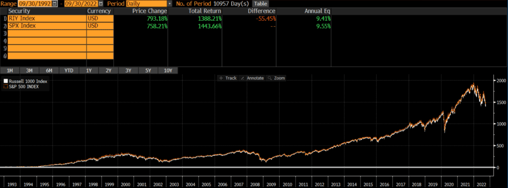
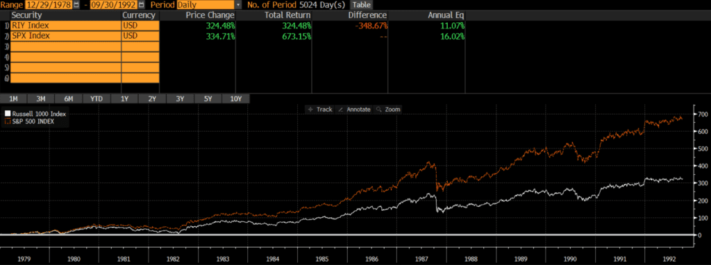
Historical Performance: KLD 400 vs S&P 500

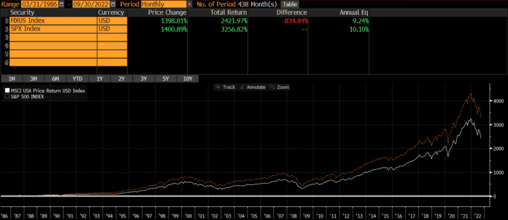
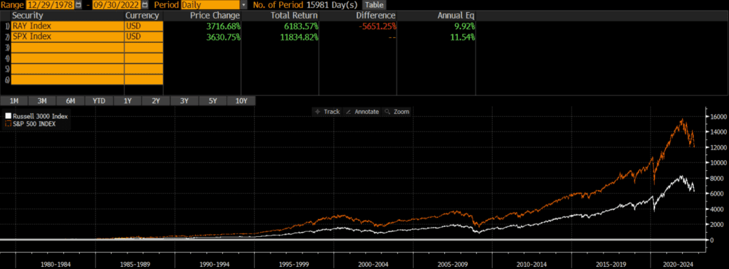
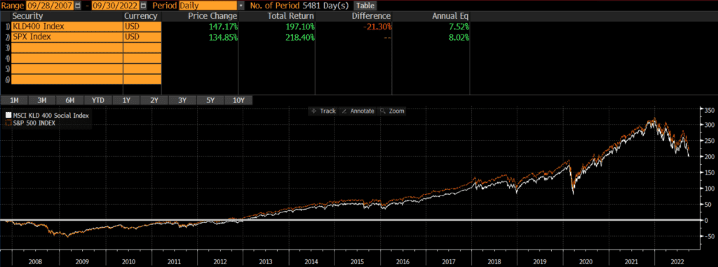
The below KLD 400 vs S&P 500 chart shows that the S&P 500 has outperformed by nearly 1% annually since the KLD 400’s inception in 1990. However, similar to our analysis of the Russell 1000 vs S&P 500, the performance differential is narrower more recently.

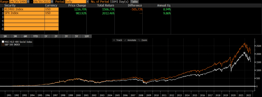
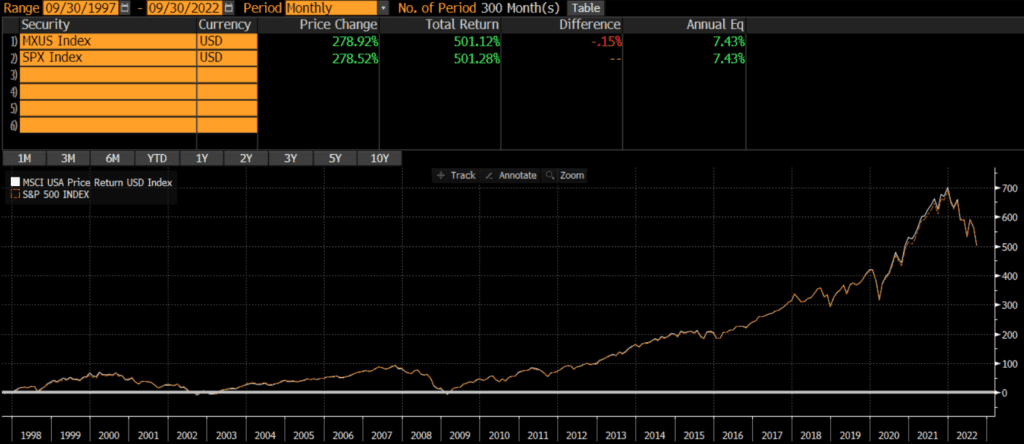
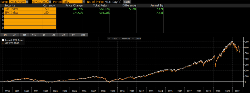
If we shorten the KLD 400 vs S&P 500 graph timeframe to the past 15 years, the performance difference narrows. Over this timeframe the S&P index outperformed the KLD index by 50 basis points annually.

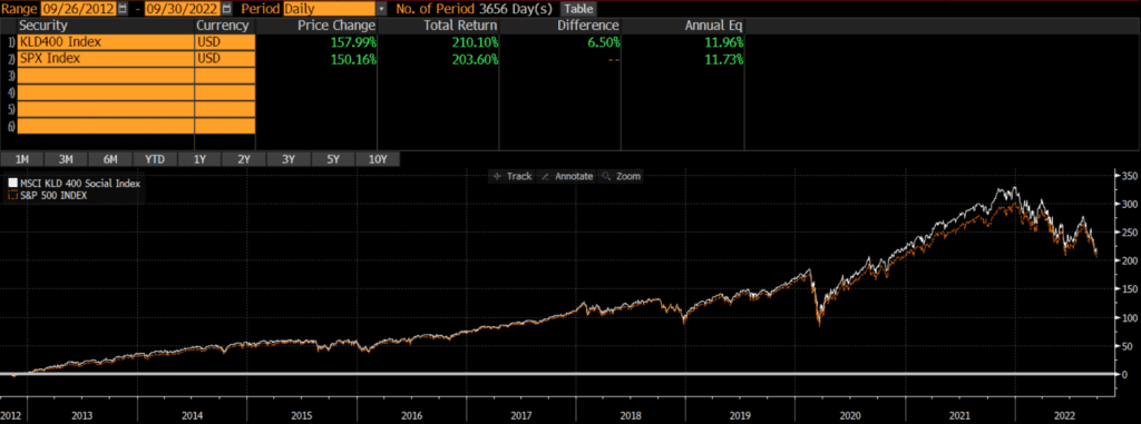
The difference in KLD 400 vs S&P 500 performance flips if we change the chart timeframe to 10 years. Over this timeframe, the KLD has outperformed by nearly a quarter percent annually. Of course, nobody knows what the future holds, but the performance over all timeframes has been relatively close (within 100 bps since inception).

Composition Differences: KLD 400 vs S&P 500

The KLD 400 and the S&P 500 are similar in many respects. The KLD 400 index

It is worth noting that the MSCI KLD 400 index is derived from the MSCI USA index. Our analysis of the MSCI USA Index vs S&P 500 found that the two are nearly identical. However, the KLD 400 contains some ESG screens that set it apart from both the MSCI USA and the S&P 500.

ESG Methodology

According to MSCI, the MSCI USA index is the parent index of the KLD 400. The first step in deriving the KLD index is to exclude any companies involved in Nuclear Power, Tobacco, Alcohol, Gambling, Military Weapons, Civilian Firearms, GMOs, or Adult Entertainment. Then constituents are added based on ESG considerations, as well as to keep sector and market cap exposures inline with the parent index. There is additional steps taken during the semi-annual reconstitution and rebalancing, all of which can be found on MSCI’s website.

Geography

Both the MSCI KLD 400 Index and the S&P 500 only include the stocks of US-domiciled companies.

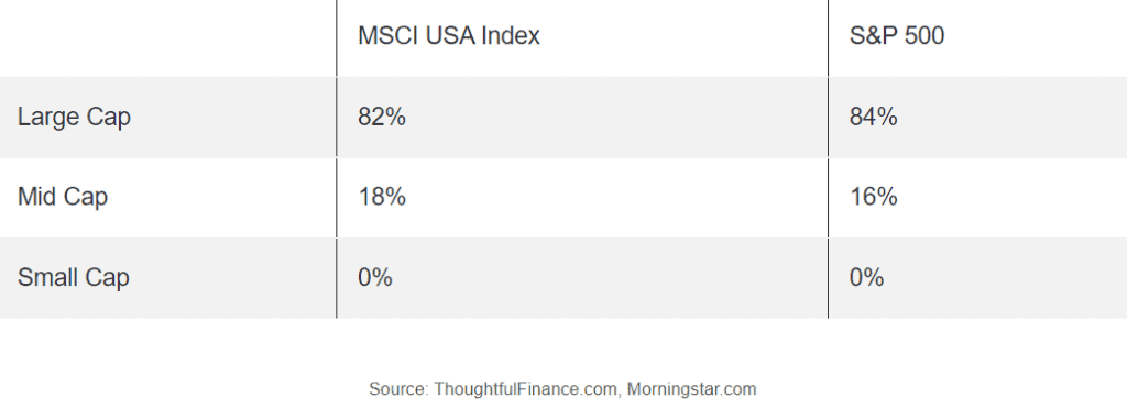
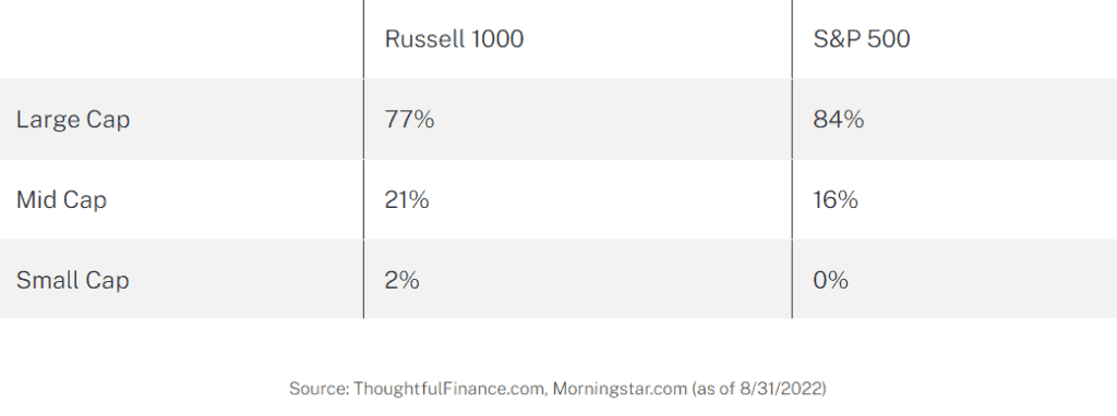
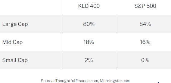
Market Capitalization: KLD 400 vs S&P 500

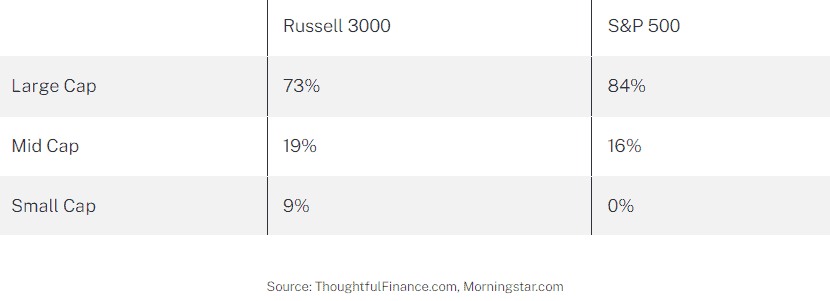
The market cap exposure of the KLD index and the S&P index are similar, although the KLD 400 tilts marginally more towards mid-cap and small-cap stocks.
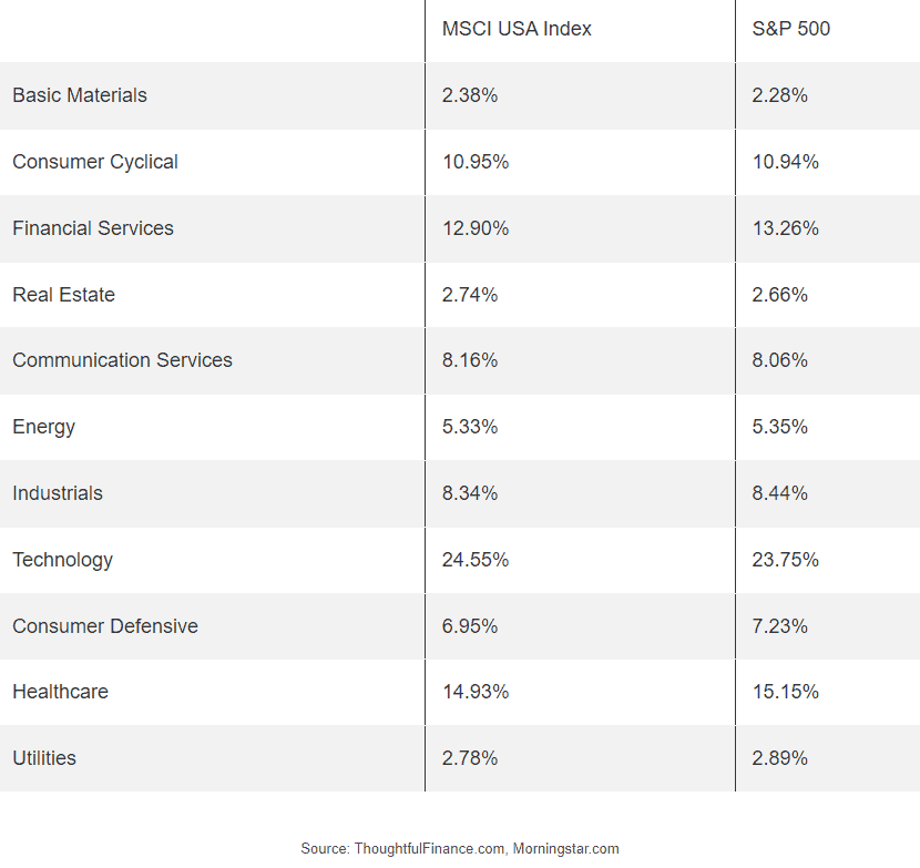
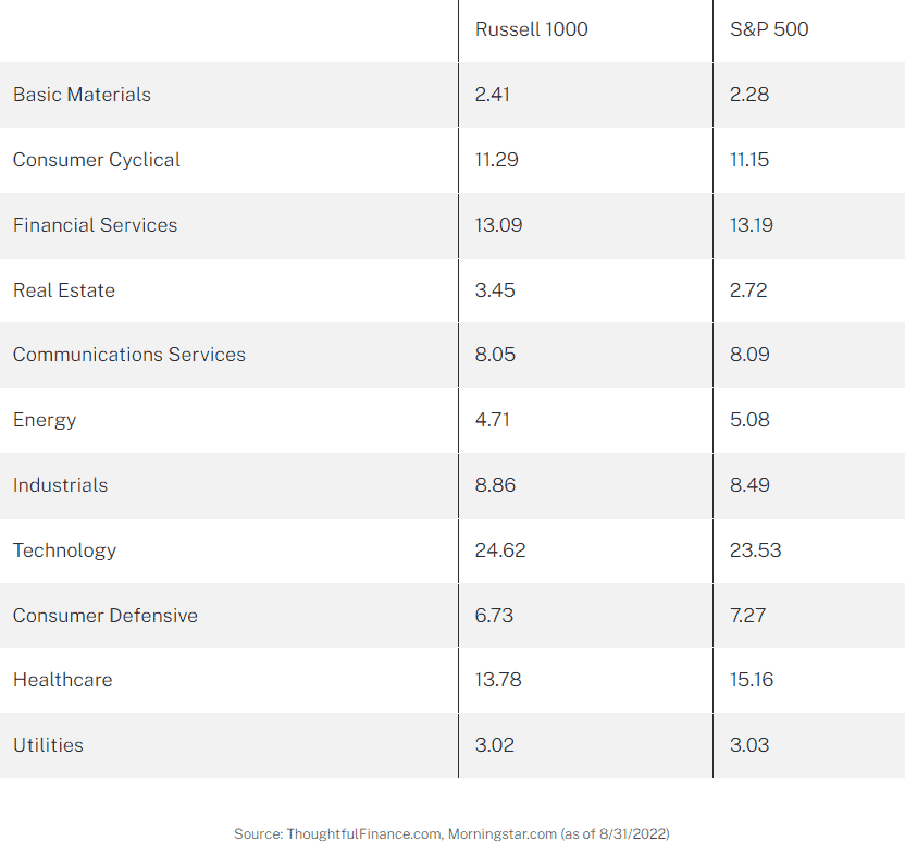
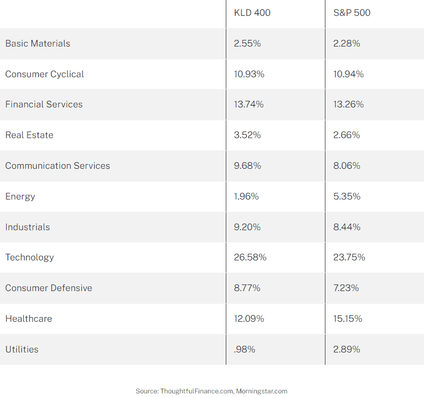
Sector Comparison

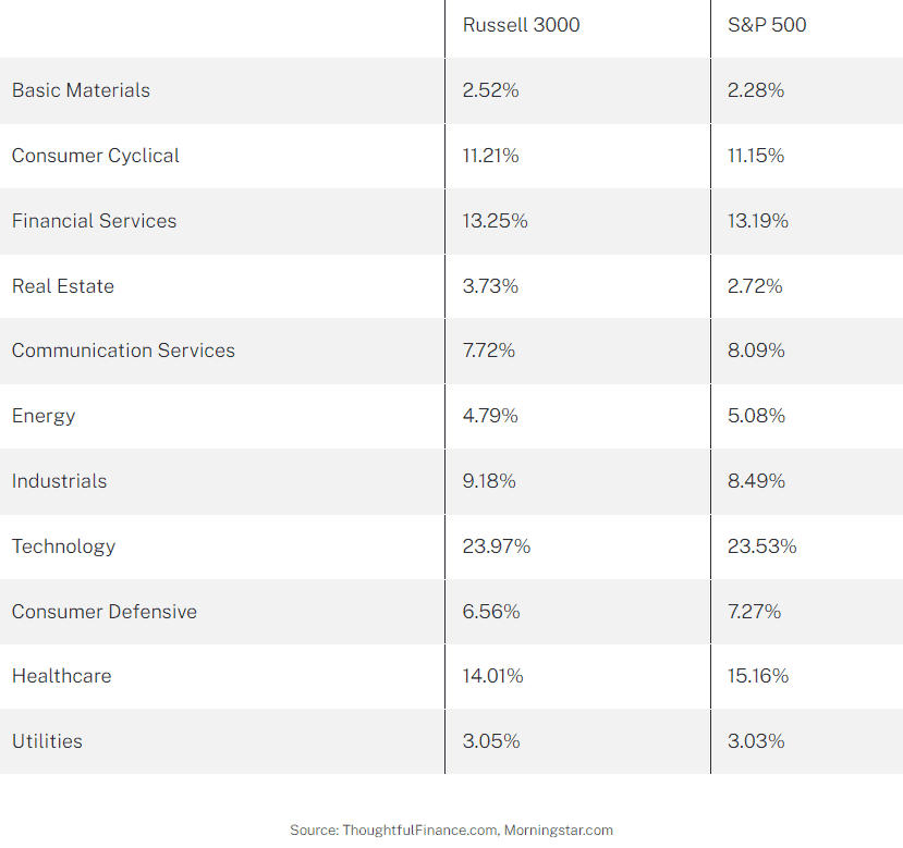
The sector exposure of the two indices is very similar with just a few key differences. Like many ESG-oriented indices, the KLD 400 is underweight energy, utilities, and healthcare.

Final Thoughts on KLD 400 vs S&P 500

Investors cannot invest in indices directly and should do their own research before deciding to invest in a fund that tracks either index. These indices are similar in many ways and performance differentials have depended on the time period being evaluated. Those considering benchmarking to the KLD 400 index (or any SRI/ESG for that matter) should first review the index methodology. The primary reason investors would use something like the KLD 400 index is to align their portfolio with their values, so they better ensure that they agree with the index methodology!

For instance, an investor may care deeply about the environment and social issues and be drawn to the KLD 400 index as a benchmark. However, if the investor is supportive of nuclear power as an alternative to fossil fuels, then the KLD index may not be the one for them.

MSCI USA Index vs S&P 500

The MSCI USA index and the S&P 500 are two of the most popular indices of US stocks. Many portfolios and investment vehicles are benchmarked to each index as both are representative of the US stock market.

These two indices are nearly identical in every respect. The below charts of the MSCI USA vs S&P 500 performance illustrate that the S&P 500 has outperformed the MSCI USA by since its inception. However, returns over the past 25 years have been nearly identical. This is extremely similar to the findings in my analysis of the Russell 1000 vs S&P 500.

A quick note that investors cannot invest directly in an index. These unmanaged indexes do not reflect management fees and transaction costs that are associated with an investable vehicle, such as the Invesco PureBeta MSCI USA ETF (symbol: PBUS) or the iShares Core S&P 500 ETF (symbol: IVV). A reminder that these are simply examples as this site does NOT provide investment recommendations.

Historical Performance: MSCI USA Index vs S&P 500

Similar to my analysis of the Russell 3000 vs S&P 500, the time period is very important when evaluating the performance of the MSCI USA Index vs S&P 500. The below chart of the MSCI USA Index vs S&P 500 shows that the S&P 500 outperformed the MSCI USA index by about 85 basis points annually (since inception on 3/31/1986).

However, it is a completely different story if we graph the MSCI USA Index vs S&P 500 over the past 25 years (as shown in the below chart). The two indices have performed identically (down to the basis point!) at 7.43% annually.

Composition Differences: MSCI USA vs S&P 500

Both the MSCI USA Index and the S&P 500 are broad-based indices that represent the US equity markets. As of Q3 2022, the indices have identical geographic exposures, similar sector weights, and slightly different market cap exposures.

Geography

Both the MSCI USA Index and the S&P 500 only include the stocks of US-domiciled companies.

Market Capitalization

The two indices have a similar number of constituent stocks; the MSCI USA has 626 constituents versus the S&P’s 500 companies. Consequently, the MSCI USA has marginally more mid-cap exposure, but it is not a material difference. Both indices are market-cap weighted, so the composition is largely similar.

Sectors

The sector exposure of the two indices is also nearly identical.

Final Thoughts on MSCI USA vs S&P 500

Investors cannot invest in indices directly and should do their own research before deciding to invest in a fund that tracks either index. That being said, these two indices appear largely identical in terms of geographic, market cap, and sector exposure. For all intents and purposes, I would argue that these two benchmarks are interchangeable.

With such a small performance difference though, the costs of investable index strategies may be a larger consideration than which benchmark to select. Sometimes benchmark selection matters quite a bit, although that does not appear to be the case between these two indices.

Russell 3000 vs S&P 500

The S&P 500 and the Russell 3000 are two of the most popular indices of US stocks. Many portfolios and investment vehicles are benchmarked to each index as both are representative of the US stock market.

The primary difference between the two indices is that the S&P 500 is a large-cap index, while the Russell 3000 is a total market index that includes mid-cap and small-cap stocks. The below charts of the Russell 3000 vs S&P 500 performance illustrate that the S&P 500 has outperformed the Russell 1000 by a wide margin since its inception. However, returns over the past 25 years have been nearly identical. This is extremely similar to the findings in my analysis of the Russell 1000 vs S&P 500.

A quick note that investors cannot invest directly in an index. These unmanaged indexes do not reflect management fees and transaction costs that are associated with an investable vehicle, such as the State Street SPDR S&P 500 ETF (symbol: SPY) or the iShares Russell 3000 ETF (symbol: IWV). A reminder that these are simply examples as this site does NOT provide investment recommendations.

Historical Performance: Russell 3000 vs S&P 500

Similar to our analysis of the Russell 1000 vs S&P 500, the time period is very important when evaluating the performance of the Russell 3000 vs the S&P 500. The below chart of the Russell 3000 vs S&P 500 shows that the S&P 500 outperformed by a wide margin (since the Russell index’s inception in 1978). In fact, the difference is about 1.6% annually.

However, it is a completely different story if we graph the Russell 3000 and S&P 500 over the past 25 years. The two indices perform nearly identically with only a .04% difference annually!

Composition Differences: Russell 3000 vs S&P 500

Both the Russell 3000 and the S&P 500 are broad-based indices that represent the US equity markets. As of Q3 2022, the indices have identical geographic exposures, similar sector weights, and slightly different market cap exposures.

Geography

Both the Russell 3000 and S&P 500 only include the stocks of US-domiciled companies.

Market Capitalization

The biggest difference between the two indices is the market capitalization of constituents. The S&P 500 includes large-cap and mid-cap stocks, while the Russell 3000 is more of a total market index and includes large-, mid-, and small- cap stocks. However, both indices are market-cap weighted, so the composition is largely similar.

Sectors

The sector exposure of the two indices is roughly similar, which is not surprising given that they are both broad-based indices.

Final Thoughts on Russell 3000 vs S&P 500

Investors cannot invest in indices directly and should do their own research before deciding to invest in a fund that tracks either index. When deciding between the Russell 3000 and S&P 500, investors should determine if they primarily want large-cap exposure or more of a total market exposure.

With such a small performance difference though, the costs of investable index strategies may be a larger consideration than which benchmark to select. Sometimes benchmark selection matters quite a bit, although that does not appear to be the case between these two indices. Perhaps the biggest consideration beyond the usual costs, taxes, etc, is the liquidity of a small-cap exposure in the Russell 3000. There is a theoretical diversification benefit of holding more assets, but the question is at what cost?

Further Reading

As mentioned in the intro, the above analysis of the Russell 3000 vs S&P 500 is extremely similar to my analysis of the Russell 1000 vs S&P 500. For more information about these two Russell indices are so similar (and arguably interchangeable for most investors), read my analysis of the Russell 1000 vs Russell 2000 vs Russell 3000.

Russell 1000 vs Russell 2000 vs Russell 3000

The Russell 1000, 2000, and 3000 are three of the most popular indices of US stocks. Many portfolios and investment vehicles are benchmarked to each index. The Russell 1000 is composed of mostly large-cap stocks, while the Russell 2000 is composed of mostly small-cap stocks. The Russell 3000 is more of a total market index, which includes large caps, mid caps, and small caps.

A quick note investors cannot invest directly in an index. These unmanaged indexes do not reflect management fees and transaction costs that are associated with an investable vehicle. Examples include the iShares Russell 1000 ETF (symbol: IWB), the iShares Russell 2000 ETF (symbol: IWM), or the iShares Russell 3000 ETF (symbol: IWV). A reminder that these are simply examples as this site does NOT provide investment recommendations.

Difference Between Russell 1000, Russell 2000, and Russell 3000

Fortunately, FTSE Russell (the provider of the Russell indices) makes it fairly simply to understand the differences between the Russell 3000, 2000, and 1000.

Russell 3000

The Russell 3000 represents the 3,000 US stocks with the largest market caps. So it is a very broad index that covers most stocks in the US, although some microcap stocks do not make the cut. Interestingly, index inclusion is based purely on market capitalization and a webpage for the index notes: “Investors seeking to capture a strategy reflecting broad US equities performance can confidently choose the Russell 3000 knowing there are no subjective inclusions or exclusions of stocks.” This seems to be a not-so-veiled criticism of Standard & Poors, the index provider for the S&P 500 and other major indices that takes a more subjective committee-based approach. That being said, my analysis of the Russell 1000 vs S&P 500 performance did not find any differences over the past 30 years.

Russell 1000 and Russell 2000

Russell segments the Russell 3000 into two additional indices. The 1,000 stocks with the largest market caps constitute the Russell 1000, while the 2,000 stocks with the smallest market caps are the Russell 2000. The full methodology can be found on FTSE Russell’s website here.

Historical Performance: Russell 1000 vs Russell 2000 vs Russell 3000

Surprisingly, the performance of all three indices is within .15% annually over the past 44 years! Looking at the Russell 1000 vs Russell 2000 vs Russell 3000 chart below, it is clear that the Russell 1000 and Russell 3000 have moved in lockstep. The Russell 2000’s performance has more volatile, both in absolute terms as well as relative to the Russell 1000 and Russell 3000 graphs. However, the Russell 2000 has more or less arrived at the same annualized performance (as of 2022).

Current Index Composition

The near-identical performance over the past two decades is not surprising when looking at the current index compositions. As of 9/30/2022, the geographic, market cap, and sector weights are nearly identical.

Geographic Exposure

The Russell 3000 (and its component Russell 1000 and Russell 2000 indices) only includes stocks of US-based companies.

Market Cap Exposure

As mentioned above, the Russell 1000 represents the larger stocks of the Russell 3000 and the Russell 2000 represents the smaller stocks of the Russell 3000. However, since these are cap-weighted indices, the Russell 3000 ends up being closer to a large-cap index even though it contains small caps. This explains the near-identical performance of the Russell 1000 and Russell 3000.

Sector Weights

Looking at the sector weightings of the respective indices, we see a similar theme. The Russell 1000 and Russell 3000 have similar sector weights, while the Russell 2000 has some notable differences.

Final Thoughts

In my view, the Russell 1000 and Russell 3000 are equivalent and interchangeable. Yes, the Russell 3000 is more diversified in that it has more stocks, but the performance has been identical for 44 years. If it walks like a duck and talks like a duck… The Russell 2000 is obviously different which is plain to see for anyone looking at a chart of the Russell 1000 vs Russell 2000 vs Russell 3000.

The question I see many allocators face is whether to simply own the total market (something benchmarked to the Russell 3000) versus splitting equity allocations into large-cap and small-cap components. My thought is that if an investor is going to hold large-caps and small-caps at their market cap weights, then go for a total market benchmark. However, if an investor wants to overweight or underweight large-caps or small-caps, then they should divide the equity allocation.

Investors cannot invest in indices directly and should do their own research before deciding to invest in a strategy that tracks any of these indices. Investors should focus their research on details like expenses, overall costs, tracking error, and so on. These factors are especially important when evaluating something benchmarked to the Russell 2000 or Russell 3000 since small-caps stocks can be notoriously illiquid.

Further Reading

The Russell indices take a similar approach as the NASDAQ indices, where the NASDAQ 100 is a subset of the NASDAQ Composite.

Investors looking for US large-cap exposure may also want to explore the MSCI USA Index or the S&P 500 Index.

Russell 1000 vs S&P 500

The Russell 1000 and the S&P 500 are two of the most widely-followed indices of US large-cap stocks. The below charts of the Russell 1000 vs the S&P 500 illustrate that the S&P 500 has outperformed the Russell 1000 by a wide margin since its inception. However, returns over the past 30 years have been identical.

A quick note investors cannot invest directly in an index. These unmanaged indexes do not reflect management fees and transaction costs that are associated with an investable vehicle, such as the iShares Russell 1000 ETF (symbol: IWB) or the State Street SPDR S&P 500 Index Trust (symbol: SPY). A reminder that these are simply examples as this site does NOT provide investment recommendations.

Performance: Russell 1000 vs S&P 500 Historical Returns

When comparing the historical returns of the Russell 1000 and the S&P 500, it is important to note the timeframe. The performance of Russell 1000 vs S&P 500 graphs (below) look completely different during different timeframes. Since the Russell 1000’s inception in 1978, the S&P 500 has outperformed it by about 1.6% annually (through 9/30/2022).

However, charts (and marketing materials) can be deceiving. If we look at the past 30 years, the S&P 500 outperformed the Russell 1000 and the performance difference has been less than .15% annually.

This implies that more than 100% of the S&P 500’s outperformance was generated between 1978 and 1993. Sure enough, the Russell 1000 vs S&P 500 chart (below) indicates that from inception to 9/30/1992, the S&P 500 outperformed the Russell 1000 by nearly 5% per year!

Current Index Composition

The near-identical performance over the past two decades is not surprising when looking at the current index compositions. As of 9/30/2022, the geographic, market cap, and sector weights are nearly identical.

Geographic Exposure

Both the Russell 1000 and the S&P 500 only include stocks of US-based companies.

Market Cap Exposure

Both indices are primarily composed of large-cap stocks. However, since the Russell has twice as many stocks, it has slightly more mid cap constituents.

Sector Weights

The Russell 1000 and S&P 500 have nearly identical sector weightings.

Final Thoughts

In my view, these two indices are interchangeable. Yes, the S&P 500 trounced the Russell 1000 in the early years, but we’ve observed 30 years of near-identical performance.

Investors cannot invest in indices directly and should do their own research before deciding to invest in a strategy that tracks either index. Given the negligible performance difference in the indices, investors should focus their research on details like expenses, overall costs, tracking error, and so on.

Russell 1000 & S&P 500 Index Funds

As mentioned, these are two of the most widely followed indices. In fact, the three largest ETFs are S&P 500 index funds (as of 9/30/2022):

  • State Street SPDR S&P 500 ETF Trust (symbol: SPY)
  • iShares Core S&P 500 ETF (symbol: IVV)
  • Vanguard S&P 500 ETF (symbol: VOO)

Two of the largest Russell 1000 index funds include:

  • iShares Russell 1000 ETF (symbol: IWB)
  • Vanguard Russell 1000 ETF (symbol: VONE)

5s10s

One economic indicator is the US Treasury 5s10s curve or 5s10s spread, which is simply the difference between the 10-year US Treasury yield and the 5-year US Treasury yield. It is also referred to as 10s52s, 5s/10s, 10-5 yield spread and so on, but 5s10s is the most common name. There are other yield curve spreads as well, including the most popular 2s10s spread.

Below is a chart of the 5s10s through time.

How is the 5s10s calculated?

We can see how the US Treasury 5s10s spread is calculated below, by simply subtracting the 5-year yield (red line) from the 10-year yield (blue line).

What is the significance of the 5s10s?

Historically, steep yield curves (indicated by a high 5s10s reading) are often followed by strong economic and financial market performance, while flat yield curves (indicated by low 5s10s readings) are followed by weaker performance.

Sometimes the yield curve flattens so much that it “inverts” and shorter-term rates are higher than longer-term rates (and the 5s10s reading goes negative). An “inverted yield curve” is typically seen as a warning sign as inverted yield curves are often followed by recessions. The gray bars in the above charts indicate recessions.

The 5s10s seems to be one of the worst yield curve measures, in terms of predicting recessions. This measure did not invert prior to the 2020 recession (although maybe we can forgive it for not predicting a pandemic!) and it also inverted several times in the 1980s and 1990s without any immediate recession. For a brief summary of which yield curve measures have the best track record of “predicting” recessions, read this post of whether the yield curve predicts recessions.

How to track the 5s10s

You can find the US Treasury 5s10s on many websites. My favorite website to track the 5s10s is FRED (Federal Reserve Economic Data), which is published by the Federal Reserve Bank of St. Louis. The first chart (above) can also be found here.

Other yield curve spreads

There are many other yield curve spreads that market participants and policymakers monitor, such as the 2s10s, the 3-month 10-year spread, and many others. For an up-to-date look at other yield curve spreads, see our yield curve spread chart page.

2s30s

One economic indicator is the 2s30s curve or 2s30s spread, which is simply the difference between the 30-year US Treasury yield and the 2-year US Treasury yield. It is also referred to as 30s2s, 2s/30s, 30-2 yield spread and so on, but 2s30s is the most common name. There are other yield curve spreads as well, including the most popular 2s10s spread.

Below is a chart of the 2s30s through time.

How is the 2s30s calculated?

We can see how the 2s30s spread is calculated below, by simply subtracting the 2-year yield (red line) from the 30-year yield (blue line).

What is the significance of the 2s30s?

Historically, steep yield curves (indicated by a high 2s30s reading) are often followed by strong economic and financial market performance, while flat yield curves (indicated by low 2s30s readings) are followed by weaker performance.

Sometimes the yield curve flattens so much that it “inverts” and shorter-term rates are higher than longer-term rates (and the 2s30s reading goes negative). An “inverted yield curve” is typically seen as a warning sign as inverted yield curves are often followed by recessions. The gray bars in the above charts indicate recessions.

The 2s30s does not have a great record relative to some other yield curve measures. This measure did not invert prior to the 2020 recession (although maybe we can forgive it for not predicting a pandemic!) and it also inverted briefly in the early 1980s many years before another inversion and recession. For a brief summary of which yield curve measures have the best track record of “predicting” recessions, read this post of whether the yield curve predicts recessions.

How to track the 2s30s

You can find the 2s30s on many websites. My favorite website to track the 2s30s is FRED (Federal Reserve Economic Data), which is published by the Federal Reserve Bank of St. Louis. The first chart (above) can also be found here.

Other yield curve spreads

There are many other yield curve spreads that market participants and policymakers monitor, such as the 2s10s, the 3-month 10-year spread, and many others. For an up-to-date look at other yield curve spreads, see our yield curve spread chart page.

MSCI World ex-USA vs MSCI EAFE

The MSCI EAFE Index and the MSCI World ex-USA Index are two popular (and nearly identical) indices that many index portfolios are benchmarked to. The historical performance of EAFE vs World ex-USA is nearly identical, despite some differences in country exposure.

A quick note that investors cannot invest directly in an index. These unmanaged indexes do not reflect management fees and transaction costs that are associated with an investable vehicle, such as the iShares EAFE ETF (symbol: EFA). A reminder that this is simply an example as this site does NOT provide investment recommendations.

Historical Performance: MSCI World ex-USA Index vs MSCI EAFE Index

Returns since inception of the indices in 1970 have been nearly identical. Over the past 52 years, the annualized performance differs by only .03%!

Source: Bloomberg

The MSCI World ex-USA Index includes exposure to stocks in developed markets around the globe, except for the US. MSCI’s EAFE Index stands for Europe, Australasia, and Far East and it covers developed markets in those regions such as the UK, Australia, and Japan. However, it does not include North America, so stocks from both the US and Canada are absent from the index.

Current Index Composition: MSCI EAFE vs MSCI World ex-USA

These two indices are nearly identical, so I will not include all of the usual comparison tables in this post.

  • The biggest difference is that Canada which makes up roughly 11.5% of the MSCI World ex-USA Index, while EAFE does not include it.
  • Both MSCI World ex-USA and MSCI EAFE only own developed markets and do not own any emerging markets.
  • Even thought both indices are broad-based in terms of market capitalizations, both are market cap weighted and heavily tilted towards large-cap stocks.
  • Additionally, the MSCI EAFE and MSCI World ex-USA have nearly identical sector weights.
  • The number of constituents stocks is similar too. MSCI EAFE has 779 stocks while MSCI World ex-USA has 887 stocks.

Composition Differences

Geography

The two indices are both extremely broad and have good coverage of developed markets, while both exclude emerging markets. The primary difference is the exposure to Canada.

Country Exposures

There are some slight differences in country weights between the two indices, although the largest difference is the exposure to Canada. Below is summary of the top country weights in each index, as of 9/30/2022.

MSCI EAFE IndexMSCI World ex-USA Index
Japan22.63%19.99%
United Kingdom15.54%13.72%
Canada0%11.67%
France11.31%9.99%
Switzerland10.75%9.50%
Totals may not equal 100% due to rounding.
Source: ThoughtfulFinance.com, MSCI

Market Cap

As of 9/30/2022, the market cap exposures of the two indices are nearly identical. The average constituent market cap of each index is approximately $15 billion, while the median of each is about $7 billion.

Sectors

The sector exposures between the indices are nearly identical, as of September 20, 2022.

MSCI EAFE IndexMSCI World ex-USA Index
Financials17.60%19.88%
Industrials15.04%14.65%
Healthcare13.53%11.96%
Consumer Discretionary11.28%10.39%
Consumer Staples11.26%10.50%
Information Technology7.92%7.64%
Materials7.48%7.93%
Energy4.93%6.53%
Communication Services4.82%4.55%
Utilities3.37%3.44%
Real Estate2.27%2.52%
Totals may not equal 100% due to rounding.
Source: ThoughtfulFinance.com, MSCI

Concluding Thoughts

These two indices are nearly identical in terms of performance and sector exposure. There is a difference in geographic exposure (primarily Canada). Investors cannot invest in indices directly and should do their own research before deciding to invest in a strategy or fund that tracks either index. With such a small performance difference though, the costs of investable index strategies may be a larger consideration than which benchmark to select. Sometimes benchmark selection matters quite a bit, although that does not appear to be the case between these two indices.

Further Reading

Investors who would like exposure to Canada, may want to consider reading our comparison of MSCI ACWI vs MSCI World. Both indices include exposure to Canada.

Additionally, investors who wish to only exclude US exposure, but maintain exposure to Canada and emerging markets may want to review our comparison of MSCI ACWI ex-USA vs MSCI EAFE.

FTSE Global All Cap Index vs MSCI ACWI Index

Some of the largest index funds track the FTSE Global All Cap Index and the MSCI ACWI Index. While many may view these indices as interchangeable, there are some important differences when comparing the MSCI ACWI Index vs the FTSE Global All Cap Index. The primary differences appear to be slightly different exposures in developed vs emerging markets as well as market cap exposures.

A quick note that investors cannot invest directly in an index. These unmanaged indexes do not reflect management fees and transaction costs that are associated with an investable vehicle, such as the Vanguard Total World Stock ETF (symbol: VT) or the iShares MSCI ACWI ETF (symbol: ACWI). A reminder that these are simply examples as this site does NOT provide investment recommendations.

Historical Performance: FTSE Global All Cap Index vs MSCI ACWI Index

Over the past 20 years, we can see that MSCI ACWI has outperformed the FTSE Global All Cap by .88% annualized. However, this performance is a story of two halves.

Source: Bloomberg

The first 10 years

From 2003 through 2012, the MSCI ACWI Index outperformed the FTSE Global All Cap Index by a wide margin on an annualized basis, 8.70% versus 7.09%. It is not immediately clear what drove the performance differential during this decade, but my suspicion is that the greater exposure to emerging markets drove ACWI’s outperformance during the early years of this century.

The past 10 years

The past 10 years has been a different ballgame as performance chart between the two indices is nearly identical. The annualized difference between the two has only been .11%!

Composition Differences: FTSE Global All Cap Index vs MSCI ACWI Index

Geography

The two indices are both extremely broad and have good representation from both developed and emerging markets. Although the top 10 countries are identical, the FTSE Global All Cap Index has a bit more exposure to developed markets and less exposure to emerging markets.

Country Exposures

There are some slight differences in country weights between the two indices, but there is 100% overlap in the top 10 countries of each index (as of 9/30/2022).

FTSE Global All Cap IndexMSCI ACWI Index
United States60.19%62.84%
Japan6.12%5.21%
United Kingdom3.84%3.68%
China3.42%2.73%
Canada3.06%3.13%
Switzerland2.65%2.47%
France2.22%2.77%
Australia2.06%1.88%
India1.98%1.65%
Germany1.72%1.86%
Totals may not equal 100% due to rounding.
Source: ThoughtfulFinance.com, Vanguard, Blackrock

Market Classification

As of October 2022, the FTSE Global All Cap Index has more exposure to developed markets than the MSCI ACWI Index.

FTSE Global All Cap IndexMSCI ACWI Index
Developed Markets88%72%
Emerging Markets11%28%
Totals may not equal 100% due to rounding.
Source: ThoughtfulFinance.com, Bloomberg

Market Cap

As of October 2022, the MSCI ACWI Index is tilted more heavily towards large-cap stocks. However, both indices are market cap weighted, so both are overwhelming composed on large-caps.

FTSE Global All Cap IndexMSCI ACWI Index
Large Cap75%84%
Mid Cap20%16%
Small Cap6%0%
Totals may not equal 100% due to rounding.
Source: ThoughtfulFinance.com, Morningstar.com

Sectors

The sector exposures between the indices are nearly identical, as of October 2022.

FTSE Global All Cap IndexMSCI ACWI Index
Basic Materials4.83%4.52%
Consumer Cyclical11.29%10.68%
Financial Services15.66%15.90%
Real Estate3.58%2.61%
Communication Services6.88%7.32%
Energy5.14%5.80%
Industrials10.60%9.78%
Technology18.76%19.53%
Consumer Defensive7.39%7.71%
Healthcare12.73%13.18%
Utilities3.12%2.96%
Totals may not equal 100% due to rounding.
Source: ThoughtfulFinance.com, Morningstar.com

Concluding Thoughts

Over the past 20 years differences in index construction have led to a performance difference between the FTSE Global All Cap Index and the MSCI ACWI Index, although that has not been the case over the past decade. Will the performance differential re-appear or will these two indices essentially track each other moving forward? Time will tell.

Further Reading

Interestingly, we did not find an even smaller performance difference when comparing the MSCI ACWI Index vs the MSCI World Index, where the main difference was the inclusion of emerging markets. I am not sure what to make of this discrepancy, but is an area for future research.

Investors looking for a global benchmark without US exposure may want to read our comparison of MSCI ACWI ex-USA vs MSCI EAFE.

Of course, some investors do not want exposure to the US or emerging markets (as they may have exposure to those asset classes elsewhere), in which case my comparison of MSCI World ex-USA vs MSCI EAFE may be helpful.

MSCI ACWI ex-USA vs MSCI EAFE

The MSCI EAFE Index and the MSCI ACWI ex-USA Index are two popular international indices that many portfolios and investment vehicles are benchmarked to. Both are representative of international stocks, but there are two major differences when comparing MSCI ACWI ex-USA vs MSCI EAFE. MSCI EAFE does not include Canada or emerging markets.

A quick note that investors cannot invest directly in an index. These unmanaged indexes do not reflect management fees and transaction costs that are associated with an investable vehicle, such as the iShares MSCI ACWI ex-USA ETF (symbol: ACWX) or the iShares MSCI EAFE ETF (symbol: EFA). A reminder that these are simply examples as this site does NOT provide investment recommendations.

Historical Performance: MSCI ACWI ex-USA vs MSCI EAFE

These two indices are overwhelmingly similar, but the small difference in holdings from both Canada and emerging markets has led to some difference in performance as well. The inclusion of these markets has driven ACWI ex-USA to outperform EAFE by roughly .27% annualized, since MSCI ACWI ex-USA’s inception. This is not a huge amount, but it can add up over time. Additionally, the chart shows that the historical volatility and drawdowns have not been appreciably different.

Composition Differences: MSCI ACWI ex-USA vs MSCI EAFE

Geography

The main difference between the two indices is exposure to Canada and emerging markets.

EAFE stands for Europe, Australasia, and Far East and thus it covers markets such as the UK, Australia, and Japan, while excluding both the USA and Canada. However, it also excludes emerging markets.

ACWI ex-USA stands for All Country World Index ex-USA and, as its name suggests, the index includes exposure to markets in all countries except the US. So it includes Canadian stocks, as well as emerging markets stocks in China, India, Brazil, and so on.

As of 10/31/2022, the geographic exposures are roughly:

MSCI ACWI ex-USAMSCI EAFE
Developed Markets72%99%
Emerging Markets28%0%
Totals may not equal 100% due to rounding.
Sources: ThoughtfulFinance.com, Bloomberg

Below is table with a more precise breakdown of the top country exposures, as of 10/31/2022. Note the differences in exposures to Canada and emerging markets (China, India, Taiwan).

MSCI ACWI ex-USAMSCI EAFE
Japan14.06%21.96%
United Kingdom9.65%15.56%
China9.16%0%
Canada8.18%0%
Switzerland6.67%10.44%
France7.00%11.68%
Australia4.94%7.93%
Germany4.69%7.90%
India4.46%0%
Taiwan4.05%0%
Source: ThoughtfulFinance.com, Blackrock.com

Market Cap

MSCI ACWI ex-USAMSCI EAFE
Large Cap88%88%
Mid Cap12%12%
Small Cap0%0%
Source: ThoughtfulFinance.com, Morningstar.com

Sectors

As of October 2022, the sector exposures of the two indices are very similar.

MSCI ACWI ex-USAMSCI EAFE
Basic Materials8.27%7.53%
Consumer Cyclical10.39%10.55%
Financial Services21.15%17.91%
Real Estate2.34%2.73%
Communication Services5.87%4.96%
Energy6.70%5.29%
Industrials12.20%15.03%
Technology10.89%8.28%
Consumer Defensive8.96%10.76%
Healthcare10.04%13.87%
Utilities3.18%3.10%
Source: ThoughtfulFinance.com, Morningstar.com

Final Thoughts on MSCI ACWI ex-USA vs MSCI EAFE

Investors cannot invest in indices directly and should do their own research before deciding to invest in a fund that tracks either index. However, understanding the differences in composition and performance between similar indices is fundamental.

Deciding between MSCI EAFE vs MSCI ACWI ex-USA will likely have to do more with what the rest of an investor’s portfolio looks like rather than the composition of these indices.

Further Reading

Investors who are looking for a benchmark that sits between MSCI EAFE and MSCI ACWI ex-USA may want to consider the MSCI World ex-USA. We previously wrote a comparison of MSCI World ex-USA vs MSCI EAFE for readers who are interested in exploring this option.

Investors who want greater small-cap exposure may want to consider the FTSE Global All-Cap Index and read our comparison of FTSE Global All-Cap vs MSCI ACWI.

Scroll to Top