Yield Curve

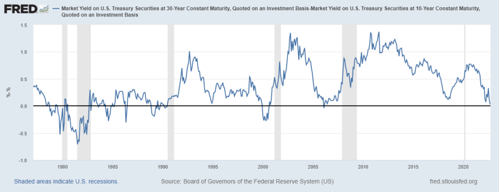
Near-Term Forward Yield Spreads

Near-term forward yield spreads are an important indicator and one that investors, economists, and policymakers monitor closely. Even the Federal Reserve Chair, Jerome Powell, has indicated that he considers near-term forward yield spreads to be better than traditional yield curve indicators (such as the 2s10s yield spread).

What is a near-term forward yield spread?

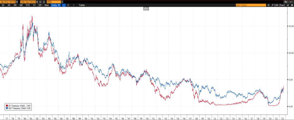
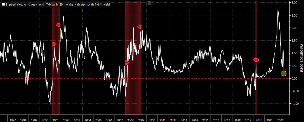
Near-term forward yield spreads are calculated by looking at what a short-term yield is expected to be minus what what the short-term yield is today. For example, the rate that a 3-month Treasury bill is expected to yield in 18 months minus the rate on a 3-month Treasury bill today. The “implied” future yield in the first half of the equation is made by extrapolating other Treasury and fixed-income data and yields.

Do near-term forward yield spreads predict recessions better?

In a blog post and press conferences, members of the Federal Reserve have argued that near-term forward spreads may be better predictors of recessions and other economic indicators than more traditional yield curve spreads. If we focus on recessions, I do not think this is true.

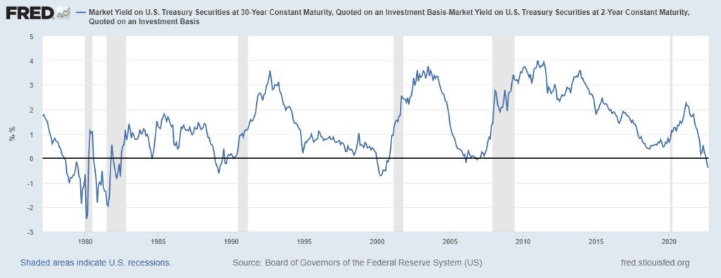
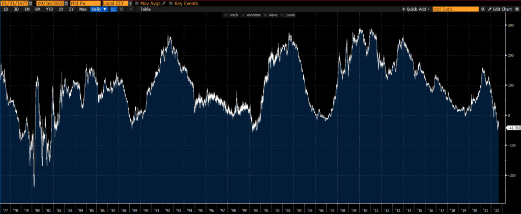
The 3m forward spread has a decent record of predicting recessions. It has inverted just before the last three recessions, although it also inverted in 1998 (a few years before any recession). So it does have one false positive recession signal since inception.

Below is a near-term forward spread chart from a couple of months ago:

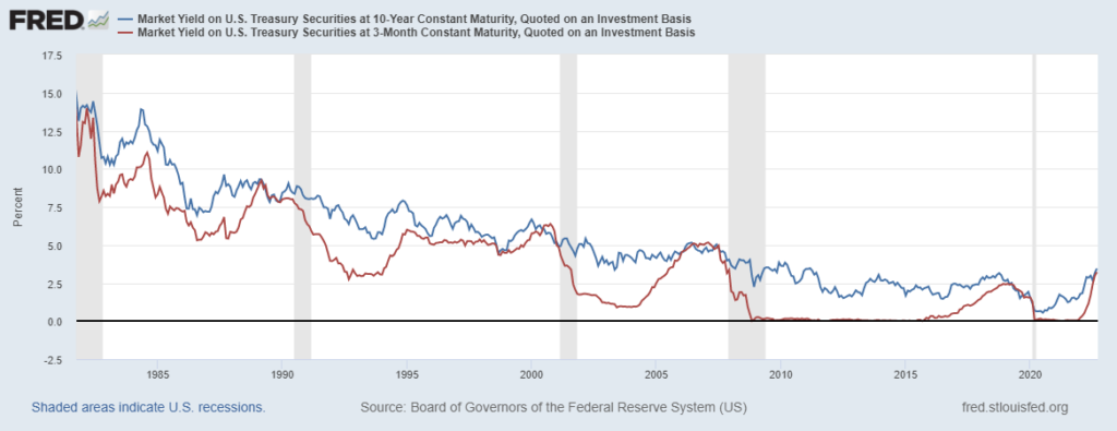
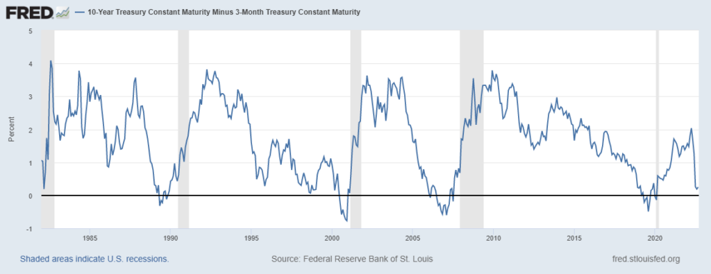
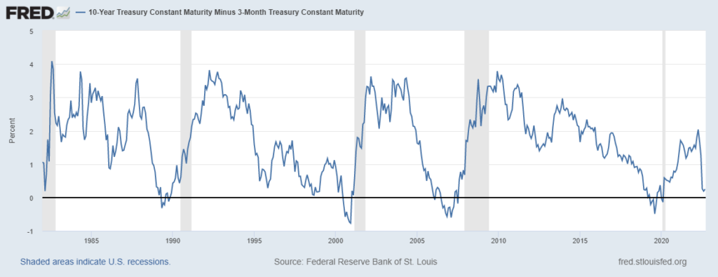
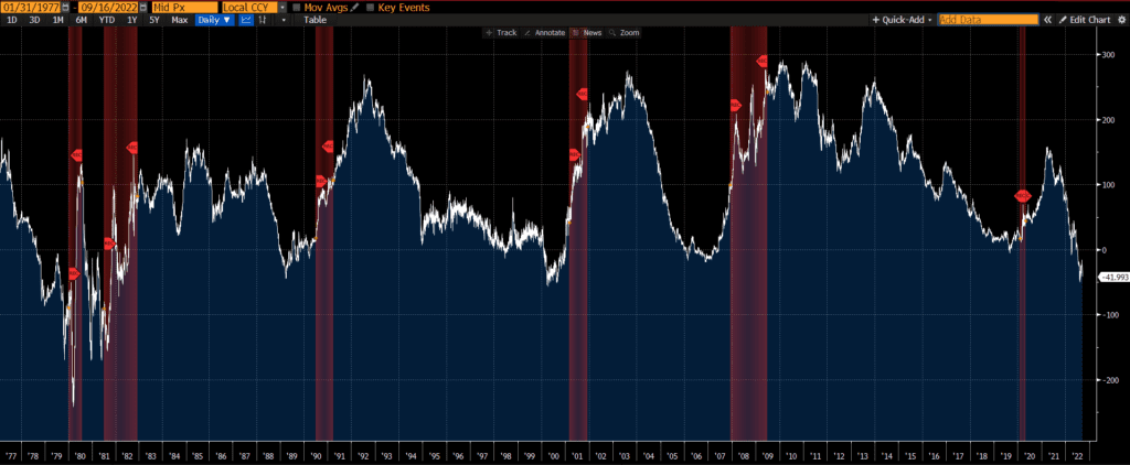
However, the next chart (below) of the 3-month 10-year yield spread shows no false positives. This curve has only inverted just before the onset of a recession. Thus, I continue to believe that the 3m10y curve is the best recession indicator.

At the moment, the near-term forward spreads are not inverted, while the traditional yield curve spreads are. If the near-term spreads do not invert in the next years, we’ll have one more data point in the battle for best recession indicator!

3 Month 10 Year Spread

A very important economic and financial indicator is the 3 month 10 year spread or 3-month 10-year curve, which is simply the difference between the 10-year US Treasury yield and the 3-month US Treasury yield. It is also referred to as 10y3m, 3m/10y, 10y-3m yield spread and so on, but “3 month 10 year” spread or “10 year 3 month” spread are the most common names. There are other yield curve spreads as well, including the most popular 2s10s spread.

Below is a chart of the US Treasury 3m-10y spread through time.

How is the 3 month 10 year spread calculated?

We can see how the US Treasury 3m10y spread is calculated below, by simply subtracting the 3-month yield (red line) from the 10-year yield (blue line).

What is the significance of the 3-month 10-year spread?

Historically, steep yield curves (indicated by a high 3m10y reading) are often followed by strong economic and financial market performance, while flat yield curves (indicated by low 3m10y readings) are followed by weaker performance.

Sometimes the yield curve flattens so much that it “inverts” and shorter-term rates are higher than longer-term rates (and the 3m10y reading goes negative). An “inverted yield curve” is typically seen as a warning sign as inverted yield curves are often followed by recessions. The gray bars in the above charts indicate recessions.

The 3m/10y spread has perhaps the best record of predicting recessions out of all of the yield curve spreads. Read our comparison of different spreads records in predicting recessions.

This measure even inverted prior to the 2020 recession and did not invert (and generate a false recession signal) in the 1980s or 1990s as some other yield curve spreads did. For these reasons, the 3m/10y curve is viewed as the most reliable yield curve spread indicator and is closely watched by the Federal Reserve. Learn more about why this spread precedes recessions.

However, in recent blog posts and press conferences, the Federal Reserve has begun focusing on the near-term forward yield spread (instead of the 3m10y curve) as a predictor of recessions and indicator of economic conditions.

How to track the 3-month 10-year curve?

You can find the 3m10y on many websites. My favorite website to track this spread through time is FRED (Federal Reserve Economic Data), which is published by the Federal Reserve Bank of St. Louis. The first chart (above) can also be found here.

Other yield curve spreads

There are many other yield curve spreads that market participants and policymakers monitor, such as the 2s10s and many others.

5s30s

One economic indicator is the US Treasury 5s30s curve or 5s30s spread, which is simply the difference between the 30-year US Treasury yield and the 5-year US Treasury yield. It is also referred to as 30s5s, 5s/30s, 30-5 yield spread and so on, but 5s30s is the most common name. There are other yield curve spreads as well, including the most popular 2s10s spread.

Below is a chart of the US Treasury 5s30s through time.

How is the 5s30s calculated?

We can see how the US Treasury 5s30s spread is calculated below, by simply subtracting the 5-year yield (blue line) from the 30-year yield (red line).

What is the significance of the 5s30s?

Historically, steep yield curves (indicated by a high 5s30s reading) are often followed by strong economic and financial market performance, while flat yield curves (indicated by low 5s30s readings) are followed by weaker performance.

Sometimes the yield curve flattens so much that it “inverts” and shorter-term rates are higher than longer-term rates (and the 5s30s reading goes negative). An “inverted yield curve” is typically seen as a warning sign as inverted yield curves are often followed by recessions. The gray bars in the above charts indicate recessions.

The 5s30s does not have a great record relative to some other yield curve measures. This measure did not invert prior to the 2020 recession (although maybe we can forgive it for not predicting a pandemic!) and it also inverted multiple times in the 1980s without an immediate recession. For a brief summary of which yield curve measures have the best track record of “predicting” recessions, read this post of whether the yield curve predicts recessions.

How to track the 5s30s

You can find the 5s30s on many websites. My favorite website to track the 5s30s is FRED (Federal Reserve Economic Data), which is published by the Federal Reserve Bank of St. Louis. The first chart (above) can also be found here.

Other yield curve spreads

There are many other yield curve spreads that market participants and policymakers monitor, such as the 2s10s, the 3-month 10-year spread, and many others. For an up-to-date look at other yield curve spreads, see our yield curve spread chart page.

Why do yield curve inversions signal recessions?

It has been documented that when certain parts of the yield curve invert, a recession often follows. Many follow the 2s10s, although the 3-month 10-year spread has been the best indicator historically. If the yield curve is a overly simplistic piece of data, why and how do yield curve inversions signal recessions so well?

The short answer is: Yield curve inversions signal recessions because they are a byproduct of policymakers’ attempts to slow down the economy. The long answer is below.

Influences on the yield curve

The yield curve is simply a graph of Treasury rates by maturity. The short-end of the curve is more heavily influenced by the overnight interest rates set by policymakers (such as the Federal Reserve) than the long-end of the curve (which is much further away from maturity). In other words, policy decisions are a bigger factor on the front end of the curve and the long end of the curve is (believed to be) more of a “natural” market-driven rate.

Source: ThoughfulFinance.com, US Treasury

Yield curve inversions driven by short maturities

Looking a chart of the 3-month yield and the 10-year yield, it is clear that the steepening and flattening of the yield curve is primarily due movements in the 3-month yield. The yield curve steepens when the 3-year rate falls and flattens (and even inverts) when the shorter-term rate increases. The major steepening and flattening is not driven by moves in the 10-year yield.

In summary, policymakers are a major influence on shorter-term rates, which are the primary driver of yield curve steepening and flattening trends.

Policymakers are trying to slow down the economy

Policymakers generally increase rates when the economy is doing well as they want to slow things down, in order to contain inflation (and possibly other excesses). Some view yield curve inversions as policy mistakes, where policymakers overtighten financial conditions which induces recessions. Others point out that inversions are consistent with policymakers’ goals of slowing down the economy and that policymakers often continue to tighten after an inversion has occurred.

In both the early 1980’s and early 1990’s, short-term rates were driven up by policymakers but not to the point of inversion. No recession followed either hiking cycle. However, the above charts show that recessions did follow hiking cycles that resulted in inversions.

Recessions often follow inverted yield curve inversions because policymakers are actively trying to slow down the economy and/or they overshoot this goal.

Does the yield curve forecast recessions?

The yield curve is a simple chart of rates on US Treasuries from 1-month to 30-years, yet many observers have noticed that it has an remarkable track record of “forecasting” recessions. Many recessions have begun relatively soon after a yield curve inversion. So headlines are made whenever parts of the yield curve invert and continue as long as there is an inverted yield curve. As is often the case, headlines and articles often skip key details.

What part of the yield curve?

Before asking whether the yield curve forecasts recessions, it is important to define which part of the yield curve is being referenced.

Source: ThoughtfulFinance.com, US Treasury

Different parts of the curve may indicate different things. For instance, some parts of the yield curve may be inverted and other parts may be positively sloped. The above chart shows that the 2s10s is negative (inverted) since the 10-year yield is lower than the 2-year yield. However, the 10s30s is positive (not inverted) since the 30-year yield exceeds the 10-year yield. So it is important to define which part of the yield curve is being references, since the relationship between some parts of the curve are much better at forecasting recessions than others.

We will review each yield curve spread listed on our chart page to illustrate which spreads are best at forecasting recessions.

2s10s

When looking at below chart of the 2s10s (the spread between the 10-year yield and the 2-year yield) we find that every single recession in the past 45 years has been preceded by a yield curve inversion. However, the curve did invert and then un-invert more than a year before a recession in several instances, which some observers may consider false positives.

3m10y

Moving on to the 3-month 10-year yield spread, we find a much better indicator. Not only was every single recession preceded by an inversion, but we do not have the same long lags (or false positives) as with the 2s10s.

2s30s

The 2s30s yield spread does not look like a good recession indicator. This measure did not invert prior to the 2020 recession (although maybe we can forgive it for not predicting a pandemic!) and it also inverted briefly in the early 1980s many years before another inversion and recession.

2s5s

The 2s5s looks a bit better and throws off the essentially the same signals as the 2s10s. Every single recession was preceded by an inversion, but some of the recessions were quite a bit later than the inversion.

1s5s

The 1s5s data goes back a bit further, but some of the inversions are well before a recession and may be considered false positives. This one doesn’t appear great or terrible.

10s30s

We will wrap up by looking at the 10s30s. A quick glance indicates that it has inverted quite a few times with no recession. It also barely inverted before the Global Financial Crisis (GFC) and did not invert prior to the 2020 recession, so this has not been a great indicator overall.

Verdict

As the above charts show, the 3-month 10-year spread has the best record of predicting recessions. It has inverted shortly before each recession in the past 40 years, without any false positives. The 2s10s and 2s5s also have a decent record, but there have been more inversions than recessions so this indicator has generated false positives.

The future may be different than the past and even an inverted 3-month 10-year curve may not be followed by a recession. On the other hand, these indicators have a better track record than most forecasters. Readers can also read more about why an inverted yield curve predicts recessions.

2s10s

What is the 2s10s?

One of the most-watched economic indicators is the 2s10s curve or 2s10s spread, which is simply the difference between the 10-year US Treasury yield and the 2-year US Treasury yield. It is sometimes referred to as 10s2s, 2s/10s, 10-2s, 10-2 yield spread and so on, but 2s10s is the most common name. There are other yield curve spreads, but the 2s10s may be the most popular.

Below is a chart of the 2s10s through time.

Source: Bloomberg

How is the 2s10s calculated?

We can see how the 2s10s spread is calculated below, by simply subtracting the 2-year yield (red line) from the 10-year yield (blue line).

Source: Bloomberg

The 2s10s spread is often referenced because it provides a quick and simple indication of the slope of the yield curve.

What is the significance of the 2s10s?

Historically, steep yield curves (indicated by a high 2s10s reading) are often followed by strong economic and financial market performance, while flat yield curves (indicated by low 2s10s readings) are followed by weaker performance. Sometimes the yield curve flattens so much that it “inverts” and shorter-term rates are higher than longer-term rates (and the 2s10s reading goes negative). An “inverted yield curve” is typically seen as a warning sign as inverted yield curves are often followed by recessions. The red bars in the below chart indicate recessions. Interestingly, not all inversions are followed by a recession, but every recession is preceded by an inversion.

Source: Bloomberg

How to track the 2s10s

You can find the 2s10s on many websites. My favorite website to track the 2s10s is FRED (Federal Reserve Economic Data), which is published by the Federal Reserve Bank of St. Louis. Below is a chart (updated daily) that can be found here.

Further Reading

There are many other yield curve spreads that market participants and policymakers monitor, such as the 3-month 10-year spread (which has the best track record of predicting recessions, historically speaking), the 2s30s, and many others. For an up-to-date look at other yield curve spreads, see our yield curve spread chart page.

In blog posts and press conferences, the Federal Reserve has begun focusing on the near-term forward yield spread as a predictor of recessions and indicator of economic conditions.

Scroll to Top