FTSE Global All Cap Index vs MSCI ACWI Index

Some of the largest index funds track the FTSE Global All Cap Index and the MSCI ACWI Index. While many may view these indices as interchangeable, there are some important differences when comparing the MSCI ACWI Index vs the FTSE Global All Cap Index. The primary differences appear to be slightly different exposures in developed vs emerging markets as well as market cap exposures.

A quick note that investors cannot invest directly in an index. These unmanaged indexes do not reflect management fees and transaction costs that are associated with an investable vehicle, such as the Vanguard Total World Stock ETF (symbol: VT) or the iShares MSCI ACWI ETF (symbol: ACWI). A reminder that these are simply examples as this site does NOT provide investment recommendations.

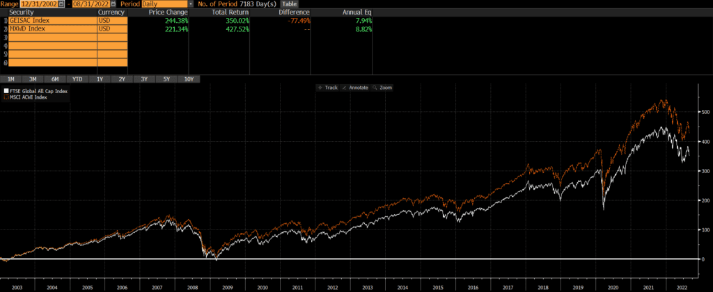
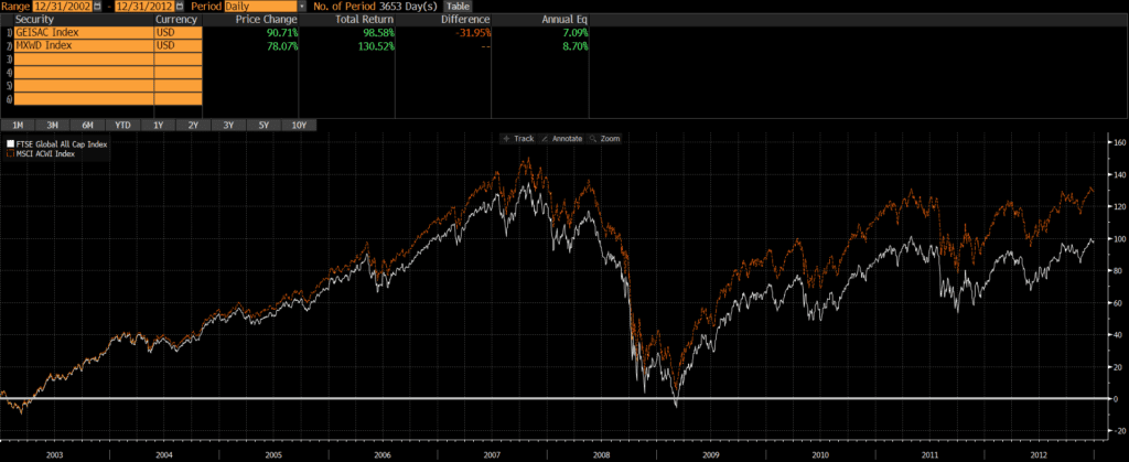
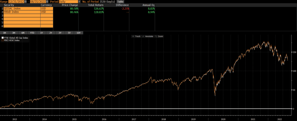
Historical Performance: FTSE Global All Cap Index vs MSCI ACWI Index

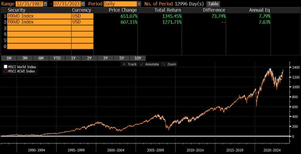
Over the past 20 years, we can see that MSCI ACWI has outperformed the FTSE Global All Cap by .88% annualized. However, this performance is a story of two halves.

Source: Bloomberg

The first 10 years

From 2003 through 2012, the MSCI ACWI Index outperformed the FTSE Global All Cap Index by a wide margin on an annualized basis, 8.70% versus 7.09%. It is not immediately clear what drove the performance differential during this decade, but my suspicion is that the greater exposure to emerging markets drove ACWI’s outperformance during the early years of this century.

The past 10 years

The past 10 years has been a different ballgame as performance chart between the two indices is nearly identical. The annualized difference between the two has only been .11%!

Composition Differences: FTSE Global All Cap Index vs MSCI ACWI Index

Geography

The two indices are both extremely broad and have good representation from both developed and emerging markets. Although the top 10 countries are identical, the FTSE Global All Cap Index has a bit more exposure to developed markets and less exposure to emerging markets.

Country Exposures

There are some slight differences in country weights between the two indices, but there is 100% overlap in the top 10 countries of each index (as of 9/30/2022).

FTSE Global All Cap IndexMSCI ACWI Index
United States60.19%62.84%
Japan6.12%5.21%
United Kingdom3.84%3.68%
China3.42%2.73%
Canada3.06%3.13%
Switzerland2.65%2.47%
France2.22%2.77%
Australia2.06%1.88%
India1.98%1.65%
Germany1.72%1.86%
Totals may not equal 100% due to rounding.
Source: ThoughtfulFinance.com, Vanguard, Blackrock

Market Classification

As of October 2022, the FTSE Global All Cap Index has more exposure to developed markets than the MSCI ACWI Index.

FTSE Global All Cap IndexMSCI ACWI Index
Developed Markets88%72%
Emerging Markets11%28%
Totals may not equal 100% due to rounding.
Source: ThoughtfulFinance.com, Bloomberg

Market Cap

As of October 2022, the MSCI ACWI Index is tilted more heavily towards large-cap stocks. However, both indices are market cap weighted, so both are overwhelming composed on large-caps.

FTSE Global All Cap IndexMSCI ACWI Index
Large Cap75%84%
Mid Cap20%16%
Small Cap6%0%
Totals may not equal 100% due to rounding.
Source: ThoughtfulFinance.com, Morningstar.com

Sectors

The sector exposures between the indices are nearly identical, as of October 2022.

FTSE Global All Cap IndexMSCI ACWI Index
Basic Materials4.83%4.52%
Consumer Cyclical11.29%10.68%
Financial Services15.66%15.90%
Real Estate3.58%2.61%
Communication Services6.88%7.32%
Energy5.14%5.80%
Industrials10.60%9.78%
Technology18.76%19.53%
Consumer Defensive7.39%7.71%
Healthcare12.73%13.18%
Utilities3.12%2.96%
Totals may not equal 100% due to rounding.
Source: ThoughtfulFinance.com, Morningstar.com

Concluding Thoughts

Over the past 20 years differences in index construction have led to a performance difference between the FTSE Global All Cap Index and the MSCI ACWI Index, although that has not been the case over the past decade. Will the performance differential re-appear or will these two indices essentially track each other moving forward? Time will tell.

Further Reading

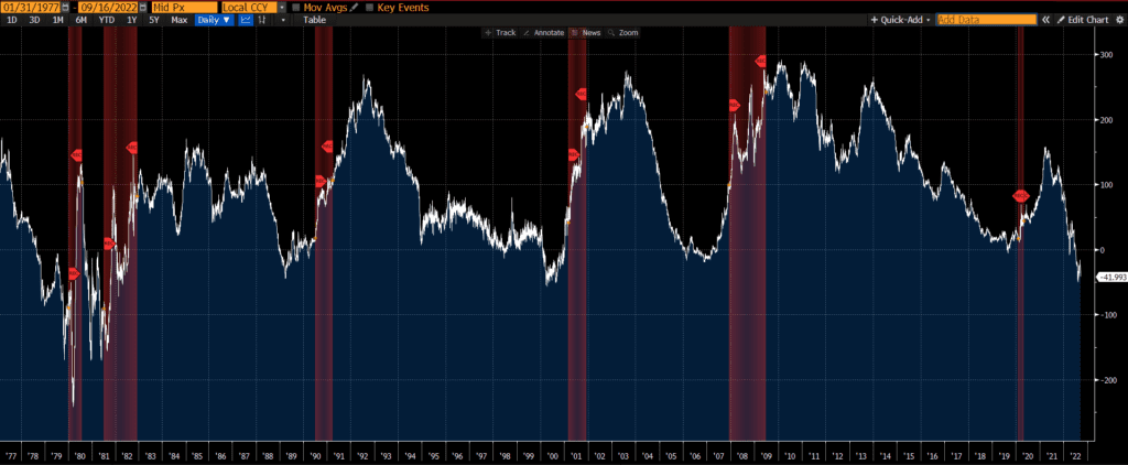
Interestingly, we did not find an even smaller performance difference when comparing the MSCI ACWI Index vs the MSCI World Index, where the main difference was the inclusion of emerging markets. I am not sure what to make of this discrepancy, but is an area for future research.

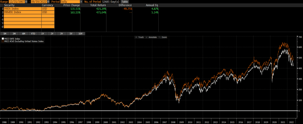
Investors looking for a global benchmark without US exposure may want to read our comparison of MSCI ACWI ex-USA vs MSCI EAFE.

Of course, some investors do not want exposure to the US or emerging markets (as they may have exposure to those asset classes elsewhere), in which case my comparison of MSCI World ex-USA vs MSCI EAFE may be helpful.

MSCI ACWI ex-USA vs MSCI EAFE

The MSCI EAFE Index and the MSCI ACWI ex-USA Index are two popular international indices that many portfolios and investment vehicles are benchmarked to. Both are representative of international stocks, but there are two major differences when comparing MSCI ACWI ex-USA vs MSCI EAFE. MSCI EAFE does not include Canada or emerging markets.

A quick note that investors cannot invest directly in an index. These unmanaged indexes do not reflect management fees and transaction costs that are associated with an investable vehicle, such as the iShares MSCI ACWI ex-USA ETF (symbol: ACWX) or the iShares MSCI EAFE ETF (symbol: EFA). A reminder that these are simply examples as this site does NOT provide investment recommendations.

Historical Performance: MSCI ACWI ex-USA vs MSCI EAFE

These two indices are overwhelmingly similar, but the small difference in holdings from both Canada and emerging markets has led to some difference in performance as well. The inclusion of these markets has driven ACWI ex-USA to outperform EAFE by roughly .27% annualized, since MSCI ACWI ex-USA’s inception. This is not a huge amount, but it can add up over time. Additionally, the chart shows that the historical volatility and drawdowns have not been appreciably different.

Composition Differences: MSCI ACWI ex-USA vs MSCI EAFE

Geography

The main difference between the two indices is exposure to Canada and emerging markets.

EAFE stands for Europe, Australasia, and Far East and thus it covers markets such as the UK, Australia, and Japan, while excluding both the USA and Canada. However, it also excludes emerging markets.

ACWI ex-USA stands for All Country World Index ex-USA and, as its name suggests, the index includes exposure to markets in all countries except the US. So it includes Canadian stocks, as well as emerging markets stocks in China, India, Brazil, and so on.

As of 10/31/2022, the geographic exposures are roughly:

MSCI ACWI ex-USAMSCI EAFE
Developed Markets72%99%
Emerging Markets28%0%
Totals may not equal 100% due to rounding.
Sources: ThoughtfulFinance.com, Bloomberg

Below is table with a more precise breakdown of the top country exposures, as of 10/31/2022. Note the differences in exposures to Canada and emerging markets (China, India, Taiwan).

MSCI ACWI ex-USAMSCI EAFE
Japan14.06%21.96%
United Kingdom9.65%15.56%
China9.16%0%
Canada8.18%0%
Switzerland6.67%10.44%
France7.00%11.68%
Australia4.94%7.93%
Germany4.69%7.90%
India4.46%0%
Taiwan4.05%0%
Source: ThoughtfulFinance.com, Blackrock.com

Market Cap

MSCI ACWI ex-USAMSCI EAFE
Large Cap88%88%
Mid Cap12%12%
Small Cap0%0%
Source: ThoughtfulFinance.com, Morningstar.com

Sectors

As of October 2022, the sector exposures of the two indices are very similar.

MSCI ACWI ex-USAMSCI EAFE
Basic Materials8.27%7.53%
Consumer Cyclical10.39%10.55%
Financial Services21.15%17.91%
Real Estate2.34%2.73%
Communication Services5.87%4.96%
Energy6.70%5.29%
Industrials12.20%15.03%
Technology10.89%8.28%
Consumer Defensive8.96%10.76%
Healthcare10.04%13.87%
Utilities3.18%3.10%
Source: ThoughtfulFinance.com, Morningstar.com

Final Thoughts on MSCI ACWI ex-USA vs MSCI EAFE

Investors cannot invest in indices directly and should do their own research before deciding to invest in a fund that tracks either index. However, understanding the differences in composition and performance between similar indices is fundamental.

Deciding between MSCI EAFE vs MSCI ACWI ex-USA will likely have to do more with what the rest of an investor’s portfolio looks like rather than the composition of these indices.

Further Reading

Investors who are looking for a benchmark that sits between MSCI EAFE and MSCI ACWI ex-USA may want to consider the MSCI World ex-USA. We previously wrote a comparison of MSCI World ex-USA vs MSCI EAFE for readers who are interested in exploring this option.

Investors who want greater small-cap exposure may want to consider the FTSE Global All-Cap Index and read our comparison of FTSE Global All-Cap vs MSCI ACWI.

Why do yield curve inversions signal recessions?

It has been documented that when certain parts of the yield curve invert, a recession often follows. Many follow the 2s10s, although the 3-month 10-year spread has been the best indicator historically. If the yield curve is a overly simplistic piece of data, why and how do yield curve inversions signal recessions so well?

The short answer is: Yield curve inversions signal recessions because they are a byproduct of policymakers’ attempts to slow down the economy. The long answer is below.

Influences on the yield curve

The yield curve is simply a graph of Treasury rates by maturity. The short-end of the curve is more heavily influenced by the overnight interest rates set by policymakers (such as the Federal Reserve) than the long-end of the curve (which is much further away from maturity). In other words, policy decisions are a bigger factor on the front end of the curve and the long end of the curve is (believed to be) more of a “natural” market-driven rate.

Source: ThoughfulFinance.com, US Treasury

Yield curve inversions driven by short maturities

Looking a chart of the 3-month yield and the 10-year yield, it is clear that the steepening and flattening of the yield curve is primarily due movements in the 3-month yield. The yield curve steepens when the 3-year rate falls and flattens (and even inverts) when the shorter-term rate increases. The major steepening and flattening is not driven by moves in the 10-year yield.

In summary, policymakers are a major influence on shorter-term rates, which are the primary driver of yield curve steepening and flattening trends.

Policymakers are trying to slow down the economy

Policymakers generally increase rates when the economy is doing well as they want to slow things down, in order to contain inflation (and possibly other excesses). Some view yield curve inversions as policy mistakes, where policymakers overtighten financial conditions which induces recessions. Others point out that inversions are consistent with policymakers’ goals of slowing down the economy and that policymakers often continue to tighten after an inversion has occurred.

In both the early 1980’s and early 1990’s, short-term rates were driven up by policymakers but not to the point of inversion. No recession followed either hiking cycle. However, the above charts show that recessions did follow hiking cycles that resulted in inversions.

Recessions often follow inverted yield curve inversions because policymakers are actively trying to slow down the economy and/or they overshoot this goal.

Does the yield curve forecast recessions?

The yield curve is a simple chart of rates on US Treasuries from 1-month to 30-years, yet many observers have noticed that it has an remarkable track record of “forecasting” recessions. Many recessions have begun relatively soon after a yield curve inversion. So headlines are made whenever parts of the yield curve invert and continue as long as there is an inverted yield curve. As is often the case, headlines and articles often skip key details.

What part of the yield curve?

Before asking whether the yield curve forecasts recessions, it is important to define which part of the yield curve is being referenced.

Source: ThoughtfulFinance.com, US Treasury

Different parts of the curve may indicate different things. For instance, some parts of the yield curve may be inverted and other parts may be positively sloped. The above chart shows that the 2s10s is negative (inverted) since the 10-year yield is lower than the 2-year yield. However, the 10s30s is positive (not inverted) since the 30-year yield exceeds the 10-year yield. So it is important to define which part of the yield curve is being references, since the relationship between some parts of the curve are much better at forecasting recessions than others.

We will review each yield curve spread listed on our chart page to illustrate which spreads are best at forecasting recessions.

2s10s

When looking at below chart of the 2s10s (the spread between the 10-year yield and the 2-year yield) we find that every single recession in the past 45 years has been preceded by a yield curve inversion. However, the curve did invert and then un-invert more than a year before a recession in several instances, which some observers may consider false positives.

3m10y

Moving on to the 3-month 10-year yield spread, we find a much better indicator. Not only was every single recession preceded by an inversion, but we do not have the same long lags (or false positives) as with the 2s10s.

2s30s

The 2s30s yield spread does not look like a good recession indicator. This measure did not invert prior to the 2020 recession (although maybe we can forgive it for not predicting a pandemic!) and it also inverted briefly in the early 1980s many years before another inversion and recession.

2s5s

The 2s5s looks a bit better and throws off the essentially the same signals as the 2s10s. Every single recession was preceded by an inversion, but some of the recessions were quite a bit later than the inversion.

1s5s

The 1s5s data goes back a bit further, but some of the inversions are well before a recession and may be considered false positives. This one doesn’t appear great or terrible.

10s30s

We will wrap up by looking at the 10s30s. A quick glance indicates that it has inverted quite a few times with no recession. It also barely inverted before the Global Financial Crisis (GFC) and did not invert prior to the 2020 recession, so this has not been a great indicator overall.

Verdict

As the above charts show, the 3-month 10-year spread has the best record of predicting recessions. It has inverted shortly before each recession in the past 40 years, without any false positives. The 2s10s and 2s5s also have a decent record, but there have been more inversions than recessions so this indicator has generated false positives.

The future may be different than the past and even an inverted 3-month 10-year curve may not be followed by a recession. On the other hand, these indicators have a better track record than most forecasters. Readers can also read more about why an inverted yield curve predicts recessions.

2s10s

What is the 2s10s?

One of the most-watched economic indicators is the 2s10s curve or 2s10s spread, which is simply the difference between the 10-year US Treasury yield and the 2-year US Treasury yield. It is sometimes referred to as 10s2s, 2s/10s, 10-2s, 10-2 yield spread and so on, but 2s10s is the most common name. There are other yield curve spreads, but the 2s10s may be the most popular.

Below is a chart of the 2s10s through time.

Source: Bloomberg

How is the 2s10s calculated?

We can see how the 2s10s spread is calculated below, by simply subtracting the 2-year yield (red line) from the 10-year yield (blue line).

Source: Bloomberg

The 2s10s spread is often referenced because it provides a quick and simple indication of the slope of the yield curve.

What is the significance of the 2s10s?

Historically, steep yield curves (indicated by a high 2s10s reading) are often followed by strong economic and financial market performance, while flat yield curves (indicated by low 2s10s readings) are followed by weaker performance. Sometimes the yield curve flattens so much that it “inverts” and shorter-term rates are higher than longer-term rates (and the 2s10s reading goes negative). An “inverted yield curve” is typically seen as a warning sign as inverted yield curves are often followed by recessions. The red bars in the below chart indicate recessions. Interestingly, not all inversions are followed by a recession, but every recession is preceded by an inversion.

Source: Bloomberg

How to track the 2s10s

You can find the 2s10s on many websites. My favorite website to track the 2s10s is FRED (Federal Reserve Economic Data), which is published by the Federal Reserve Bank of St. Louis. Below is a chart (updated daily) that can be found here.

Further Reading

There are many other yield curve spreads that market participants and policymakers monitor, such as the 3-month 10-year spread (which has the best track record of predicting recessions, historically speaking), the 2s30s, and many others. For an up-to-date look at other yield curve spreads, see our yield curve spread chart page.

In blog posts and press conferences, the Federal Reserve has begun focusing on the near-term forward yield spread as a predictor of recessions and indicator of economic conditions.

MSCI World vs MSCI ACWI (Updated 2023)

The MSCI World index and the MSCI ACWI index are two popular global stock indices, which many index portfolios track. Although there are some important differences, the long-term performance has been nearly identical. Let’s take a look at MSCI ACWI vs MSCI World:

A quick note investors cannot invest directly in an index. These unmanaged indexes do not reflect management fees and transaction costs that are associated with an investable vehicle, such as the iShares MSCI ACWI ETF (symbol: ACWI) or the iShares MSCI World ETF (symbol: URTH). Readers who want to compare these ETFs rather than the underlying indices should check out our ETF comparison of URTH vs ACWI. A reminder that these funds are simply examples as this site does NOT provide investment recommendations.

Difference Between MSCI World vs MSCI ACWI

The main difference between the MSCI World Index and the MSCI ACWI index is that MSCI World only includes stocks of developed markets, while the MSCI ACWI Index includes stocks in both developed and emerging markets. Developed markets are markets such as the US, Japan, Western Europe and so on, while emerging markets include places like China and India. Since emerging markets have bounced around between 10-15% of global market cap in the past decade or two (and were much smaller prior to that), the risk and returns of the MSCI World and MSCI ACWI indices have been nearly identical (as shown in the below chart of historical performance).

Historical Performance: MSCI World vs MSCI ACWI

MSCI World was launched in 1986, while MSCI ACWI was launched in 2001. However, MSCI has back-tested performance data going back to (at least) 1987. Since then, the two indices have performed nearly identically. MSCI World has an annualized performance of 7.79%, while MSCI ACWI was an annualized performance of 7.63%. Even though the annualized difference is only .16%, this has compounded to a difference of over 73% since 1987.

Source: Bloomberg

Current Index Composition: MSCI ACWI vs MSCI World

As of 9/30/2022, the geographic, market cap, and sector weights are quite similar.

  • The major difference is that the MSCI World is 100% developed markets, while MSCI is 88% developed markets and 12% emerging markets.
  • Even thought both indices are broad-based in terms of market capitalizations, both are market cap weighted and heavily tilted towards large-cap stocks.
  • Additionally, the MSCI ACWI and MSCI World have nearly identical sector weights.

Geographic Exposure

ACWI stands for All Country World Index and so the MSCI ACWI Index includes stocks from a broader set of countries than the MSCI World Index. The primary difference is the inclusion and exclusion of emerging markets.

Below are the top five country weights of the two indices, as of 6/30/2023. Note that China is NOT included in the MSCI World’s top holdings.

MSCI WorldMSCI ACWI
US69.42%61.95%
Japan6.12%5.46%
UK4.04%3.60%
China0.00%3.30%
Canada3.20%3.00%
Source: ThoughtfulFinance.com, MSCI; data as of 6/30/2023

Market Cap Exposure

The MSCI ACWI Index is a much broader index with 2,934 constituents vs MSCI World’s 1,512 constituents (as of 6/30/2023).

Both indices are market cap weighted, so the both indices are essentially large-cap indices. If we use the URTH and ACWI ETFs as proxies for the indices, we find that the market cap exposure is nearly identical (despite differences in the mean and median market caps).

MSCI WorldMSCI ACWI
Large Cap83%84%
Mid Cap17%16%
Small Cap0%0%
Source: ThoughtfulFinance.com, Morningstar; using URTH and ACWI ETFs as proxies for the indices as of 7/31/2023
MSCI WorldMSCI ACWI
Mean Market Cap$38.79 billion$22.40 billion
Median Market Cap$14.58 billion$6.01 billion
Source: ThoughtfulFinance.com, MSCI; data as of 6/30/2023

Sector Weights

The MSCI World and MSCI ACWI indices have nearly identical sector exposures. Every sector weight in each index is within 1% of the other.

MSCI WorldMSCI ACWI
Information Technology22.09%21.90%
Financials14.89%15.61%
Healthcare12.52%11.58%
Consumer Discretionary11.05%11.39%
Industrials10.96%10.47%
Consumer Staples7.27%7.16%
Communication Services7.19%7.48%
Energy4.69%4.73%
Materials4.19%4.63%
Utilities2.74%2.72%
Real Estate2.41%2.34%
Source: ThoughtfulFinance.com, MSCI; data as of 6/30/2023

Conclusions

What does this mean for investors? Since the risks and returns of the indices are nearly identical, selecting an investment vehicle and cost structure may matter more than selecting the index. A fund investor might select MSCI ACWI due to the greater geographic diversification (especially with a large index fund that invests in local exchanges), while an SMA investor might opt for MSCI World due to cost considerations. Of course, the next 35 years could be completely different than the past 35 years!

Further Reading

Investors who want to compare a non-MSCI global index that has slightly different exposures from the the above indices, may want to evaluate the FTSE Global All-Cap Index vs MSCI ACWI Index.

Investors who want to see how the above comparison looks if US exposure is excluded should read my comparison of MSCI World ex-USA vs MSCI ACWI ex-USA.

No Specific Investment Recommendations

This site will never recommend specific investments or investment managers. There are a few reasons for this:

I Don’t Know You

I don’t know you. I don’t know what your ability or willingness to take risk is. I don’t know your liquidity needs or investment time horizon. Unless I know you and understand your situation well, it’s impossible to make a recommendation.

To illustrate the above, consider that I will often make different recommendations to the exact same client! Suppose a client has four accounts, but wants to invest all of them identically. I may recommend a specific index fund for one account, a different share class of the same fund for the second account, a different fund targeting the same index for a third account because it is taxed differently than the first two, and a separately managed account targeting the same index for the fourth account due to tax considerations. The client may be purchasing the same underlying holdings in all four accounts, but there are four different recommendations.

Things Change

Things change. An investment may look attractive in one environment, but not in another. A manager’s strategy may “drift” over time, turning a low-risk portfolio into a high-risk one. Time stamping recommendations could help, but not to the level that I’d be comfortable with.

Clients Come First

Sourcing and conducting due diligence on investment opportunities is what I do in my day job for clients and many of the funds that we invest in have capacity constraints. My goal is to help the investor community as much as possible, but not at the expense of my clients.

The Bottom Line

Investment advice is personal and recommendations should be made within the context of an investor’s situation. To make a good recommendation, I’d need to know someone’s ability to take risk, willingness to take risk, time horizon, liquidity needs, tax situation, net worth, account details, and a lot more. If I were to make a recommendation on this blog, I’d have to list out all of the nuances, caveats, exceptions, and so on, which I do not believe is feasible.

Its not clear to me how anyone can make a recommendation to strangers, so I will leave the specific recommendations to the talking heads on CNBC and the writers who contribute to Seeking Alpha. Publishing specific recommendations for the general public is not something I want to do, nor do I believe it is especially helpful to individual investors. My goal is to be helpful to investors.

New Blog, One Goal

Hi, I’m Matt. Most of my time is spent managing an investment advisory firm.

Helping people reach their goals through investing is incredibly satisfying. Yet my firm can only serve so many clients, many investors do not have enough assets to work with an investment advisor, and I recognize that some people prefer to manage their own investments even if they can work with an advisor.

My goal is to provide readers with the resources that they need to reach their own goals.

Definitions: Negative Screening and Exclusionary Screening

Negative screening (or exclusionary screening) is the process of screening specific assets out of an investment universe or strategy. Implementing negative screening and exclusionary screening is called divesting and results in divestment.

Divesting does connotate excluding something that one would otherwise own. For instance, a large-cap fund might not own tobacco stocks or small-cap stocks. Intentionally screening out tobacco stocks would be considered divestment, because it is something the fund would own otherwise. However, the fund would not be considered to have divested from small-cap stocks though, as they fall outside a large-cap fund’s investment universe. In other words, divestment is the intentional act of excluding assets that one would otherwise own.

There are purely economic reasons to divest from assets, but I will focus on values-based divestment here. Values-based reasons to exclude assets may include not wanting to be associated with or derive any benefit from specific activities, products, and/or services. Values-based screening has ancient roots as various religions have forbidden debt with very high interest (or any interest at all) for thousands of years (see here). More recent examples include the Quakers divesting from the Atlantic slave trade or US investors divesting from Apartheid-era South African assets. Today, hot topics include tobacco, weapons, and fossil fuels.

It should be noted that there are arguments that even non-economic considerations can also be economic ones. For instance, as energy consumption shifts towards renewable energy, the returns from fossil fuels may suffer. A mass shooting may bring unwanted publicity and legislation upon a firearm manufacturer. These are cases where values issues may become value issues.

There are a wide variety of objectives and approaches to divestment, each with a unique set of benefits and drawbacks. Exploring all of the applications of divestment is beyond the scope of a blog post, but we will look at some common examples in the coming weeks.

Scroll to Top