The iShares Core S&P 500 Index ETF (IVV) and the Vanguard Total Stock Market Index fund (VTSAX) are two of the largest funds in existence and easily two of the most popular among individual investors. IVV and VTSAX are the core of many investor portfolios and many investors compare VTSAX vs IVV in order to decide which should be the foundation of their portfolio.
The Short Answer
The main difference between IVV and VTSAX is that IVV is a large- and mid-cap ETF, while VTSAX is a total market mutual fund. Despite these differences, the total return between these two funds is nearly identical and I consider them interchangeable for all intents and purposes.
IVV was launched on May 15, 2000, while VTSAX was launched on November 13, 2000. Since then VTSAX has outperformed by roughly .34% annually. This is most likely driven by small-caps’ relative outperformance initially, even though that trend has reversed during the past decade. Despite variations in the size factor performance over the decades, the long-term performance between these two funds is incredibly similar.
Differences between VTSAX vs IVV
The biggest difference between IVV and VTSAX is the market cap exposure of the funds. IVV tracks the S&P 500 index which includes mostly large-caps and some mid-caps, while VTSAX covers much more of the market by including more mid-caps and small-caps.
Geographic Exposure
Both IVV and VTSAX hold essentially 100% stocks, so I will not dig into country exposures or market classification here. For intents and purposes, the two funds have identical exposures.
Market Cap Exposure
IVV focuses on the S&P 500 index and so it mostly holds large-caps with a bit of mid-cap exposure. VTSAX tracks the broader CRSP US Total Market Index and so it owns many more mid-caps and small-caps, as of 11/30/2022. In other words, IVV is a large-cap vehicle, while VTSAX is a total market vehicle. That being said, due to market cap weighting, both funds are overwhelmingly influenced by the large-cap holdings.
IVV
VTSAX
Large-Cap
83%
73%
Mid-Cap
16%
19%
Small-Cap
0%
9%
Source: ThoughtfulFinance.com, Morningstar
Sector Weights
The sector weights between IVV and VTSAX are nearly identical, as of 11/20/2022. The weights are within 1% for every single sector.
IVV
VTSAX
Basic Materials
2.40%
2.51%
Consumer Cyclical
10.16%
10.66%
Financial Services
13.80%
13.79%
Real Estate
2.77%
3.45%
Communication Services
7.46%
6.80%
Energy
5.12%
5.31%
Industrials
8.86%
9.64%
Technology
23.72%
23.06%
Consumer Defensive
7.40%
6.75%
Healthcare
15.31%
15.17%
Utilities
2.99%
2.87%
Source: ThoughtfulFinance.com, Morningstar
Final Thoughts: VTSAX vs IVV
Both IVV and VTSAX are large, core funds sponsored and managed by Blackrock and Vanguard respectively. Although IVV is more of a large-cap ETF and VTSAX is a total market mutual fund, performance has been nearly identical. I view these two funds as essentially interchangeable and would not spend too much energy trying to decide which one is “better.”
However, there are some situations that may call for one fund versus another.
Many custodians offer free ETF trades, but charge trading fees or redemption fees for mutual fund. So unless my account was at Vanguard, I might opt for IVV.
If most of my existing portfolio was mutual funds, I might stick to mutual funds so that settlement periods for trades are consistent (for activities like tax-loss harvesting, etc). Similarly, if most of my portfolio was ETFs, I might stick to ETFs.
The ETF structure is generally a more tax-efficient vehicle, so IVV may have a lower risk of adverse tax situations in the future.
Despite these considerations, these two funds are very similar for all intents and purposes.
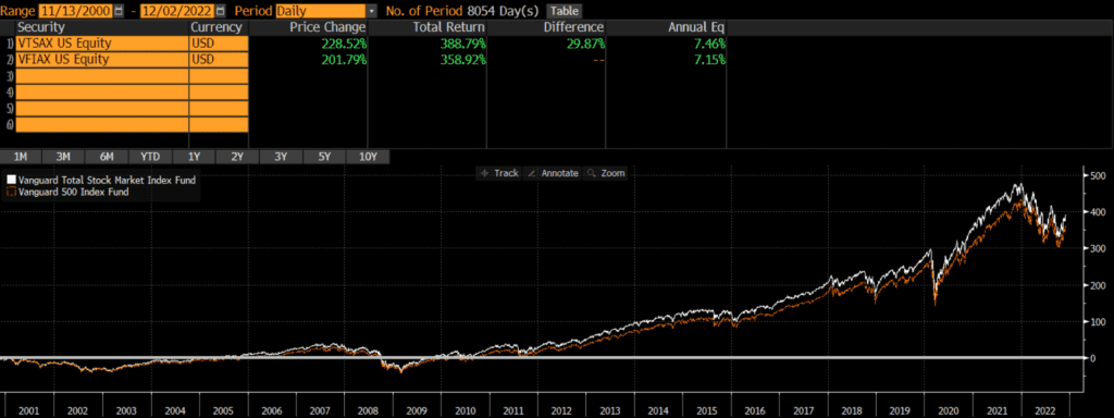
The Vanguard S&P 500 Index mutual fund (VFIAX) and the Vanguard Total Stock Market Index fund (VTSAX) are two of the largest mutual funds in existence. VFIAX and VTSAX are the core of many investor portfolios. Many investors compare VTSAX vs VFIAX in order to decide which should be the foundation of their portfolio.
The Short Answer
The main difference between VFIAX and VTSAX is that VFIAX is a large- and mid-cap fund, while VTSAX is a total market fund. Despite these differences, the total return between these two funds is nearly identical and I consider them interchangeable.
Both VTSAX and VFIAX were launched on November 13, 2000. Since then VTSAX has outperformed by about .31% annually. This is most likely driven by small-caps’ relative outperformance initially, even though that trend has reversed during the past decade. Despite variations in the size factor performance over the decades, the long-term performance between these two funds is incredibly similar.
Differences between VTSAX vs VFIAX
The biggest difference between VFIAX and VTSAX is the market cap exposure of the funds. VFIAX tracks the S&P 500 index which includes mostly large-caps and some mid-caps, while VTSAX covers much more of the market by including more mid-caps and small-caps.
Geographic Exposure
Both VFIAX and VTSAX hold essentially 100% stocks, so I will not dig into country exposures or market classification here. For intents and purposes, the two funds have identical exposures.
Market Cap Exposure
VFIAX focuses on the S&P 500 index and so it mostly holds large-caps with a bit of mid-cap exposure. VTSAX tracks the broader CRSP US Total Market Index and so it owns many more mid-caps and small-caps, as of 10/31/2022. In other words, VFIAX is a large-cap vehicle, while VTSAX is a total market vehicle. That being said, due to market cap weighting, both funds are overwhelmingly influenced by the large-cap holdings.
VFIAX
VTSAX
Large-Cap
84%
73%
Mid-Cap
17%
19%
Small-Cap
0%
9%
Source: ThoughtfulFinance.com, Morningstar
Sector Weights
The sector weights between VFIAX and VTSAX are nearly identical, as of 10/31/2022. The weights are within 1% for every single sector.
VFIAX
VTSAX
Basic Materials
2.27%
2.51%
Consumer Cyclical
10.59%
10.66%
Financial Services
13.61%
13.79%
Real Estate
2.74%
3.45%
Communication Services
7.36%
6.80%
Energy
5.37%
5.31%
Industrials
8.69%
9.64%
Technology
23.60%
23.06%
Consumer Defensive
7.38%
6.75%
Healthcare
15.42%
15.17%
Utilities
2.97%
2.87%
Source: ThoughtfulFinance.com, Morningstar
Final Thoughts: VTSAX vs VFIAX
Both VFIAX and VTSAX are large, core funds sponsored and managed by Vanguard. Although VFIAX is more of a large-cap fund and VTSAX is a total market mutual fund, performance has been nearly identical. I view these two funds as essentially interchangeable and would not spend too much energy splitting hairs to decide which one is “better.”
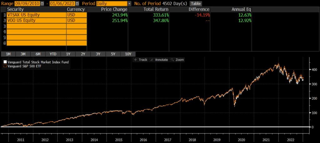
The Vanguard S&P 500 Index ETF (VOO) and the Vanguard Total Stock Market Index fund (VTSAX) are two of the largest funds in existence. VOO and VTSAX are the core of many investor portfolios. Many investors compare VTSAX vs VOO in order to decide which should be the foundation of their portfolio.
The main difference between VOO and VTSAX is that VOO is a large- and mid-cap ETF, while VTSAX is a total market mutual fund. Despite these differences, the total return between these two funds is nearly identical and I consider them interchangeable.
I should note that there is an ETF version of VTSAX, which is VTI. Investors looking for an ETF vs ETF comparison should read my review of VTI vs VOO. Readers may also be interested in my standalone VOO review.
The Long Answer
Historical Performance: VTSAX vs VOO
VTSAX was launched on November 13, 2000, while VOO was launched on September 7, 2010. Since then, VOO has outperformed by about .29% annually. This is most likely driven by large-caps’ relative outperformance during this time period, although that dynamic could reverse in the future. That being said, the performance between these two funds is extremely close considering the market cap differences.
Differences between VTSAX vs VOO
The biggest difference between VOO and VTSAX is the market cap exposure of the funds. VOO tracks the S&P 500 index which includes mostly large-caps and some mid-caps, while VTSAX covers much more of the market by including more mid-caps and small-caps.
Geographic Exposure
Both VOO and VTSAX hold essentially 100% stocks, so I will not dig into country exposures or market classification here. For intents and purposes, the two funds have identical exposures.
Market Cap Exposure
VOO focuses on the S&P 500 index and so it mostly holds large-caps with a bit of mid-cap exposure. VTSAX tracks the broader CRSP US Total Market Index and so it owns many more mid-caps and small-caps, as of 10/31/2022. In other words, VOO is a large-cap vehicle, while VTSAX is a total market vehicle. That being said, due to market cap weighting, both funds are overwhelmingly influenced by the large-cap holdings.
VOO
VTSAX
Large-Cap
84%
73%
Mid-Cap
17%
19%
Small-Cap
0%
9%
Source: ThoughtfulFinance.com, Morningstar
Sector Weights
The sector weights between VOO and VTSAX are nearly identical, as of 10/31/2022. The weights are within 1% for every single sector.
VOO
VTSAX
Basic Materials
2.27%
2.51%
Consumer Cyclical
10.59%
10.66%
Financial Services
13.61%
13.79%
Real Estate
2.74%
3.45%
Communication Services
7.36%
6.80%
Energy
5.37%
5.31%
Industrials
8.69%
9.64%
Technology
23.60%
23.06%
Consumer Defensive
7.38%
6.75%
Healthcare
15.42%
15.17%
Utilities
2.97%
2.87%
Source: ThoughtfulFinance.com, Morningstar
Final Thoughts: VTSAX vs VOO
Both VOO and VTSAX are large, core funds sponsored and managed by Vanguard. Although VOO is more of a large-cap ETF and VTSAX is a total market mutual fund, performance has been nearly identical. I view these two funds as essentially interchangeable and would not spend too much energy splitting hairs to decide which one is “better.”
However, there are some situations that may call for one fund versus another.
Many custodians offer free ETF trades, but charge trading fees or redemption fees for mutual fund. So unless my account was at Vanguard, I might opt for VOO.
If most of my existing portfolio was mutual funds, I might stick to mutual funds so that settlement periods for trades are consistent (for activities like tax-loss harvesting, etc). Similarly, if most of my portfolio was ETFs, I might stick to ETFs.
The ETF structure is generally a more tax-efficient vehicle, so VOO may have a lower risk of adverse tax situations in the future. However, Vanguard ETFs are share class of Vanguard mutual funds, so this tax benefit may be muted.
Despite these considerations, these two funds are very similar for all intents and purposes.
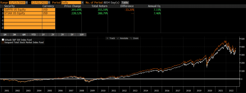
The Schwab S&P 500 Index mutual fund (SWPPX) and the Vanguard Total Stock Market Index fund (VTSAX) are two of the largest mutual funds in existence. SWPPX and VTSAX are the core of many investor portfolios. Many investors compare SWPPX vs VTSAX in order to decide which should be the foundation of their portfolio.
The main difference between SWPPX and VTSAX is that SWPPX is a large- and mid-cap fund, while VTSAX is a total market fund. Despite these differences, the total return between these two funds is nearly identical and I consider them interchangeable.
The Long Answer
Historical Performance: SWPPX vs VTSAX
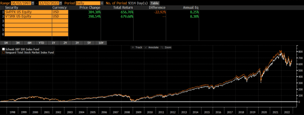
SWPPX was launched on May 19, 1997, while VTSAX was launched a year later on November 13, 2000. Since then VTSAX has outperformed by .35% annually. This is not a huge performance differential, but it does compound over time.
However, when we stretch the time period back a bit further by swapping the older investor share class VTSMX for VTSAX, we see that the annual performance difference narrows to about .13% annually.
The conclusion, of course, is that performance differentials can be highly time dependent. Things that look one way during one time period can looking completely different during a different time period. Nonetheless, performance is pretty similar between these two funds (or strategies if we use older share classes as proxies).
Differences between SWPPX vs VTSAX
The biggest difference between SWPPX and VTSAX is the market cap exposure of the funds. SWPPX tracks the S&P 500 index which includes mostly large-caps and some mid-caps, while VTSAX covers much more of the market by including more mid-caps and small-caps.
Geographic Exposure
Both SWPPX and VTSAX hold essentially 100% stocks, so I will not dig into country exposures or market classification here. For intents and purposes, the two funds have identical exposures.
Market Cap Exposure
SWPPX focuses on the S&P 500 index and so it mostly holds large-caps with a bit of mid-cap exposure. VTSAX tracks the broader CRSP US Total Market Index and so it owns many more mid-caps and small-caps, as of 10/31/2022. In other words, SWPPX is a large-cap vehicle, while VTSAX is a total market vehicle. That being said, due to market cap weighting, both funds are overwhelmingly influenced by the large-cap holdings.
SWPPX
VTSAX
Large-Cap
84%
73%
Mid-Cap
17%
19%
Small-Cap
0%
9%
Source: ThoughtfulFinance.com, Morningstar
Sector Weights
The sector weights between SWPPX and VTSAX are nearly identical, as of 10/31/2022. The weights are within 1% for every single sector.
SWPPX
VTSAX
Basic Materials
2.27%
2.51%
Consumer Cyclical
10.59%
10.66%
Financial Services
13.65%
13.79%
Real Estate
2.75%
3.45%
Communication Services
7.35%
6.80%
Energy
5.37%
5.31%
Industrials
8.68%
9.64%
Technology
23.59%
23.06%
Consumer Defensive
7.38%
6.75%
Healthcare
15.41%
15.17%
Utilities
2.96%
2.87%
Source: ThoughtfulFinance.com, Morningstar
Final Thoughts: SWPPX vs VTSAX
Both SWPPX and VTSAX are large, core funds sponsored and managed by some of the largest asset managers in the world (Schwab and Vanguard). Beyond market cap exposures, the funds appear and act very similar. Long-term performance has been nearly identical. I view these two funds as essentially interchangeable and would not spend too much energy splitting hairs to decide which one is “better.”
One consideration that might tip the scales is where the investors’ account is. Unlike ETFs, many mutual funds are still subject to trading fees and/or short-term redemption fees. So if my accounts were at Schwab, I might lean more towards SWPPX. If my accounts were at Vanguard, I might favor VTSAX. But overall, these two funds are very similar and I wouldn’t worry too much about picking the “right” one.
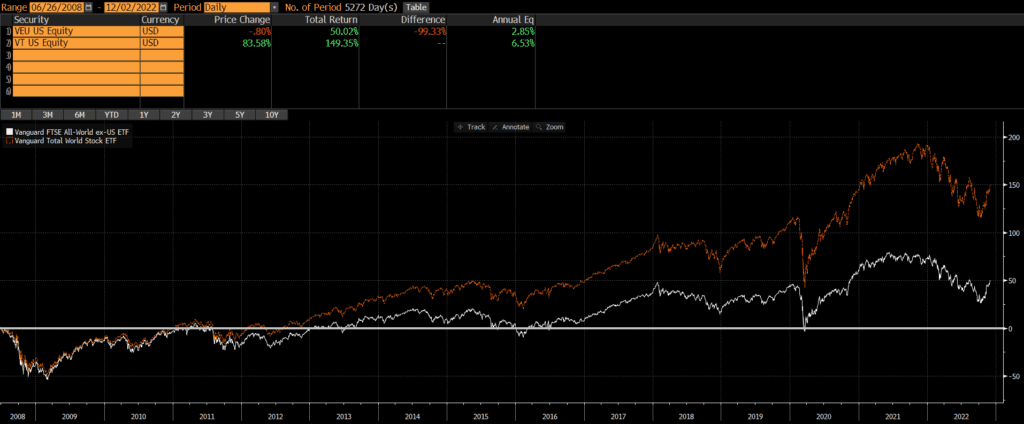
VEU and VT are two of the largest ETFs and popular building blocks for many portfolios. My personal opinion is that these two ETFs are like apples and oranges and should not be compared against one another. However, many people request a comparison of these two funds, so I will write a post about VEU vs VT.
VT is benchmarked to the FTSE Global All-Cap Index, while VEU is benchmarked to the namesake FTSE All-World ex-US Index. When comparing VEU vs VT, it is clear that the biggest difference is that VEU excludes the US while VT includes it. A secondary difference is that VT has way more holdings and has more market cap coverage.
VEU was launched on March 8, 2007, while VT was launched a year later on June 24, 2008. Since then, VT has trounced VEU by over 3.5% annually. The reason for this is simply that VEU excludes US stocks and US stocks have outperformed non-US stocks by a wide margin, during this time period. We don’t have to split hairs or run complex attribution analyses for this comparison.
Differences between VEU and VT
The biggest difference between VEU and VT is that VT includes stocks from the US. As VEU’s name (the Vanguard FTSE All-World ex-US) implies, it excludes stocks from the US.
A second major difference is that VT is more of a total market fund than VEU. VT has 9,548 stocks, while VEU “only” has 3,720 stocks (as of 10/31/2022).
Geographic Exposure
Country Exposure
VEU excludes US stocks, while VT includes US stocks. Consequently, the top five country weights are materially different (data as of 10/31/2022).
VT
VEU
United States
61.7%
0.0%
Japan
5.9%
15.5%
United Kingdom
3.9%
10.1%
Canada
3.1%
7.3%
China
2.7%
7.2%
Source: ThoughtfulFinance.com, Vanguard
Market Classification
Both ETFs include emerging markets, but VEU’s exclusion of US stocks results in a much higher allocation to emerging markers.
VT
VEU
Developed Markets
90.5%
74.1%
Emerging Markets
9.50%
24.9%
Source: ThoughtfulFinance.com, Vanguard
Market Cap Exposure
VT covers more mid- and small-cap stocks primarily since it has more than double the number of stocks, as of 10/31/2022.
VT
VEU
Large-Cap
75%
84%
Mid-Cap
20%
15%
Small-Cap
6%
0%
Source: ThoughtfulFinance.com, Morningstar
Sector Weights
There are some notable differences in sector exposure when comparing VT vs VEU. As the table below shows, the sector weightings of the two differs a bit as of 10/31/2022.
VT
VEU
Basic Materials
4.79%
8.18%
Consumer Cyclical
10.74%
10.62%
Financial Services
16.01%
20.49%
Real Estate
3.43%
2.79%
Communication Services
6.38%
5.77%
Energy
5.72%
6.39%
Industrials
10.94%
13.14%
Technology
18.76%
10.84%
Consumer Defensive
7.31%
8.59%
Healthcare
12.90%
9.99%
Utilities
3.02%
3.20%
Source: ThoughtfulFinance.com, Morningstar
Final Thoughts: VEU vs VT
As readers can see, these two ETFs are quite different. I would not even compare them on this site, except that differentiating between them is a common question. VT is a global solution, while VEU specifically fills the need for non-US exposure.
The decision for investors should be an easy one. Those who want a total global market solution should consider VT, while those who want to manage their US and non-US allocations separately should look at VEU. A more appropriate comparison might be comparing VXUS vs VEU or comparing VT to another total global market ETF. Investors looking for a mutual fund version of VEU should read our comparison of VEU vs VFWAX.
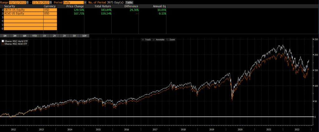
The iShares URTH and iShares ACWI are two popular ETFs that track the well-known indices MSCI World and MSCI ACWI, respectively. Although there are some important differences, the long-term performance of URTH vs ACWI has been nearly identical.
ACWI is the older of the two ETFs as it was launched on March 28, 2008. URTH was launched just a few years later on January 12, 2012. Since them, URTH has outperformed by .90% annually.
URTH only includes stocks of developed markets (think the US, Western Europe, Japan, Canada, Australia, etc), while ACWI includes stocks in both developed and emerging markets (think China, India, Brazil, etc). Emerging markets have bounced around between 10-15% of global market cap in the past decade or two (and were much smaller prior to that).
Current Composition: URTH vs ACWI
Historically, the geographic, market cap, and sector weights of URTH and ACWI have been extremely similar.
The major difference is that URTH owns 100% developed markets, while ACWI owns 93% developed markets and 7% emerging markets (according to ETF.com, as of 11/30/2022).
Even thought both ETFs are broad-based in terms of market capitalizations, both are market cap weighted and heavily tilted towards large-cap stocks.
Additionally, the URTH and ACWI have nearly identical sector weights.
Geographic Exposure
ACWI stands for All Country World Index and so the ACWI ETF includes stocks from a broader set of countries than URTH. The primary difference is the inclusion and exclusion of emerging markets.
Below are the top five country weights of the two ETFs, as of 11/30/2022. Note that China is not included in URTH’s top holdings.
URTH
ACWI
United States
68.90%
61.23%
Japan
5.95%
5.30%
United Kingdom
4.21%
3.76%
China
0.00%
3.27%
Canada
3.47%
3.11%
Source: ThoughtfulFinance.com, iShares
Market Cap Exposure
As of 10/31/2022, the market cap weights of the two ETFs is essentially identical. The small difference in mid-cap weights below is simply a result of rounding. However, both ETFs are market cap weighted, so they up both being large-cap ETFs.
URTH
ACWI
Large Cap
84%
84%
Mid Cap
17%
16%
Small Cap
0%
0%
Source: ThoughtfulFinance.com, Morningstar
Sector Weights
As of 11/28/2022, the sector weights on the two ETFs are very similar.
URTH
ACWI
Basic Materials
4.23%
4.76%
Consumer Cyclical
10.12%
10.34%
Financial Services
15.54%
16.22%
Real Estate
2.72%
2.71%
Communication Services
6.60%
6.97%
Energy
5.66%
5.64%
Industrials
10.68%
10.12%
Technology
19.14%
19.14%
Consumer Defensive
8.03%
7.87%
Healthcare
14.29%
13.21%
Utilities
3.00%
3.03%
Source: ThoughtfulFinance.com, Morningstar
Final Thoughts: URTH vs ACWI
URTH has outperformed ACWI by a healthy margin over the past 10 years. This is likely the result of emerging markets’ underperformance relative to the US and other developed markets, since ACWI owns emerging markets and URTH does now. So investors who want the marginal risk and return of emerging markets should consider ACWI, while those looking for a standalone developed market solution may be better off with URTH.
Of course, the past 10 years is a very short timeframe and what’s done well recently may not do well in the future. If we look under the hood and evaluate these ETF’s benchmark indices, we can look at an additional 25+ years of performance. Investors who read my review of MSCI World Index vs MSCI ACWI Index will see that the long-term performance of the underlying indices has been incredibly close.
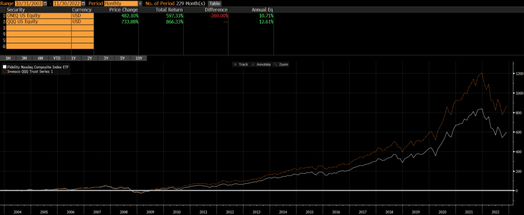
QQQ is one of the largest, most popular, and most liquid ETFs. The NASDAQ Composite Index is one of the most popular and most-watched indices. Interestingly, “the Q’s” does not track the NASDAQ Composite Index; QQQ tracks the Nasdaq 100 Index. In other words, “The NASDAQ” Composite Index is referred to in the news and displayed on websites/TV, while the NASDAQ 100 Index seems to be the benchmark for more investable funds and strategies. Despite their similar names, a comparison of the ONEQ vs QQQ reveals some major differences.
The ONEQ and QQQ have very different compositions, slightly different weights and exposures, and performance differences have reflected that.
QQQ is the older ETF with an inception date of March 10, 1999. ONEQ was launched just a few years later on October 1, 2003. Since that time, QQQ has outperformed ONEQ by a wide margin of nearly 2% annually. In other words, investing in “the Qs” would have beaten investing in “the Nasdaq” by quite a bit (nearly 270% over the past 19 years)!
Those looking to evaluate performance history before the 2000s should compare the index performance of these ETFs’ benchmarks and may want to read our post on the Nasdaq 100 vs Nasdaq Composite.
Investors looking for a lower cost version of QQQ may want to research QQQM and/or read my post comparing QQQM vs QQQ or ONEQ vs QQQM. Investors looking a mutual fund version of ONEQ should read my comparison of QQQ vs FNCMX.
Differences between ONEQ and QQQ
Overall, the two ETFs are very similar, since they are both based on the same universe of stocks. ONEQ holds approximately 1,000 stocks, while QQQ owns roughly 100 stocks. The NASDAQ site publishes the index methodologies for both the Composite and 100.
Geographic Exposure
Substantially all (95%+) of each ETF is composed of US-based companies, so I will not include the usual tables of countries, market classification, and so on.
Market Cap Exposure
QQQ holds the 100 largest stocks on the NASDAQ exchange (excluding financials), so it has a much larger weighting to large-caps than ONEQ which tracks the Composite Index. However, both ETFs use weighting methodologies based on market-cap, so large-caps dominate each ETF.
Below is an estimate of the market cap exposure as of 11/28/2022.
ONEQ
QQQ
Large Cap
73%
93%
Mid Cap
16%
7%
Small Cap
10%
0%
Source: ThoughtfulFinance.com, Morningstar
Sector Weights
Given that ONEQ tracks a much broader index than QQQ, it is not surprising that the ONEQ owns more sectors and is less concentrated than QQQ. Below are the sector weightings of the two ETFs, as of 11/29/2022.
ONEQ
QQQ
Basic Materials
0.39%
0.00%
Consumer Cyclical
14.17%
14.25%
Financial Services
5.53%
0.85%
Real Estate
1.23%
0.00%
Communication Services
13.18%
15.25%
Energy
0.82%
0.00%
Industrials
5.28%
5.07%
Technology
43.31%
47.92%
Consumer Defensive
5.08%
7.22%
Healthcare
9.89%
7.96%
Utilities
1.14%
1.48%
Source: ThoughtfulFinance.com, Morningstar
Final Thoughts: ONEQ vs QQQ
The decision of whether to invest in ONEQ vs QQQ comes down to whether an investor wants a more fund that is more concentrated in large-cap and tech or a more diversified portfolio. As the chart of ONEQ vs QQQ shows, QQQ has done better historically although this may not hold true moving forward (especially if tech and/or large-caps fall out of favor).
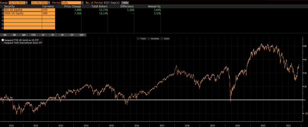
The Vanguard Total International Stock ETF (symbol: VXUS) and the Vanguard FTSE All-World ex-US ETF (symbol: VEU) are two popular and relatively large ETFs, covering a majority of the world’s non-US investable stocks. VXUS is benchmarked to the FTSE Global All-Cap Index ex-US, while VEU is benchmarked to the namesake FTSE All-World ex-US Index. When comparing VEU vs VXUS, it is important to be aware of the similarities, differences, and understand whether these differences are material to a portfolio.
The primary difference between VEU and VXUS is that VXUS has broader market coverage than VEU. However, performance is fairly similar, as is sector and geographic exposure.
VEU was launched on March 8, 2007, while VXUS was launched on January 28, 2011. So we can compare performance of the two back to VXUS’ inception date. Those interested in looking back further should compare the underlying benchmarks and can read our post about the FTSE Global All-Cap Index ex-US vs FTSE All World ex-US Index.
Since their common inception, the two ETFs have performed nearly identically with a difference of only .09% annually!
Source: ThoughtfulFinance.com, Bloomberg
Differences between VEU and VXUS
Both ETFs are benchmarked to indices provided by FTSE and they are nearly identical in many respects. The primary difference is that VXUS is more of a total market fund than VEU. VXUS has 7,985 stocks, while VEU “only” has 3,720 stocks (all data as of 10/31/2022)
Geographic Exposure
Country Exposure
Both VEU and VXUS exclude US stocks. The top five country weights are identical and the weightings are very close too. Data as of 10/31/2022.
VXUS
VEU
Japan
15.3%
15.5%
United Kingdom
10.2%
10.1%
Canada
8.1%
7.3%
China
7.1%
7.2%
France
6.5%
6.8%
Source: ThoughtfulFinance.com, Vanguard
Market Classification
The only difference in developed and emerging market exposure when comparing VXUS vs VEU seems to be a rounding error!
VXUS
VEU
Developed Markets
75.0%
74.1%
Emerging Markets
25.0%
24.9%
Source: ThoughtfulFinance.com, Vanguard
Market Cap Exposure
VXUS covers more mid- and small-cap stocks primarily since it has more than double the number of stocks, as of 10/31/2022.
VXUS
VEU
Large-Cap
76%
84%
Mid-Cap
19%
15%
Small-Cap
5%
0%
Source: ThoughtfulFinance.com, Morningstar
Sector Weights
The market cap differences do not translate into any material differences in sector exposure. As the table below shows, the sector weightings of the two indices are nearly identical as of 10/31/2022.
VXUS
VEU
Basic Materials
8.44%
8.18%
Consumer Cyclical
10.77%
10.62%
Financial Services
19.66%
20.49%
Real Estate
3.48%
2.79%
Communication Services
5.53%
5.77%
Energy
6.27%
6.39%
Industrials
13.67%
13.14%
Technology
11.09%
10.84%
Consumer Defensive
8.14%
8.59%
Healthcare
9.68%
9.99%
Utilities
3.27%
3.20%
Source: ThoughtfulFinance.com, Morningstar
Final Thoughts: VEU vs VXUS
These two ETFs are quite different in some ways, but not in ways that matter very much. VXUS is a much broader ETF than VEU (with more than double the number of holdings!). However, due to the market cap weighting methodology of both indices, the additional holdings do materially impact the geographic exposure, sector weights, or performance. This is very similar to the dynamic we find with the Russell 1000 and Russell 3000 where one index is essentially a subset of another.
These two ETFs are very similar and performance since inception has been very close. Trading liquidity and tax impact may be more consequential than differentials in ETF performance. Personally, I view these two ETFs as interchangeable in a portfolio and would spend my time on higher-value activities rather than determining which of these two ETFs is better.
Further Reading
Readers curious to learn about Vanguard’s mutual fund version of VEU, may want to read our comparison of VEU vs VFWAX.
Donating appreciated assets to charity can provide economic benefits to charities, while also providing tax benefits to donors. The benefits to both charities and donors is amplified for donations of appreciated assets.
Non-Cash Charitable Donations
What types of non-cash assets can be donated to charity?
There are many types of non-cash assets that can be donated to charitable organizations. Below are several types and examples.
Liquid securities such as stocks, bonds, mutual funds, ETFs, listed options, crypto and so on. This is the focus of this post, although the below principals apply to any many of the below.
Illiquid assets such as insurance contracts, restricted stock, employer stock options, business interests.
Real assets such as real estate or commodities.
Other complex assets.
Depreciated Assets such as clothes, cars, and so on. These items are beyond the scope of this post since they do not provide the same tax benefits as appreciated assets.
What charities accept non-cash financial assets?
Not all charities can accept non-cash donations.
Many charities are setup to accept liquid securities, but most do not have the resources to accept illiquid and/or complex assets. Typically, these can only be donated to (larger) well-resourced organizations. Ultra high net worth donors often establish a foundation to handle their charitable donations and grants.
Unfortunately, many donors only donate cash because they believe that is the only way to fund the charities they support. Donors wishing to donate liquid or illiquid assets to charities that cannot accept them should consider donor-advised funds.
Tax Benefits of Donating Appreciated Assets to Charity
Fortunately for US taxpayers, the IRS provides income tax benefits for cash and non-cash charitable contributions. Additionally, donating appreciated non-cash assets can generate additional capital gains tax benefits.
Income Tax Benefits of Donating Non-Cash Assets to Charity
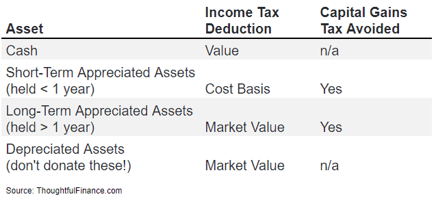
The value of cash or non-cash donations can generally be deducted from a donor’s income on their tax return, thus lowering their income tax liability.
For cash donations, the value of the donation is straightforward.
For non-cash assets that have been held more than one year, donors can deduct the market value (or estimated/appraised value if there is no market value).
For non-cash assets held less than one year, then the deduction is the lower of the cost basis or value (so donating “short-term” assets rarely, if ever, makes sense).
The above bullet points are summarized in the table below.
Capital Gains Tax Benefits of Donating Appreciated Assets to Charity
While donating non-cash assets can provide an income tax benefit, donating appreciated non-cash assets can provide a capital gains tax benefit.
The reason that donating appreciated assets is often more attractive than donating cash is because donating an appreciated asset allows donors to avoid long-term capital gains tax on the donated asset.
Appreciated assets generally have an embedded tax liability which must be paid when the gain is realized. For instance, if someone buys a stock at $10 and it rises to $100, there is a capital gains tax that is owed on the $90 gain. It may not be paid until the stock is sold, but that tax liability exists nonetheless and is embedded in the position until it is sold. However, if the stock is donated to charity, then the investor will never have to pay capital gains tax on the $90 gain (and neither will the charity since it is a non-profit organization that does not pay taxes)!
The below table shows the income tax and capital gains tax benefits of donating appreciated assets with various holding periods:
Benefits of Donating Appreciated Non-Cash Assets
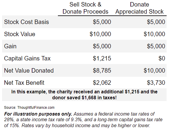
Donating appreciated assets provides donors with tax benefits, but it can also benefit charities. Below is an example of the benefits of donating appreciated stock:
Assume a donor buys $5,000 of stock which appreciates to $10,000 over several years. If the donor sells the stock, they will realize a $5,000 gain which will be subject to capital gains tax. Assuming a 15% long-term capital gains tax and a 9.3% state income tax, the donor will pay $1,215 in taxes. The charity will receive $8,785 ($10,000 minus the $1,215 of taxes). Assuming a 28% federal tax rate (and 9.3% state tax rate still), the donor will receive a $3,276 deduction. But the net tax benefit to the donor will only be $2,062 ($3,276 deduction minus $1,215 capital gains tax paid, rounded).
Alternatively, if the donor donated the stock directly to the charity, they would have received a larger tax benefit AND the charity would have received more. The donor could send the entire $10,000 position to the charity and deduct the $10,000 on their tax return. The charity would receive $1,215 more AND the donor would have saved $1,668 in taxes (because they could deduct $3,730 without subtracting any capital gains, assuming the same tax rates).
The below table illustrates the benefits from the above example of donating stock to charity.
Obviously, the dual impacts of receiving an income tax deduction and avoiding capital gains tax are beneficial.
The above methods can be used to dispose of assets and/or reallocate/rebalance portfolios in a tax-efficient way. For instance, some investors hold stocks (that they wouldn’t otherwise hold) due to tax constraints. Donating shares of stock eliminates this constraint. This would also apply to mutual funds, ETFs, and other portfolio positions that donors wish to exit.
I should note that the above is a high-level overview and there are additional tax issues to consider, so donors should consult with their tax adviser before making any donations. As readers know, this site is designed to provide education rather than recommendations.
An important consideration when investing in private equity is the preferred return, which is not a standardized term and has many variations. At the highest level, private equity investors should understand what the preferred return is as well as how its calculated, what the catch-up is (if any) and whether there are claw back provisions. Additionally, investors should evaluate whether the preferred return is simple, compounded, cumulative, and so on.
Performance fees are also known as carry, carried interest, performance allocations, incentive allocations, or incentive fees (among other terms) and I’ll be using them interchangeably. Private equity funds are typically long-term closed-end vehicles, so the below information and examples are more conceptual than anything else. They are examples of private equity preferred returns and investors are encouraged to carefully read the legal documents of any prospective investment.
Preferred Returns: Pure vs Catch-Ups
Pure Preferred Return
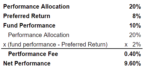
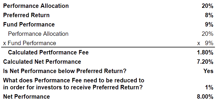
Pure preferred return is also known as a “true preferred return” or a “hard preferred return” (similar to a “hard hurdle” in hedge fund lingo, although use the term in a private equity context too). A pure preferred return means that the manager only collects a fee on the performance above the preferred return. This arrangement is more investor-friendly than the alternative of a “preferred return with catch-up.” Below is a detailed example of a private equity pure preferred return:
In the above example, the manager charges a 20% performance fee above an 8% preferred return. Since the fund returned 10%, the performance fee is .4% (20% multiplied by 2%).
Preferred Return with Catch-Up
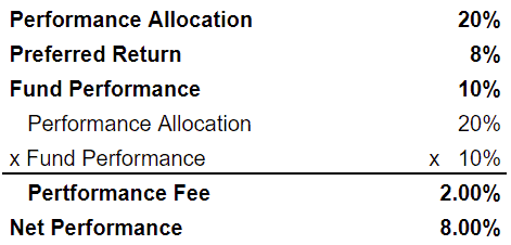
A preferred return with catch-up means that the manager collects fees back to the first dollar of performance (the manager “catches up”), assuming that gross performance exceeds the preferred return. This arrangement is more manager-friendly than a pure preferred return. Below is a detailed example of a private equity preferred return with catch up:
In the above example with catch-up, the manager also charges a 20% performance fee above an 8% preferred return. However, the fee is applied on all returns (assuming fund performance exceeds the preferred return). So the performance fee is 2% (20% multiplied by 10%).
100% Catch-up
Once performance hits 7%, all additional returns accrue to the manager until gross performance surpasses 8.24% (because 7% is 85% of 8.24%). In other words, investors receive the returns from 0% to 7% and the manager receives returns from 7% to 8.24%. Returns of 8.25% and beyond are split 85%/15% between the investors and manager.
50/50 Catch-up
A 50/50 catch-up is a common catch-up structure, although it could be 60/40, 75/25, or any other combination.
Let’s look at an example of a private equity preferred return with a 50/50 catch-up. A private equity fund fund has 20% performance fee above a 10% preferred return with a 50/50 catch-up provision. In this case, the investors would receive all of the returns up to 10%. Additional returns would be split 50/50 until gross returns hit 12.5%. At 12.5%, the manager would be fully caught-up since they would receive 50% of the returns from 10% to 12.5% or 1.25% (which is 10% of 12.5%). Returns above 12.5% would be split 90/10 between the investors and manager.
Catch-Up Modifications and Limitations
Some funds have a structure where the manager earns carried interest back to the first dollar of performance (assuming that gross performance exceeds the preferred return), but the performance fee is reduced if it would cause net returns to be lower than the preferred return. Below is a detailed example of this modified structure private equity waterfall structure.
This structure allows managers to retain the upside, while somewhat protecting investors.
Tiered Preferred Returns
Similar to how a catch-up allows managers to have more upside than a pure performance return, a tiered preferred return allows managers to capture even more upside as performance increases.
Here’s an example of a private equity fund with tiered performance fees. The performance fee may be 20% over an 8% preferred return, 30% over a 12% preferred return, and so on. The performance fee can be structured to only apply to returns above the preferred return or to go back to the first dollar of returns. So an investor may pay a 20% performance fee up to 12% and a 30% performance fee on returns above 12%. Or they might pay 30% on all returns if the performance is above 12%. The fees at different tiers can also be limited so as to not push returns below the tier that they are being charged fees for.
Some investors believe that tiered preferred returns in private equity improve the alignment of interests between managers and investors, while others believe that it incentivizes risky behavior.
Simple, Compounding, and Resetting
Regardless of whether a private equity fund has a pure preferred return or a catch-up, it is important to note how the preferred return rate is quoted and how it works.
Simple Preferred Returns
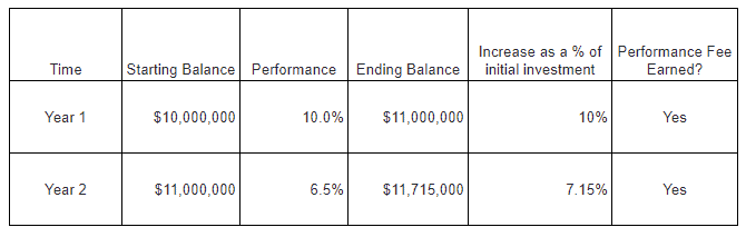
Some private equity preferred returns are quoted as a simple rate, which is generally not a great arrangement for investors. Consider the example in the below table where a fund may have a preferred return of a 7%. In this case, the fund will be entitled to its performance fee as long as it returns at least 7% on invested capital. So if the fund starts with $10 million and returns are 10% in Year 1, the manager gets the performance fee. However, if the fund returns 6.5% in Year 2, the manager still gets the performance fee. This is because the $715,000 (calculated as 6.5% x $11 million) that it earned in Year 2 is more than 7% of invested capital (of $10 million).
This model is obviously favorable to managers, although it may make sense for certain open-ended vehicles (and may not matter for some closed-end vehicles).
Compounded Preferred Returns
Some private equity preferred returns are quoted as an annually compounded rate. If the preferred return is 6%, then the fund must return at least 12.36% over a 2-year period (since a 6% return compounded for 2 years is 12.36%), 19.1% over a 3-year period (since a 6% return compounded for 3 years is 19.1%), and so on.
Non-cumulative Preferred Returns
The advent of evergreen and open-ended private equity has resulted in some preferred returns that are “non-cumulative” and reset periodically. In other words, the preferred return will reset regardless of the prior periods performance.
This is obviously manager-friendly (and unfavorable to investors). Consider a fund with an 8% preferred return that that loses 20% in Year 1 and gains 10% in Year 2. No performance fee would have been charged in Year 1, but it would have been charged in Year 2 (since the Year 2 performance exceeded the preferred the return). Investors would be down 12% and yet still have to pay a performance fee! This example is detailed in the table below.
High Water Marks
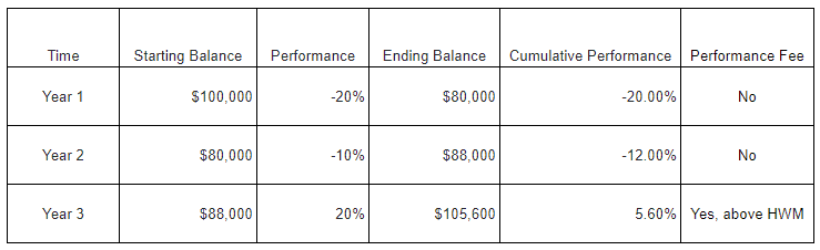
A high water mark (or high-water mark or high watermark) has primarily been used by hedge funds historically, but it is becoming more common in private equity due to the wave of evergreen offerings with non-cumulative performance fees.
A high water mark is a mechanism to address the downsides of a non-cumulative preferred return. Furthermore, it ensures that a performance fee will not be charged until cumulative performance is positive. Returning to the previous example, a high water mark would prevent the manager from collecting performance fee in Year 2 (even though the preferred return resets in the new year) because the cumulative performance is still negative. However, once the cumulative performance exceeds the 0%, then the manager would be entitled to the performance fee.
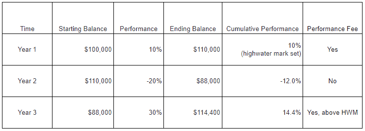
It is easy to think of other examples where a high water mark would protect investors. A common risk would be paying the performance fee twice on the same performance. In the chart below, we assume a fund returns 10% in Year 1 and -20% in Year 2 and then 30% in Year 3. The investment would have gone from 100,000 to 110,000 in Year 1 and again in Year 3 and investors would not want to pay for that twice. A high water mark ensures that they only pay a performance fee on the gains from 110,000 to 114,400 in Year 3.
Private Equity Waterfall Structures
I’ll probably write another post on this, but there are two main types of “waterfalls” or ordering of distributions.
European Waterfall
Under a European waterfall structure, investors typically receive their return of capital and preferred return before the manager begins receiving its fee carried interest catch-up. Given that many private equity funds are 10 year funds (plus extensions), managers may be waiting a very long time before receiving any carry from the waterfall.
American Waterfall
Under an American waterfall, the manager is allowed to receive advances of its carried interest catch-up on a “deal-by-deal” basis. Essentially, this allows the manager to receive some compensation earlier. Proponents of this structure argue that it allows managers to think longer-term and not sell assets prematurely in order to generate income for themselves.
Clawback Provisions
Clawback provisions are important for investors to have under an American waterfall structure. It provides a mechanism for investors to receive some compensation from the manager if the deal-by-deal carried interest fees that are advanced are ultimately more than what the manager is entitled to (once the fund is fully wound down and the actual fees known). Unfortunately for investors, clawbacks are generally net of taxes since managers argue that they cannot refund what they paid to the IRS. So investors may receive a fraction of what was overpaid to the manager.
Conclusion
Ultimately, performance fees, preferred returns, and high water marks are designed to align the interests of private equity managers and investors. The structure of these terms varies from fund to fund, depending on factors like manager size, asset class, and so on. There is no “best” set of terms, but investors should ask whether the terms create alignment in a variety of good and bad scenarios. This is also true when investing in real estate, hedge funds, and many other alternative investments beyond private equity.