Fund Comparison

ITOT vs IVV

The iShares Core S&P 500 ETF (IVV) and the iShares Core S&P Total U.S. Stock Market ETF (ITOT) are two of the largest funds in existence and both sponsored by Blackrock’s iShares. As their names suggest, IVV and ITOT are a core holding of many portfolios. Many investors compare ITOT vs IVV in order to decide which should be the foundation of their portfolio.

The Short Answer

The main difference between IVV and ITOT is that IVV is a large- and mid-cap ETF, while ITOT is a total market mutual fund. Despite these differences, the long-term total return between these two funds is nearly identical and I consider them interchangeable.

A quick reminder that this site does NOT provide investment recommendations.

The Long Answer

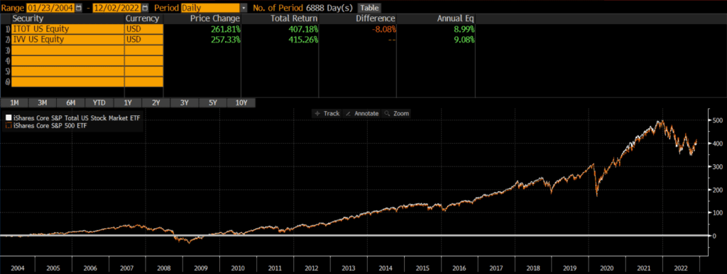
Historical Performance: ITOT vs IVV

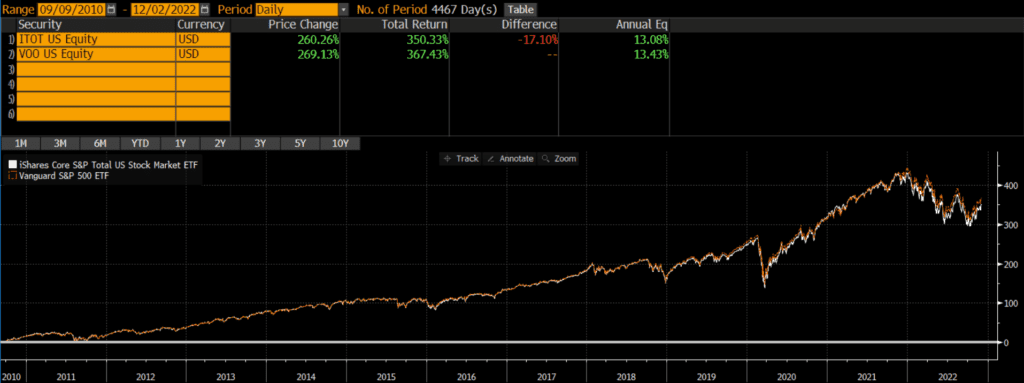
IVV was launched on May 15, 2000, and ITOT was launched a few years later on January 20, 2004. Since then, IVV has outperformed by just .09% annually! This is a miniscule difference that could be overshadowed by investor trading costs like trading costs or bid-ask spreads. That being said, the performance between these two funds is basically identical, even considering the market cap differences between the two.

Differences between ITOT vs IVV

The biggest difference between IVV and ITOT is the market cap exposure of the funds. IVV tracks the S&P 500 index which includes mostly large-caps and some mid-caps, while ITOT covers much more of the market by including more mid-caps and small-caps.

Geographic Exposure

Both IVV and ITOT hold essentially 100% stocks, so I will not dig into country exposures or market classification here. For all intents and purposes, the two funds have identical exposures.

Market Cap Exposure

IVV focuses on the S&P 500 index and so it mostly holds large-caps with a bit of mid-cap exposure. ITOT tracks the broader S&P Total Market Index and so it owns many more mid-caps and small-caps, as of 11/30/2022. In other words, IVV is a large-cap vehicle, while ITOT is a total market vehicle. That being said, due to market cap weighting, both funds are overwhelmingly influenced by the large-cap holdings.

IVVITOT
Large-Cap83%73%
Mid-Cap16%19%
Small-Cap0%9%
Source: ThoughtfulFinance.com, Morningstar

Sector Weights

The sector weights between IVV and ITOT are nearly identical, as of 11/30/2022. The weights are within 1% for every single sector.

IVVITOT
Basic Materials2.40%2.66%
Consumer Cyclical10.17%10.45%
Financial Services13.74%13.96%
Real Estate2.77%3.45%
Communication Services7.49%6.94%
Energy5.11%5.10%
Industrials8.87%9.59%
Technology23.74%23.24%
Consumer Defensive7.36%6.73%
Healthcare15.36%15.01%
Utilities2.99%2.86%
Source: ThoughtfulFinance.com, Morningstar

Final Thoughts: ITOT vs IVV

Both IVV and ITOT are large, core funds sponsored and managed by one of the largest asset managers in the world. Although IVV is more of a large-cap ETF and ITOT is a total market ETF, performance has been nearly identical. I view these two funds as essentially interchangeable and would not spend too much energy splitting hairs to decide which one is “better.”

ITOT vs VOO

The Vanguard S&P 500 Index ETF (VOO) and the iShares Core S&P Total U.S. Stock Market ETF (ITOT) are two of the largest funds in existence. VOO and ITOT are a core holding of many investor portfolios. Many investors compare ITOT vs VOO in order to decide which should be the foundation of their portfolio.

The Short Answer

The main difference between VOO and ITOT is that VOO is a large- and mid-cap ETF, while ITOT is a total market mutual fund. Despite these differences, the total return between these two funds is nearly identical and I consider them interchangeable.

A quick reminder that this site does NOT provide investment recommendations.

The Long Answer

Historical Performance: ITOT vs VOO

ITOT was launched on January 20, 2004, while VOO was launched on September 7, 2010. Since then, VOO has outperformed by .35% annually. This is most likely driven by large-caps’ relative outperformance during this time period, although that dynamic could reverse in the future. That being said, the performance between these two funds is extremely close (especially considering the market cap differences).

Differences between ITOT vs VOO

The biggest difference between VOO and ITOT is the market cap exposure of the funds. VOO tracks the S&P 500 index which includes mostly large-caps and some mid-caps, while ITOT covers much more of the market by including more mid-caps and small-caps.

Geographic Exposure

Both VOO and ITOT hold essentially 100% stocks, so I will not dig into country exposures or market classification here. For all intents and purposes, the two funds have identical exposures.

Market Cap Exposure

VOO focuses on the S&P 500 index and so it mostly holds large-caps with a bit of mid-cap exposure. ITOT tracks the broader S&P Total Market Index and so it owns many more mid-caps and small-caps, as of 11/30/2022. In other words, VOO is a large-cap vehicle, while ITOT is a total market vehicle. That being said, due to market cap weighting, both funds are overwhelmingly influenced by the large-cap holdings.

VOOITOT
Large-Cap84%73%
Mid-Cap17%19%
Small-Cap0%9%
Source: ThoughtfulFinance.com, Morningstar

Sector Weights

The sector weights between VOO and ITOT are nearly identical, as of 11/30/2022. The weights are within 1% for every single sector.

VOOITOT
Basic Materials2.27%2.66%
Consumer Cyclical10.59%10.45%
Financial Services13.61%13.96%
Real Estate2.74%3.45%
Communication Services7.36%6.94%
Energy5.37%5.10%
Industrials8.69%9.59%
Technology23.60%23.24%
Consumer Defensive7.38%6.73%
Healthcare15.42%15.01%
Utilities2.97%2.86%
Source: ThoughtfulFinance.com, Morningstar

Final Thoughts: ITOT vs VOO

Both VOO and ITOT are large, core funds sponsored and managed by the two largest ETF sponsors (Vanguard and Blackrock, respectively). Although VOO is more of a large-cap ETF and ITOT is a total market ETF, performance has been nearly identical. I view these two funds as essentially interchangeable and would not spend too much energy splitting hairs to decide which one is “better.”

Why I Write Comparison Posts

Comparing indices and funds is relatively basic (compared to complex investment or tax strategies) and relatively boring to write about, but this site’s goal is to help investors.

Differential analysis is something that many people ask about and research. Investors often want to know whether to use Fund A or Fund B. Sometimes the answer is easy and sometimes the answer doesn’t matter. 

I remember trying to find the “best” funds as an amateur investor back in high school and college by scouring magazines and Morningstar.com. I’d focus on the 3-, 5-, and 10-year returns, not understanding that the timeframes we’re highly correlated with one another. I’d spend tons of time looking at expense ratios or betas, not understanding the much larger differences between funds. In short, I wasted a lot of time focusing on things that were irrelevant. I see many investors making the same mistakes today.

Unfortunately, there are not a lot of helpful sites out there. There is a lot of data available, but not much of it is necessarily helpful to individual investors.

  • Understanding the difference in two expense ratios is not as important as understanding whether two funds are even comparable in the first place.
  • Focusing on performance differences is not as important as understanding how the performance is presented and/or what drove that performance.
  • Trying to differentiate between two nearly identical funds is usually not a great use of an investor’s time. Sometimes it is though.
  • A post that’s got affiliate links all over it and takes paragraph-long tangents into this brokerage or that investing service is annoying at best and dangerous at worst. 

The purpose of these comparison articles is to help investors focus on the things that matter. My overall goal is to help investors and these articles are an easy way for me to scalably address widespread (but easy) questions.

VTSAX vs IVV

The iShares Core S&P 500 Index ETF (IVV) and the Vanguard Total Stock Market Index fund (VTSAX) are two of the largest funds in existence and easily two of the most popular among individual investors. IVV and VTSAX are the core of many investor portfolios and many investors compare VTSAX vs IVV in order to decide which should be the foundation of their portfolio.

The Short Answer

The main difference between IVV and VTSAX is that IVV is a large- and mid-cap ETF, while VTSAX is a total market mutual fund. Despite these differences, the total return between these two funds is nearly identical and I consider them interchangeable for all intents and purposes.

A quick reminder that this site does NOT provide investment recommendations.

The Long Answer

Historical Performance: VTSAX vs IVV

IVV was launched on May 15, 2000, while VTSAX was launched on November 13, 2000. Since then VTSAX has outperformed by roughly .34% annually. This is most likely driven by small-caps’ relative outperformance initially, even though that trend has reversed during the past decade. Despite variations in the size factor performance over the decades, the long-term performance between these two funds is incredibly similar.

Differences between VTSAX vs IVV

The biggest difference between IVV and VTSAX is the market cap exposure of the funds. IVV tracks the S&P 500 index which includes mostly large-caps and some mid-caps, while VTSAX covers much more of the market by including more mid-caps and small-caps.

Geographic Exposure

Both IVV and VTSAX hold essentially 100% stocks, so I will not dig into country exposures or market classification here. For intents and purposes, the two funds have identical exposures.

Market Cap Exposure

IVV focuses on the S&P 500 index and so it mostly holds large-caps with a bit of mid-cap exposure. VTSAX tracks the broader CRSP US Total Market Index and so it owns many more mid-caps and small-caps, as of 11/30/2022. In other words, IVV is a large-cap vehicle, while VTSAX is a total market vehicle. That being said, due to market cap weighting, both funds are overwhelmingly influenced by the large-cap holdings.

IVVVTSAX
Large-Cap83%73%
Mid-Cap16%19%
Small-Cap0%9%
Source: ThoughtfulFinance.com, Morningstar

Sector Weights

The sector weights between IVV and VTSAX are nearly identical, as of 11/20/2022. The weights are within 1% for every single sector.

IVVVTSAX
Basic Materials2.40%2.51%
Consumer Cyclical10.16%10.66%
Financial Services13.80%13.79%
Real Estate2.77%3.45%
Communication Services7.46%6.80%
Energy5.12%5.31%
Industrials8.86%9.64%
Technology23.72%23.06%
Consumer Defensive7.40%6.75%
Healthcare15.31%15.17%
Utilities2.99%2.87%
Source: ThoughtfulFinance.com, Morningstar

Final Thoughts: VTSAX vs IVV

Both IVV and VTSAX are large, core funds sponsored and managed by Blackrock and Vanguard respectively. Although IVV is more of a large-cap ETF and VTSAX is a total market mutual fund, performance has been nearly identical. I view these two funds as essentially interchangeable and would not spend too much energy trying to decide which one is “better.”

However, there are some situations that may call for one fund versus another.

  • Many custodians offer free ETF trades, but charge trading fees or redemption fees for mutual fund. So unless my account was at Vanguard, I might opt for IVV.
  • If most of my existing portfolio was mutual funds, I might stick to mutual funds so that settlement periods for trades are consistent (for activities like tax-loss harvesting, etc). Similarly, if most of my portfolio was ETFs, I might stick to ETFs.
  • The ETF structure is generally a more tax-efficient vehicle, so IVV may have a lower risk of adverse tax situations in the future.

Despite these considerations, these two funds are very similar for all intents and purposes.

VTSAX vs VFIAX

The Vanguard S&P 500 Index mutual fund (VFIAX) and the Vanguard Total Stock Market Index fund (VTSAX) are two of the largest mutual funds in existence. VFIAX and VTSAX are the core of many investor portfolios. Many investors compare VTSAX vs VFIAX in order to decide which should be the foundation of their portfolio.

The Short Answer

The main difference between VFIAX and VTSAX is that VFIAX is a large- and mid-cap fund, while VTSAX is a total market fund. Despite these differences, the total return between these two funds is nearly identical and I consider them interchangeable.

A quick reminder that this site does NOT provide investment recommendations.

The Long Answer

Historical Performance: VTSAX vs VFIAX

Both VTSAX and VFIAX were launched on November 13, 2000. Since then VTSAX has outperformed by about .31% annually. This is most likely driven by small-caps’ relative outperformance initially, even though that trend has reversed during the past decade. Despite variations in the size factor performance over the decades, the long-term performance between these two funds is incredibly similar.

Differences between VTSAX vs VFIAX

The biggest difference between VFIAX and VTSAX is the market cap exposure of the funds. VFIAX tracks the S&P 500 index which includes mostly large-caps and some mid-caps, while VTSAX covers much more of the market by including more mid-caps and small-caps.

Geographic Exposure

Both VFIAX and VTSAX hold essentially 100% stocks, so I will not dig into country exposures or market classification here. For intents and purposes, the two funds have identical exposures.

Market Cap Exposure

VFIAX focuses on the S&P 500 index and so it mostly holds large-caps with a bit of mid-cap exposure. VTSAX tracks the broader CRSP US Total Market Index and so it owns many more mid-caps and small-caps, as of 10/31/2022. In other words, VFIAX is a large-cap vehicle, while VTSAX is a total market vehicle. That being said, due to market cap weighting, both funds are overwhelmingly influenced by the large-cap holdings.

VFIAXVTSAX
Large-Cap84%73%
Mid-Cap17%19%
Small-Cap0%9%
Source: ThoughtfulFinance.com, Morningstar

Sector Weights

The sector weights between VFIAX and VTSAX are nearly identical, as of 10/31/2022. The weights are within 1% for every single sector.

VFIAXVTSAX
Basic Materials2.27%2.51%
Consumer Cyclical10.59%10.66%
Financial Services13.61%13.79%
Real Estate2.74%3.45%
Communication Services7.36%6.80%
Energy5.37%5.31%
Industrials8.69%9.64%
Technology23.60%23.06%
Consumer Defensive7.38%6.75%
Healthcare15.42%15.17%
Utilities2.97%2.87%
Source: ThoughtfulFinance.com, Morningstar

Final Thoughts: VTSAX vs VFIAX

Both VFIAX and VTSAX are large, core funds sponsored and managed by Vanguard. Although VFIAX is more of a large-cap fund and VTSAX is a total market mutual fund, performance has been nearly identical. I view these two funds as essentially interchangeable and would not spend too much energy splitting hairs to decide which one is “better.”

VTSAX vs VOO (updated 2023)

The Vanguard S&P 500 Index ETF (VOO) and the Vanguard Total Stock Market Index fund (VTSAX) are two of the largest funds in existence. VOO and VTSAX are the core of many investor portfolios. Many investors compare VTSAX vs VOO in order to decide which should be the foundation of their portfolio.

A quick reminder that this site does NOT provide investment recommendations.

The Short Answer

The main difference between VOO and VTSAX is that VOO is a large- and mid-cap ETF, while VTSAX is a total market mutual fund. Despite these differences, the total return between these two funds is nearly identical and I consider them interchangeable.

I should note that there is an ETF version of VTSAX, which is VTI. Investors looking for an ETF vs ETF comparison should read my review of VTI vs VOO. Readers may also be interested in my standalone VOO review.

The Long Answer

Historical Performance: VTSAX vs VOO

VTSAX was launched on November 13, 2000, while VOO was launched on September 7, 2010. Since then, VOO has outperformed by about .29% annually. This is most likely driven by large-caps’ relative outperformance during this time period, although that dynamic could reverse in the future. That being said, the performance between these two funds is extremely close considering the market cap differences.

Differences between VTSAX vs VOO

The biggest difference between VOO and VTSAX is the market cap exposure of the funds. VOO tracks the S&P 500 index which includes mostly large-caps and some mid-caps, while VTSAX covers much more of the market by including more mid-caps and small-caps.

Geographic Exposure

Both VOO and VTSAX hold essentially 100% stocks, so I will not dig into country exposures or market classification here. For intents and purposes, the two funds have identical exposures.

Market Cap Exposure

VOO focuses on the S&P 500 index and so it mostly holds large-caps with a bit of mid-cap exposure. VTSAX tracks the broader CRSP US Total Market Index and so it owns many more mid-caps and small-caps, as of 10/31/2022. In other words, VOO is a large-cap vehicle, while VTSAX is a total market vehicle. That being said, due to market cap weighting, both funds are overwhelmingly influenced by the large-cap holdings.

VOOVTSAX
Large-Cap84%73%
Mid-Cap17%19%
Small-Cap0%9%
Source: ThoughtfulFinance.com, Morningstar

Sector Weights

The sector weights between VOO and VTSAX are nearly identical, as of 10/31/2022. The weights are within 1% for every single sector.

VOOVTSAX
Basic Materials2.27%2.51%
Consumer Cyclical10.59%10.66%
Financial Services13.61%13.79%
Real Estate2.74%3.45%
Communication Services7.36%6.80%
Energy5.37%5.31%
Industrials8.69%9.64%
Technology23.60%23.06%
Consumer Defensive7.38%6.75%
Healthcare15.42%15.17%
Utilities2.97%2.87%
Source: ThoughtfulFinance.com, Morningstar

Final Thoughts: VTSAX vs VOO

Both VOO and VTSAX are large, core funds sponsored and managed by Vanguard. Although VOO is more of a large-cap ETF and VTSAX is a total market mutual fund, performance has been nearly identical. I view these two funds as essentially interchangeable and would not spend too much energy splitting hairs to decide which one is “better.”

However, there are some situations that may call for one fund versus another.

  • Many custodians offer free ETF trades, but charge trading fees or redemption fees for mutual fund. So unless my account was at Vanguard, I might opt for VOO.
  • If most of my existing portfolio was mutual funds, I might stick to mutual funds so that settlement periods for trades are consistent (for activities like tax-loss harvesting, etc). Similarly, if most of my portfolio was ETFs, I might stick to ETFs.
  • The ETF structure is generally a more tax-efficient vehicle, so VOO may have a lower risk of adverse tax situations in the future. However, Vanguard ETFs are share class of Vanguard mutual funds, so this tax benefit may be muted.

Despite these considerations, these two funds are very similar for all intents and purposes.

SWPPX vs VTSAX

The Schwab S&P 500 Index mutual fund (SWPPX) and the Vanguard Total Stock Market Index fund (VTSAX) are two of the largest mutual funds in existence. SWPPX and VTSAX are the core of many investor portfolios. Many investors compare SWPPX vs VTSAX in order to decide which should be the foundation of their portfolio.

A quick reminder that this site does NOT provide investment recommendations. Fund comparisons (such as this one) are not conducted to identify the “best” fund (since that will vary from investor to investor based on investor-specific factors). Rather, these fund comparison posts are designed to identify and distinguish between the fund details that matter versus the ones that don’t.

The Short Answer

The main difference between SWPPX and VTSAX is that SWPPX is a large- and mid-cap fund, while VTSAX is a total market fund. Despite these differences, the total return between these two funds is nearly identical and I consider them interchangeable.

The Long Answer

Historical Performance: SWPPX vs VTSAX

SWPPX was launched on May 19, 1997, while VTSAX was launched a year later on November 13, 2000. Since then VTSAX has outperformed by .35% annually. This is not a huge performance differential, but it does compound over time.

However, when we stretch the time period back a bit further by swapping the older investor share class VTSMX for VTSAX, we see that the annual performance difference narrows to about .13% annually.

The conclusion, of course, is that performance differentials can be highly time dependent. Things that look one way during one time period can looking completely different during a different time period. Nonetheless, performance is pretty similar between these two funds (or strategies if we use older share classes as proxies).

Differences between SWPPX vs VTSAX

The biggest difference between SWPPX and VTSAX is the market cap exposure of the funds. SWPPX tracks the S&P 500 index which includes mostly large-caps and some mid-caps, while VTSAX covers much more of the market by including more mid-caps and small-caps.

Geographic Exposure

Both SWPPX and VTSAX hold essentially 100% stocks, so I will not dig into country exposures or market classification here. For intents and purposes, the two funds have identical exposures.

Market Cap Exposure

SWPPX focuses on the S&P 500 index and so it mostly holds large-caps with a bit of mid-cap exposure. VTSAX tracks the broader CRSP US Total Market Index and so it owns many more mid-caps and small-caps, as of 10/31/2022. In other words, SWPPX is a large-cap vehicle, while VTSAX is a total market vehicle. That being said, due to market cap weighting, both funds are overwhelmingly influenced by the large-cap holdings.

SWPPXVTSAX
Large-Cap84%73%
Mid-Cap17%19%
Small-Cap0%9%
Source: ThoughtfulFinance.com, Morningstar

Sector Weights

The sector weights between SWPPX and VTSAX are nearly identical, as of 10/31/2022. The weights are within 1% for every single sector.

SWPPXVTSAX
Basic Materials2.27%2.51%
Consumer Cyclical10.59%10.66%
Financial Services13.65%13.79%
Real Estate2.75%3.45%
Communication Services7.35%6.80%
Energy5.37%5.31%
Industrials8.68%9.64%
Technology23.59%23.06%
Consumer Defensive7.38%6.75%
Healthcare15.41%15.17%
Utilities2.96%2.87%
Source: ThoughtfulFinance.com, Morningstar

Final Thoughts: SWPPX vs VTSAX

Both SWPPX and VTSAX are large, core funds sponsored and managed by some of the largest asset managers in the world (Schwab and Vanguard). Beyond market cap exposures, the funds appear and act very similar. Long-term performance has been nearly identical. I view these two funds as essentially interchangeable and would not spend too much energy splitting hairs to decide which one is “better.”

One consideration that might tip the scales is where the investors’ account is. Unlike ETFs, many mutual funds are still subject to trading fees and/or short-term redemption fees. So if my accounts were at Schwab, I might lean more towards SWPPX. If my accounts were at Vanguard, I might favor VTSAX. But overall, these two funds are very similar and I wouldn’t worry too much about picking the “right” one.

VEU vs VT

VEU and VT are two of the largest ETFs and popular building blocks for many portfolios. My personal opinion is that these two ETFs are like apples and oranges and should not be compared against one another. However, many people request a comparison of these two funds, so I will write a post about VEU vs VT.

VT is benchmarked to the FTSE Global All-Cap Index, while VEU is benchmarked to the namesake FTSE All-World ex-US Index. When comparing VEU vs VT, it is clear that the biggest difference is that VEU excludes the US while VT includes it. A secondary difference is that VT has way more holdings and has more market cap coverage.

A quick reminder that this site does NOT provide investment recommendations.

Historical Performance: VEU vs VT

VEU was launched on March 8, 2007, while VT was launched a year later on June 24, 2008. Since then, VT has trounced VEU by over 3.5% annually. The reason for this is simply that VEU excludes US stocks and US stocks have outperformed non-US stocks by a wide margin, during this time period. We don’t have to split hairs or run complex attribution analyses for this comparison.

Differences between VEU and VT

The biggest difference between VEU and VT is that VT includes stocks from the US. As VEU’s name (the Vanguard FTSE All-World ex-US) implies, it excludes stocks from the US.

A second major difference is that VT is more of a total market fund than VEU. VT has 9,548 stocks, while VEU “only” has 3,720 stocks (as of 10/31/2022).

Geographic Exposure

Country Exposure

VEU excludes US stocks, while VT includes US stocks. Consequently, the top five country weights are materially different (data as of 10/31/2022).

VTVEU
United States61.7%0.0%
Japan5.9%15.5%
United Kingdom3.9%10.1%
Canada3.1%7.3%
China2.7%7.2%
Source: ThoughtfulFinance.com, Vanguard

Market Classification

Both ETFs include emerging markets, but VEU’s exclusion of US stocks results in a much higher allocation to emerging markers.

VTVEU
Developed Markets90.5%74.1%
Emerging Markets9.50%24.9%
Source: ThoughtfulFinance.com, Vanguard

Market Cap Exposure

VT covers more mid- and small-cap stocks primarily since it has more than double the number of stocks, as of 10/31/2022.

VTVEU
Large-Cap75%84%
Mid-Cap20%15%
Small-Cap6%0%
Source: ThoughtfulFinance.com, Morningstar

Sector Weights

There are some notable differences in sector exposure when comparing VT vs VEU. As the table below shows, the sector weightings of the two differs a bit as of 10/31/2022.

VTVEU
Basic Materials4.79%8.18%
Consumer Cyclical10.74%10.62%
Financial Services16.01%20.49%
Real Estate3.43%2.79%
Communication Services6.38%5.77%
Energy5.72%6.39%
Industrials10.94%13.14%
Technology18.76%10.84%
Consumer Defensive7.31%8.59%
Healthcare12.90%9.99%
Utilities3.02%3.20%
Source: ThoughtfulFinance.com, Morningstar

Final Thoughts: VEU vs VT

As readers can see, these two ETFs are quite different. I would not even compare them on this site, except that differentiating between them is a common question. VT is a global solution, while VEU specifically fills the need for non-US exposure.

The decision for investors should be an easy one. Those who want a total global market solution should consider VT, while those who want to manage their US and non-US allocations separately should look at VEU. A more appropriate comparison might be comparing VXUS vs VEU or comparing VT to another total global market ETF. Investors looking for a mutual fund version of VEU should read our comparison of VEU vs VFWAX.

URTH vs ACWI

The iShares URTH and iShares ACWI are two popular ETFs that track the well-known indices MSCI World and MSCI ACWI, respectively. Although there are some important differences, the long-term performance of URTH vs ACWI has been nearly identical.

A reminder that this site does NOT provide investment recommendations.

Historical Performance: URTH vs ACWI

ACWI is the older of the two ETFs as it was launched on March 28, 2008. URTH was launched just a few years later on January 12, 2012. Since them, URTH has outperformed by .90% annually.

URTH only includes stocks of developed markets (think the US, Western Europe, Japan, Canada, Australia, etc), while ACWI includes stocks in both developed and emerging markets (think China, India, Brazil, etc). Emerging markets have bounced around between 10-15% of global market cap in the past decade or two (and were much smaller prior to that).

Current Composition: URTH vs ACWI

Historically, the geographic, market cap, and sector weights of URTH and ACWI have been extremely similar.

  • The major difference is that URTH owns 100% developed markets, while ACWI owns 93% developed markets and 7% emerging markets (according to ETF.com, as of 11/30/2022).
  • Even thought both ETFs are broad-based in terms of market capitalizations, both are market cap weighted and heavily tilted towards large-cap stocks.
  • Additionally, the URTH and ACWI have nearly identical sector weights.

Geographic Exposure

ACWI stands for All Country World Index and so the ACWI ETF includes stocks from a broader set of countries than URTH. The primary difference is the inclusion and exclusion of emerging markets.

Below are the top five country weights of the two ETFs, as of 11/30/2022. Note that China is not included in URTH’s top holdings.

URTHACWI
United States68.90%61.23%
Japan5.95%5.30%
United Kingdom4.21%3.76%
China0.00%3.27%
Canada3.47%3.11%
Source: ThoughtfulFinance.com, iShares

Market Cap Exposure

As of 10/31/2022, the market cap weights of the two ETFs is essentially identical. The small difference in mid-cap weights below is simply a result of rounding. However, both ETFs are market cap weighted, so they up both being large-cap ETFs.

URTHACWI
Large Cap84%84%
Mid Cap17%16%
Small Cap0%0%
Source: ThoughtfulFinance.com, Morningstar

Sector Weights

As of 11/28/2022, the sector weights on the two ETFs are very similar.

URTHACWI
Basic Materials4.23%4.76%
Consumer Cyclical10.12%10.34%
Financial Services15.54%16.22%
Real Estate2.72%2.71%
Communication Services6.60%6.97%
Energy5.66%5.64%
Industrials10.68%10.12%
Technology19.14%19.14%
Consumer Defensive8.03%7.87%
Healthcare14.29%13.21%
Utilities3.00%3.03%
Source: ThoughtfulFinance.com, Morningstar

Final Thoughts: URTH vs ACWI

URTH has outperformed ACWI by a healthy margin over the past 10 years. This is likely the result of emerging markets’ underperformance relative to the US and other developed markets, since ACWI owns emerging markets and URTH does now. So investors who want the marginal risk and return of emerging markets should consider ACWI, while those looking for a standalone developed market solution may be better off with URTH.

Of course, the past 10 years is a very short timeframe and what’s done well recently may not do well in the future. If we look under the hood and evaluate these ETF’s benchmark indices, we can look at an additional 25+ years of performance. Investors who read my review of MSCI World Index vs MSCI ACWI Index will see that the long-term performance of the underlying indices has been incredibly close.

ONEQ vs QQQ

QQQ is one of the largest, most popular, and most liquid ETFs. The NASDAQ Composite Index is one of the most popular and most-watched indices. Interestingly, “the Q’s” does not track the NASDAQ Composite Index; QQQ tracks the Nasdaq 100 Index. In other words, “The NASDAQ” Composite Index is referred to in the news and displayed on websites/TV, while the NASDAQ 100 Index seems to be the benchmark for more investable funds and strategies. Despite their similar names, a comparison of the ONEQ vs QQQ reveals some major differences.

The ONEQ and QQQ have very different compositions, slightly different weights and exposures, and performance differences have reflected that.

A reminder that these are simply examples as this site does NOT provide investment recommendations.

Historical Performance: ONEQ vs QQQ

QQQ is the older ETF with an inception date of March 10, 1999. ONEQ was launched just a few years later on October 1, 2003. Since that time, QQQ has outperformed ONEQ by a wide margin of nearly 2% annually. In other words, investing in “the Qs” would have beaten investing in “the Nasdaq” by quite a bit (nearly 270% over the past 19 years)!

Those looking to evaluate performance history before the 2000s should compare the index performance of these ETFs’ benchmarks and may want to read our post on the Nasdaq 100 vs Nasdaq Composite.

Investors looking for a lower cost version of QQQ may want to research QQQM and/or read my post comparing QQQM vs QQQ or ONEQ vs QQQM. Investors looking a mutual fund version of ONEQ should read my comparison of QQQ vs FNCMX.

Differences between ONEQ and QQQ

Overall, the two ETFs are very similar, since they are both based on the same universe of stocks. ONEQ holds approximately 1,000 stocks, while QQQ owns roughly 100 stocks. The NASDAQ site publishes the index methodologies for both the Composite and 100.

Geographic Exposure

Substantially all (95%+) of each ETF is composed of US-based companies, so I will not include the usual tables of countries, market classification, and so on.

Market Cap Exposure

QQQ holds the 100 largest stocks on the NASDAQ exchange (excluding financials), so it has a much larger weighting to large-caps than ONEQ which tracks the Composite Index. However, both ETFs use weighting methodologies based on market-cap, so large-caps dominate each ETF.

Below is an estimate of the market cap exposure as of 11/28/2022.

ONEQQQQ
Large Cap73%93%
Mid Cap16%7%
Small Cap10%0%
Source: ThoughtfulFinance.com, Morningstar

Sector Weights

Given that ONEQ tracks a much broader index than QQQ, it is not surprising that the ONEQ owns more sectors and is less concentrated than QQQ. Below are the sector weightings of the two ETFs, as of 11/29/2022.

ONEQQQQ
Basic Materials0.39%0.00%
Consumer Cyclical14.17%14.25%
Financial Services5.53%0.85%
Real Estate1.23%0.00%
Communication Services13.18%15.25%
Energy0.82%0.00%
Industrials5.28%5.07%
Technology43.31%47.92%
Consumer Defensive5.08%7.22%
Healthcare9.89%7.96%
Utilities1.14%1.48%
Source: ThoughtfulFinance.com, Morningstar

Final Thoughts: ONEQ vs QQQ

The decision of whether to invest in ONEQ vs QQQ comes down to whether an investor wants a more fund that is more concentrated in large-cap and tech or a more diversified portfolio. As the chart of ONEQ vs QQQ shows, QQQ has done better historically although this may not hold true moving forward (especially if tech and/or large-caps fall out of favor).

Scroll to Top