Hard Money Investor Due Diligence

Investing in hard money loans can be attractive, but many individual investors may have no idea where to start or what questions to ask. Asking questions and getting information before an investment is made is important for private investments because they cannot be sold as easily as stocks or bonds (which can be sold with a few clicks generally). Below are some basic due diligence items that I ask hard money lenders for before deciding whether to invest or not. My personal preference is to invest in hard money loan funds rather than individual loans, so the below is oriented towards funds although many of the topics may apply to individuals loans as well.

I work with a handful of hard money lending funds and they’re all different. Different risk profiles, geographies, portfolio compositions, and so on. There are no right/wrong answers necessarily. The purpose of the below questions is to either very information or better understand a hard money lender or fund.

Hard Money Fund Composition

Property Type & Loan Type

Different property types have different risk and return profiles. Typically, funds loan against multifamily, commercial, industrial, retail, and office, although land or other esoteric property types are out there.

It is equally important to understand what types of debt are being used. Bridge loans, fix-and-flip, value add, and lines of credit are common. Understanding why a fund’s borrowers use hard money is also a good data point.

LTV

One of the most basic data points that investors should evaluate is loan-to-value (LTV), which is a percentage calculated as the loan amount divided by the value of the property.

CLTV

In addition to LTV, investors should also inquire about the combined loan-to-value (CLTV), which is a percentage calculated as the balance of all loans divided by the value of the property.

First Liens vs Second Liens

Properties can be financed in a number of ways, so hard money lenders and investor need to understand a property’s capital structure (or cap stack). Common equity is typically most junior, meaning that common equity will absorb losses first. Debt in a first lien position is generally the most senior, which means that it will take losses last. Some properties have multiple mortgages and so some debt sits in the second line position. Second position generally sits above equity, but below first lien position. Some hard money investors hate second lien positions and won’t touch them. I’m comfortable with second liens if the CLTV is low enough (and even more so if there are appropriate intercreditor agreements in place).

Geography

Geography is important to understand from a concentration or diversification perspective. Diversification is often desirable, but not if it comes at the expense of a lender operating outside their region of expertise. I’m not too particular about diversification across states, although it is important to know whether loans are in judicial or non-judicial states.

Fixed or Floating

Loans come in all shapes and size, some fixed rate, some floating rate, some fixed rate for a period followed by floating rate after a certain date. Understanding a lender’s loan terms and the portfolio composition of fixed- and floating-rate may help hard money investors model what returns might look like in various rate and spread scenarios. Read my recent post on hard money investing in different rate environments.

Loan Size

What is the average loan size? How does that compare to the overall portfolio? Is that number growing, staying steady, or something else? The thing I’d watch for here are big swings in loan size depending on fund growth. In my view, its better to have a consistent loan size rather that doing too many different types of deals or being forced to do larger deals because the fund is growing.

Hard Money Lending Process

Sourcing & Conflicts/Costs

How are loans sourced? Internally, through a broker network, a combination of both? Who is compensated for making loans and how much? Do any of the compensation arrangements represent a conflict of interest with the fund investors?

Legal Review of Loan Documents

Not all funds have this, but it is nice to see when a lender/fund has counsel review each and every loan document.

Defaults, Foreclosures, and REOs

One of the most important aspects to understand about a fund are the delinquency, default, and foreclosure rates. Ask how delinquency is and has been handled in the past; ask the same for defaults and foreclosures. Sometimes lenders do foreclose on properties and have “real estate owned” (REO) on their balance sheet. How many loans gone through the foreclosure process and become REOs and how have those REOs performed?

Investment Committee

Who sits on the investment committee and makes decisions about whether or not to fund loans? What are their incentives and compensation structured? Is anyone from the origination side of the business on the investment committee (this would generally be a negative)?

Hard Money Fund Terms

Liquidity Features & Lockup

Many funds have lock-ups, ranging from 30-90 days on the short-end to a couple of years on the long-end. A one year lockup seems to be an industry standard in my experience. The lockup could be a hard lock, meaning no redemptions are allowed before the lockup expires, or a soft lock where early redemptions are allowed subject to a penalty.

Fees & Compensation

Beyond interest, many lending funds charge origination fees and/or points to borrowers. It is important to understand whether 100% of the economics are going to the fund or whether non-interest income is being shared with the lender/manager and in what proportions.

Investor Qualification

Many funds accept accept “accredited investors,” but some may require investors to be qualified clients or qualified purchasers. Read our primer on investor qualifications to learn more.

Hard Money Tax Considerations

K-1 Reporting & Sub-REIT

Different funds report income differently for tax purposes. Some funds report income in Box 1 of the Form K-1 (which is not necessarily subject to the 3.8% net investment income tax [NIIT]). In my experience though, most funds report income in Box 6a of the Form K-1. Furthermore, most of these funds have elected to be taxed as a REIT (or established a “sub-REIT” which is subsidiary entity that holds the loans and elects to taxed as a REIT). The benefit of electing REIT status is that investors can claim a 20% 199a QBI (qualified business income) deduction; in other words, investors are only taxed on 80% of the income. There are non-tax considerations and risks of claiming REIT status too.

UBTI

It is important to know whether a fund is expected to generate Unrelated Business Taxable Income (UBTI). If UBTI is not expected, then investing through a tax-advantaged account (such as an IRA or 401k) is fine. However, I would avoid investing in hard money loans via a tax-advantaged account if UBTI is expected, since the income would be subject to Unrelated Business Income Tax (UBIT, a similar sounding acronym) which uses onerous trust tax rate schedule. Personally, I don’t want to ever file a tax return on behalf of my IRA or 401k (nor pay tax out of them).

Other Hard Money Due Diligence Items

AUM & Capacity

It is always helpful to know how much assets under management (AUM) a fund has. As a hard money investor, I like to see sufficient scale and know that my allocation will not be a disproportionately large part of the fund. It is also important to understand how much capacity the fund has. The lender and fund manager needs to balance the supply of capital coming in with the demand for loans. I usually just ask, “How much capital can you accept this month?” The answer may vary over time, but it is helpful to understand the supply/demand dynamics of the fund. Too little capital and the fund cannot make loans, too much capital and cash drag will decrease hard money investor returns.

Service Providers

I attempt to speak with the funds service providers. Administration is sometimes done in-house, but third-party administrators are generally happy to talk about fund processes and so forth. Legal counsel is important to independently verify. The same goes for fund auditors, although I find them generally less willing to speak or disclose information (and sometimes they requires pages and pages of forms in order to share very little). For auditors, investors often have to settle for whatever they can get.

Background Research

Some basic internet research is foundational and I’m sometimes surprised by what I can find with some quick google searches. That being said, I typically order a a background check before investing with any hard money lending fund too. There are a lot of services that will pull court records and data for less than $50, while a report from a private investigator may cost $500 to $1,000 or more.

Verify loans and amounts

One of the nice things about real estate is that most transactions and loan documents are publicly recorded with the county. I typically ask for a list of all loans in a portfolio and then will research a cross-section of those loans. I will go to each county’s website (pay the nominal fees if needed) and pull the loan documents on file to verify the existence of the loan, the entities involved, and verify the amounts. It is not always clear (especially if the loan structure is more complex and involves multiple entities, properties, etc.), but the manager should be able to answer any questions that come up. And if not, then time to walk away.

100% Transparency

I have a rule that I will not allocate capital to any sponsor or manager does not provide information that I request. Of course, the requests for information have to be reasonable for the fund as well as the size of the investment and some funds will require an NDA before providing the requested information. Yet, as an investor, it it is important to have 100% transparency.

FTEC vs XLK

The Fidelity MSCI Information Technology Index ETF (FTEC) and State Street’s The Technology Select Sector SPDR Fund (XLK) are two of the largest information technology sector ETFs and two of the most popular among individual investors. Many investors compare FTEC vs XLK because they are so similar. The funds are quite similar with one important difference.

A quick reminder that this site does NOT provide investment recommendations. Fund comparisons (such as this one) are not conducted to identify the “best” fund (since that will vary from investor to investor based on investor-specific factors). Rather, these fund comparison posts are designed to identify and distinguish between the fund details that matter versus the ones that don’t.

The Short Answer

The primary difference between the funds is that XLK is a large-cap fund, while FTEC includes mid-caps and small-caps. Despite this difference, risk and return has been nearly identical and I consider these two funds identical and interchangeable.

The Longer Answer

Historical Performance: FTEC vs XLK

XLK was launched back in 1998, while FTEC was launched in 2013. Since the FTEC’s launch, the two funds have performed incredibly similarly, with an annualized difference of .28%. The cumulative performance differential over that timeframe is roughly 9%.

Portfolio Exposures: FTEC vs XLK

XLK tracks the Technology Select Sector Index, which is essentially a sub-index of the S&P 500 (which is predominantly composed of large-caps). It has changed over the years, but the index that FTEC currently tracks is includes more mid-caps and small-caps (even though it is also predominantly large-caps).

Geographic Exposure

Both FTEC and XLK hold essentially 100% stocks, so I will not dig into country exposures or market classification here. For all intents and purposes, the two funds have identical geographic exposures.

Market Cap Exposure

As the below data illustrates, XLK primarily holds large-caps, while FTEC is a bit more diversified in terms of market cap. Despite this difference, both funds are market-cap weighted and risk/return is overwhelmingly driven by the large-cap exposure.

XLKFTEC
Large Cap93%83%
Mid Cap5%12%
Small Cap0%5%
Source: ThoughtfulFinance.com, Morningstar (data as of 2/10/2023)

Sector Exposure

FTEC and XLK are information technology ETFs and so their holdings are 100% information technology stocks.

Practical Factors: FTEC vs XLK

Transaction Costs

As ETFs, both XLK and FTEC are free to trade on many platforms. Bid-ask spreads for both FTEC and XLK are extremely low and volume is sufficient to prevent most individual investors from “moving the market.”

Expenses

XLK’s expense ration is .10%, while FTEC’s is .085%. At these low levels of expense ratios, small differences in expense ratios does not typically matter anyways. Something to keep in mind if one fund or the other decides to reduce fees.

Tax Efficiency & Capital Gain Distributions

Neither FTEC nor XLK has ever made a capital gains distribution and I do not expect them to make any moving forward. In my opinion, these two funds are equally tax-efficient.

Options Strategies

The one factor that may sway someone towards XLK is if they are managing some type of option strategy, such as covered calls. The options market for XLK is much more active than for FTEC. Of course, if someone wants to trade options without triggering tax consequences in another part of their portfolio, perhaps FTEC is the better pick for the non-option holding.

Bottom Line: FTEC vs XLK

FTEC and XLK are identical in nearly every way and I would not spend any time comparing them or trying to decide which is better. I believe investors’ time is better spent evaluating and thinking through more material decisions.

Investing in Hard Money Lending

Hard money lending is a great asset class for investors who need to generate income and it provides a different risk/return profile than traditional stocks and bonds. Successfully investing in hard money loans can generate similar returns to those of stocks with less volatility than bonds (read about hard money investing in various interest rate environments).

What Is Hard Money Lending & Investing?

Hard money has a negative connotation for some people, so some call the asset class private money or other names that refer to lending from a small non-bank balance sheet. In other words, hard money loans are mortgages that are not securitized, sold to financial institutions, or held by banks.

I wouldn’t get to hung up on labels or classifications (as there are some tangential strategies that may or may not technically be “hard money” lending); just recognize that hard money loans are originated by non-bank lenders and typically owned by individuals, families, and small investment funds.

Side Note: The question often comes up, but I am not sure why it’s called “hard money.” There are a variety explanations, claims, and theories on the internet. I won’t cover here because it’s not important, but curious readers can search online.

Hard Money For Individual Investors

My observation has been that nearly all private money lenders are small, regional firms. Many hard money lenders simply syndicate individual notes to individual hard money investors, while others pool notes into investment funds that are typically below $500 million (and many are below $100 million). There are a few larger funds out there, but not many.

Few institutional investors (if any) are able to even consider investing in hard money loans due to the small size of the lenders and hard money investment funds. Thus, this is one asset class where being small gives individual investors an edge over institutional investors. Individual investors may have challenges sourcing and conducting due diligence on lenders and portfolios of loans, but this can be mitigated by working with an experienced advisor.

Depending on the borrowers, leverage, fees, and other factors, net returns to hard money investors typically ranges from 5-15% annually.

Why The Hard Money Investment Opportunity Exists

The opportunity for investors has developed over time, largely as a result of regulations and the failures of traditional lenders which I’ll cover below. The reasons people have used hard money loans has not changed a whole lot, although it has become more difficult in recent years to obtain traditional financing.

Hard Money History

Hard money lending has existed for a long time, but it has grown exponentially since the Global Financial Crisis (GFC) of 2007-2009. While hard money lenders have historically had a reputation of primarily lending to riskier borrowers with issues, the quality of borrowers in the hard money space has improved quite a bit as banks retreated from lending following the GFC.

Over the past 15+ years, banks have been unable to make a lot of (what I would consider) common sense loans and hard money has been able to step into these situations and maintain an attractive risk/return profile.

There was too much (bad) lending prior to the GFC. Bankers blew up financial markets and the global economy with their lending. A lot banking regulations were passed in the years following the GFC (and rightfully so, in my opinion). Dodd-Frank was passed in the US, Basel III was agreed upon internationally, and so on.

These laws and regulations restricted banks’ ability to originate and hold loans on their books and/or regulated the cost to hold various types of loans. As banks pulled back lending, there was a shortage of capital in the market. Non-bank lenders, including hard money lenders stepped in to fill the void.

Where Traditional Lenders Fall Short

Non-QM Loans

Dodd-Frank designated that mortgages with certain attributes were “Qualifying Mortgages” (QM). It was very easy for banks to continue to issue QM loans, however non-QM loans became much more difficult to make (due to the inability to securitize them or hold on one’s balance sheet).

To qualify as a QM loan, a borrowers debt-to-income (DTI) have to stay below a mandated level, payments have to be fully amortizing, fees have to below a certain level, and so on. These are generally good guidelines to protect consumers from predatory lending and the economy from reckless financiers.

That being said, there was and remains a need for non-QM loans. Not every borrower fits in the QM box, especially borrowers with more complex situations. In this post Dodd-Frank world, it sometimes seems as if banks are more concerned about checking the right boxes than evaluating risk.

Bridge Loans

Consider a homeowner who is looking to sell their home and buy a new one. The borrower says to their bank, “Hey, give me a mortgage for this new house. I’ll sell the existing house and payoff the mortgage with the proceeds, so I’ll only have one mortgage like you want me to.” Many lenders would have gone along with this arrangement prior to the GFC.

However, after the GFC, lenders stopped going along with this. Instead lenders now respond with, “Not so fast. Sell the existing house and payoff that mortgage. Then, once you have no existing mortgages, we’ll give you a new one.” Essentially, banks no longer trusted the borrower to sell the old house after buying the new one (and perhaps for good reason).

This new approach works to an extent in a buyer’s market that moves slowly, but is very problematic in a hot real estate market. Someone looking for a new house might not want to sell their existing house before buying the new house (because it may be difficult to find a new house in a competitive market). But lenders generally won’t provide financing for the new house until the existing one is sold (and mortgage paid off).

Many hard money lenders offer a bridge loan product. In this case, a borrower can obtain a mortgage for a new house if they “cross collateralize” the loan with their existing house. In other words, the lender secures the loan with both the new house and the existing house. These types of loans can be a prudent investment, assuming there is sufficient equity between the two houses. However, banks will rarely make these loans today.

Certainty of Execution

As banks pulled back lending operations and focused on plain vanilla QM loans, there was less focus on serving borrowers with more complex situations. Borrowers with W-2 income are easy for a bank to understand, but someone with self-employment or K-1 income will be more difficult for a bank to evaluate these days. The same goes for borrowers with many properties, complex businesses, multiple entities, and so on. The amount of document requests, questions, and so on is expansive (some would say excessive and I’ve heard more than one business owner refer to the mortgage process as a “financial colonoscopy”).

The process to get a loan from a bank often takes time and there is no guarantee of success. This doesn’t work well in real estate where there are deadlines with non-refundable deposits on the line. For many borrowers, “certainty of execution” is much more important than a loan’s cost.

Conclusion: Hard Money Investing

One of the most attractive attributes about hard money lending as an asset class today is that the opportunity set has largely been created by regulation, rather than risk. The government has hampered banks ability to compete for certain types of loans, while it just unprofitable to make relatively small loans to complex borrowers (and difficult to scale as well). Asset classes with limited competition often have attractive risk/reward profiles. This may change in the future, depending on regulations, risk appetite, and so on, but the past 15 years have been a great time to be a non-bank lender/investor.

XLK vs QQQ: An Expert’s Opinion

State Street’s Technology Select Sector SPDR Fund (XLK) and the Invesco QQQ ETF (QQQ) are two of the largest and oldest ETFs. XLK is a tech sector ETF, while QQQ is a core holding of many investor portfolios. Both are oriented towards tech, although XLK only holds tech while QQQ is a bit more diversified sector-wise.

A quick reminder that this site does NOT provide investment recommendations. Fund comparisons (such as this one) are not conducted to identify the “best” fund (since that will vary from investor to investor based on investor-specific factors). Rather, these fund comparison posts are designed to identify and distinguish between the fund details that matter versus the ones that don’t.

The Short Answer

The primary difference between the funds is that XLK only holds tech stocks, while QQQ includes others sectors.

The Long Answer

Historical Performance: QQQ vs XLK

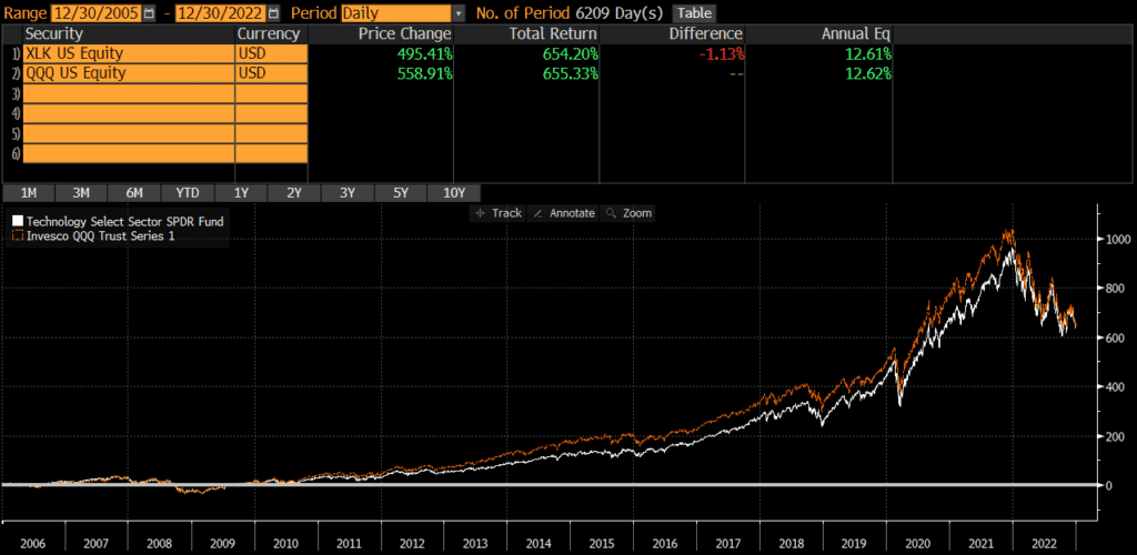
XLK was launched in 1998, while QQQ was launched in 1999. Since QQQ’s launch, it has outperformed XLK by 1.21% annually. The cumulative performance differential over that time period is about 143%.

However, much of that difference was caused by the dot com crash of 2000. If start the comparison in 2005, the annual performance difference is only .01%!

Differences between QQQ vs XLK

The two main differences between XLK and QQQ are their sector exposures. XLK tracks the tech-only The Technology Select Sector Index. QQQ tracks the Nasdaq 100 Index which covers many sectors (even though it is heavily weighted towards tech).

Geographic Exposure

Both XLK and QQQ hold essentially 100% stocks, so I will not dig into country exposures or market classification here. For all intents and purposes, the two funds have identical exposures.

Market Cap Exposure

XLK and QQQ have identical market cap exposures. Due to market cap weighting, both funds are overwhelmingly influenced by the large-cap holdings though.

XLKQQQ
Large-Cap93%93%
Mid-Cap7%7%
Small-Cap0%0%
Source: ThoughtfulFinance.com, Morningstar; data as of 2/10/2023

Sector Weights

The sector weights between XLK and QQQ are quite different.

XLKQQQ
Basic Materials0.00%0.00%
Consumer Cyclical0.00%15.54%
Financial Services8.48%0.75%
Real Estate0.00%0.24%
Communication Services0.00%16.18%
Energy0.00%0.48%
Industrials0.00%4.20%
Technology89.25%48.56%
Consumer Defensive0.00%6.02%
Healthcare0.00%6.76%
Utilities0.00%1.25%
Source: ThoughtfulFinance.com, Morningstar; data as of 2/10/2023

Expenses

The expense ratio for XLK is .10%, while QQQ’s expense ratio is .20%. Although QQQ’s expense ratio is 100% higher than XLK’s, its only 10 basis points in absolute terms.

Transaction Costs

ETFs are free to trade at many brokers and custodians, so both XLK and QQQ should be free to trade in most cases. Additionally, these funds are among the largest ETFs and are very liquid. The bid-ask spread of both XLK and QQQ is about .01%, so individual investor trades will not generally be large enough to “move” the market.

Tax Efficiency & Capital Gain Distributions

ETFs are typically more tax-efficient than mutual funds, due to their ability to avoid realizing capital gains through like-kind redemptions (a process that is beyond the scope of this post). As expected, neither QQQ nor XLK has ever made a capital gains distribution (nor do I expect them to). Thus, these funds are about as tax-efficient as any fund can be and either fund is appropriate in taxable accounts.

Final Thoughts: QQQ vs XLK

Both XLK and QQQ are large, popular funds sponsored and managed by two of the largest asset managers in the world. XLK and QQQ are quite different, but performance has been extremely similar. Although QQQ is a bit more diversified, it’s still a concentrated fund.

Neither fund should be a core holding, but either can play a role in a portfolio. Investors just need to decide which sectors they want exposure to for that role when deciding between XLK and QQQ.

VGT vs QQQ: Comparison by an expert

The Vanguard Information Technology ETF (VGT) and the Invesco QQQ ETF (QQQ) are two of the largest and oldest ETFs. VGT is a tech sector ETF, while QQQ is a core holding of many investor portfolios. Each is diversified in a different way; QQQ by sector and VGT by market-cap.

A quick reminder that this site does NOT provide investment recommendations. Fund comparisons (such as this one) are not conducted to identify the “best” fund (since that will vary from investor to investor based on investor-specific factors). Rather, these fund comparison posts are designed to identify and distinguish between the fund details that matter versus the ones that don’t.

The Short Answer

The main differences between the funds is that QQQ is a tech-oriented large-cap fund, while VGT is 100% tech stocks (of all market caps).

The Long Answer

Historical Performance: QQQ vs VGT

QQQ was launched on in 1999, while VGT was launched in January 2004. Since then, QQQ has outperformed by .46% annually. The cumulative performance differential over that time period is about 62%. That being said, the performance between these two funds is extremely close, which is somewhat surprising given their differences.

Differences between QQQ vs VGT

The two main differences between VGT and QQQ are their sector exposures and market cap exposures. VGT tracks the tech-only MSCI US Investable Market Information Technology 25/50 Index which includes tech stocks of all market caps. QQQ tracks the Nasdaq 100 Index which is primarily large caps, but covers many sectors (even though it is heavily weighted towards tech).

Geographic Exposure

Both VGT and QQQ hold essentially 100% stocks, so I will not dig into country exposures or market classification here. For all intents and purposes, the two funds have identical exposures.

Market Cap Exposure

QQQ is essentially a large cap fund, while VGT is more of an all cap fund. Due to market cap weighting, both funds are overwhelmingly influenced by the large-cap holdings though.

VGTQQQ
Large-Cap84%93%
Mid-Cap12%7%
Small-Cap5%0%
Source: ThoughtfulFinance.com, Morningstar; data as of 1/31/2023 for VGT and 2/10/2023 for QQQ

Sector Weights

The sector weights between VGT and QQQ are nearly identical.

VGTQQQ
Basic Materials0.01%0.00%
Consumer Cyclical0.03%15.54%
Financial Services7.52%0.75%
Real Estate0.00%0.24%
Communication Services0.13%16.18%
Energy0.00%0.48%
Industrials2.24%4.20%
Technology90.06%48.56%
Consumer Defensive0.00%6.02%
Healthcare0.00%6.76%
Utilities0.00%1.25%
Source: ThoughtfulFinance.com, Morningstar; data as of 1/31/2023 for VGT and 2/10/2023 for QQQ

Expenses

The expense ratio for VGT is .10%, while QQQ’s expense ratio is .20%. Although QQQ’s expense ratio is 100% higher than VGT’s, its only 10 basis points in absolute terms.

Transaction Costs

ETFs are free to trade at many brokers and custodians, so both VGT and QQQ should be free to trade in most cases. Additionally, these funds are among the largest ETFs and are very liquid. The bid-ask spread of both VGT and QQQ is about .01%, so individual investor trades will not generally be large enough to “move” the market.

Tax Efficiency & Capital Gain Distributions

ETFs are typically more tax-efficient than mutual funds, due to their ability to avoid realizing capital gains through like-kind redemptions (a process that is beyond the scope of this post). As expected, neither QQQ nor VGT has ever made a capital gains distribution (nor do I expect them to). Thus, these funds are about as tax-efficient as any fund can be and either fund is appropriate in taxable accounts.

Final Thoughts: QQQ vs VGT

Both VGT and QQQ are large, popular funds sponsored and managed by two of the largest asset managers in the world. Although VGT and QQQ are quite different, performance has been extremely similar. Although each fund is diversified in a different way, neither fund is really diversified. Either fund can be a piece of a portfolio rather than core holding. Investors just need to decide sectors and market caps they want exposure to when deciding between VGT and QQQ.

VAW vs XLB

The Vanguard Materials Index Fund ETF (VAW) and State Street’s The Materials Select Sector SPDR Fund (XLB) are two of the largest Materials sector ETFs and two of the most popular among individual investors. Many investors compare VAW vs XLB because they are so similar. The funds are nearly identical and I consider them interchangeable for most intents and purposes.

A quick reminder that this site does NOT provide investment recommendations. Fund comparisons (such as this one) are not conducted to identify the “best” fund (since that will vary from investor to investor based on investor-specific factors). Rather, these fund comparison posts are designed to identify and distinguish between the fund details that matter versus the ones that don’t.

The Short Answer

The primary difference between the funds is that XLB is a large-cap fund, while VAW includes mid-caps and small-caps.

The Longer Answer

Historical Performance: VAW vs XLB

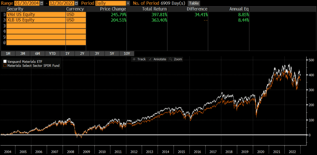
XLB was launched back in 1998, while VAW was launched in 2004. Since the VAW’s launch, the two funds have performed similarly, with an annualized difference of only .41%. The cumulative performance differential over that timeframe has compounded to roughly 35% though.

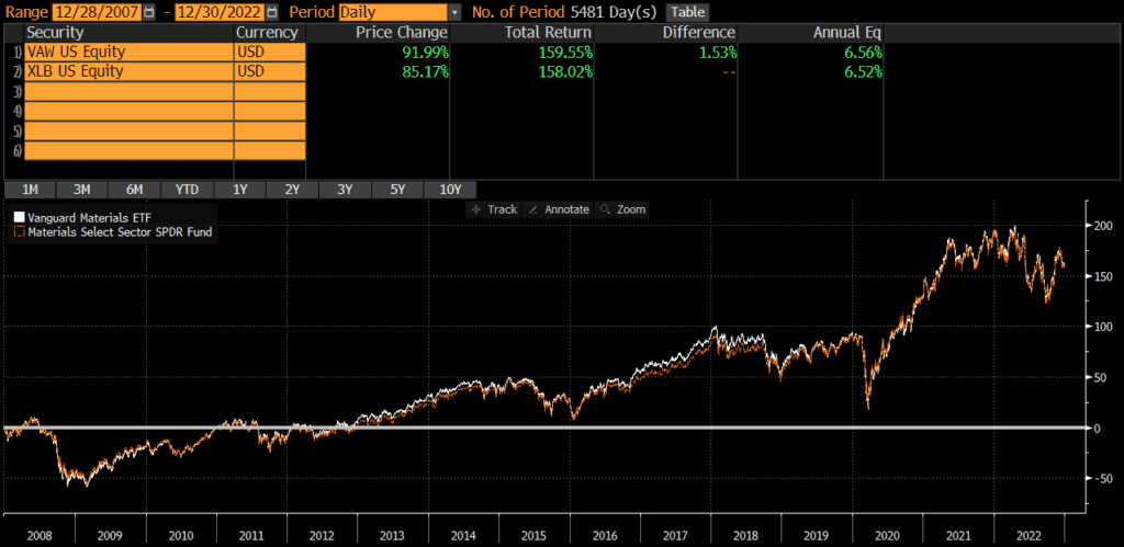
Interestingly, if we look at performance from 2008 through early 2022, we find that the annualized performance difference is only .04%! Thus, for the past ~15 years, performance has been nearly identical.

Portfolio Exposures: VAW vs XLB

XLB tracks the Materials Select Sector Index, which is essentially a sub-index of the S&P 500 (which is predominantly composed of large-caps). It has changed over the years, but the index that VAW currently tracks is includes more mid-caps and small-caps (even though it is also predominantly large-caps).

Geographic Exposure

Both VAW and XLB hold essentially 100% stocks, so I will not dig into country exposures or market classification here. For all intents and purposes, the two funds have identical geographic exposures.

Market Cap Exposure

As the below data illustrates, XLB primarily holds large-caps, while VAW is a bit more diversified in terms of market cap. Despite this difference, both funds are market-cap weighted and risk/return is overwhelmingly driven by the large-cap exposure.

XLBVAW
Large Cap61%48%
Mid Cap40%39%
Small Cap0%13%
Source: ThoughtfulFinance.com, Morningstar (data as of 1/31/2023 for VAW & 2/10/2023 for XLB)

Sector Exposure

VAW and XLB are materials ETFs and so their holdings are 100% materials stocks.

Practical Factors: VAW vs XLB

Transaction Costs

As ETFs, both XLB and VAW are free to trade on many platforms. Bid-ask spreads for both VAW and XLB are extremely low and volume is sufficient to prevent most individual investors from “moving the market.”

Expenses

The expense ratio for both XLB and VAW is .10%. At these low levels of expense ratios, small differences in expense ratios does not typically matter anyways. Something to keep in mind if one fund or the other decides to reduce fees.

Tax Efficiency & Capital Gain Distributions

VAW has never made a capital gain distribution and XLB has not made one since 2000. I do not expect either fund to make capital gains distributions moving forward (since they are ETFs). In my opinion, these two funds are equally tax-efficient.

Options Strategies

The one factor that may sway someone towards XLB is if they are managing some type of option strategy, such as covered calls. The options market for XLB is much more active than for VAW. Of course, if someone wants to trade options without triggering tax consequences in another part of their portfolio, perhaps VAW is the better pick for the non-option holding.

Bottom Line: VAW vs XLB

VAW and XLB are nearly identical in most ways and I personally consider them identical and interchangeable (the period from 2004 through 2007 notwithstanding). I believe investors’ time is better spent evaluating and thinking through more material decisions.

VHT vs XLV

The Vanguard Health Care Index Fund ETF (VHT) and State Street’s The Health Care Select Sector SPDR Fund (XLV) are two of the largest health care sector ETFs and two of the most popular among individual investors. Many investors compare VHT vs XLV because they are so similar. The funds are nearly identical, especially if we focus on the past 15 years.

A quick reminder that this site does NOT provide investment recommendations. Fund comparisons (such as this one) are not conducted to identify the “best” fund (since that will vary from investor to investor based on investor-specific factors). Rather, these fund comparison posts are designed to identify and distinguish between the fund details that matter versus the ones that don’t.

The Short Answer

The primary difference between the funds is that XLV is a large-cap fund, while VHT includes mid-caps and small-caps.

The Longer Answer

Historical Performance: VHT vs XLV

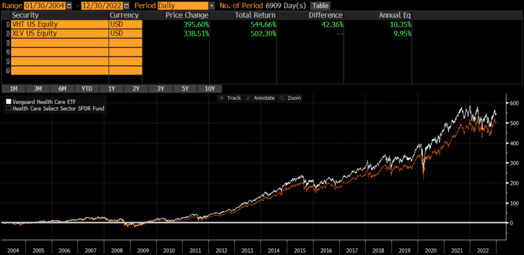
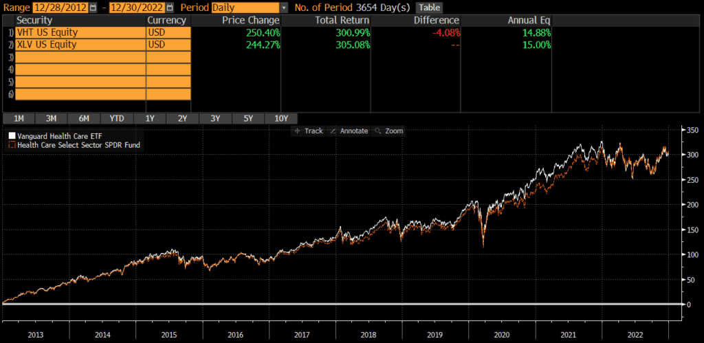
XLV was launched back in 1998, while VHT was launched in 2004. Since the VHT’s launch, the two funds have performed similarly, with an annualized difference of only .40%. The cumulative performance differential over that timeframe has compounded to roughly 42% though.

Interestingly, if we look at performance over the past 10 years (from 2013 through 2022), we find that the annualized performance difference is only .12%! There appears to be some deviation during the pandemic, but that gap has closed and the overall performance is nearly identical.

Portfolio Exposures: VHT vs XLV

XLV tracks the Health Care Select Sector Index, which is essentially a sub-index of the S&P 500 (which is predominantly composed of large-caps). It has changed over the years, but the index that VHT currently tracks is includes more mid-caps and small-caps (even though it is also predominantly large-caps).

Geographic Exposure

Both VHT and XLV hold essentially 100% stocks, so I will not dig into country exposures or market classification here. For all intents and purposes, the two funds have identical geographic exposures.

Market Cap Exposure

As the below data illustrates, XLV primarily holds large-caps, while VHT is a bit more diversified in terms of market cap. Despite this difference, both funds are market-cap weighted and risk/return is overwhelmingly driven by the large-cap exposure.

XLVVHT
Large Cap90%77%
Mid Cap11%14%
Small Cap0%8%
Source: ThoughtfulFinance.com, Morningstar (data as of 1/31/2023 for VHT & 2/10/2023 for XLV)

Sector Exposure

VHT and XLV are health care ETFs and so their holdings are 100% health care stocks.

Practical Factors: VHT vs XLV

Transaction Costs

As ETFs, both XLV and VHT are free to trade on many platforms. Bid-ask spreads for both VHT and XLV are extremely low and volume is sufficient to prevent most individual investors from “moving the market.” Investors looking for a mutual fund version of VHT should consider VHCIX and read my comparison of VHT and VHCIX.

Expenses

The expense ratio for both XLV and VHT is .10%. At these low levels of expense ratios, small differences in expense ratios does not typically matter anyways. Something to keep in mind if one fund or the other decides to reduce fees.

Tax Efficiency & Capital Gain Distributions

VHT has never made a capital gain distribution and XLV has not made one since 2000. I do not expect either fund to make capital gains distributions moving forward (since they are ETFs). In my opinion, these two funds are equally tax-efficient.

Options Strategies

The one factor that may sway someone towards XLV is if they are managing some type of option strategy, such as covered calls. The options market for XLV is much more active than for VHT. Of course, if someone wants to trade options without triggering tax consequences in another part of their portfolio, perhaps VHT is the better pick for the non-option holding.

Bottom Line: VHT vs XLV

VHT and XLV are nearly identical in most ways and the decision to use versus the other depends on an investor’s preference for small-caps vs large-caps. I believe investors’ time is better spent evaluating and thinking through more material decisions.

Investors looking for other health care ETFs may want to read my comparison of VHT and FHLC (Fidelity’s health care ETF).

VDC vs XLP: Comparison (of these nearly identical funds)

The Vanguard Consumer Staples Index Fund ETF (VDC) and State Street’s The Consumer Staples Select Sector SPDR Fund (XLP) are two of the largest consumer staples sector ETFs and two of the most popular among individual investors. Many investors compare VDC vs XLP because they are so similar. The funds are nearly identical, especially if we focus on the past 15 years.

A quick reminder that this site does NOT provide investment recommendations. Fund comparisons (such as this one) are not conducted to identify the “best” fund (since that will vary from investor to investor based on investor-specific factors). Rather, these fund comparison posts are designed to identify and distinguish between the fund details that matter versus the ones that don’t.

The Short Answer

The primary difference between the funds is that XLP is a large-cap fund, while VDC includes mid-caps and small-caps.

The Longer Answer

Historical Performance: VDC vs XLP

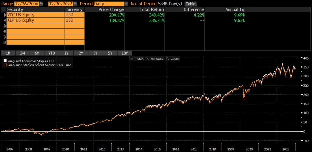
XLP was launched back in 1998, while VDC was launched in 2004. Since the VDC’s launch, the two funds have performed similarly, with an annualized difference of only .28%. The cumulative performance differential over that timeframe has compounded to nearly 28% though.

Interestingly, if we look at performance from 2007 through early 2022, we find that the annualized performance difference is only .06%! Thus, for the past 15 years, performance has been nearly identical.

Portfolio Exposures: VDC vs XLP

XLP tracks the Consumer Staples Select Sector Index, which is essentially a sub-index of the S&P 500 (which is predominantly composed of large-caps). It has changed over the years, but the index that VDC currently tracks is includes more mid-caps and small-caps (even though it is also predominantly large-caps).

Geographic Exposure

Both VDC and XLP hold essentially 100% stocks, so I will not dig into country exposures or market classification here. For all intents and purposes, the two funds have identical geographic exposures.

Market Cap Exposure

As the below data illustrates, XLP primarily holds large-caps, while VDC is a bit more diversified in terms of market cap. Despite this difference, both funds are market-cap weighted and risk/return is overwhelmingly driven by the large-cap exposure.

XLPVDC
Large Cap88%77%
Mid Cap13%15%
Small Cap0%9%
Source: ThoughtfulFinance.com, Morningstar (data as of 1/31/2023 for VDC & 2/10/2023 for XLP)

Sector Exposure

VDC and XLP are consumer staples ETFs and so their holdings are 100% consumer staples stocks.

Practical Factors: VDC vs XLP

Transaction Costs

As ETFs, both XLP and VDC are free to trade on many platforms. Bid-ask spreads for both VDC and XLP are extremely low and volume is sufficient to prevent most individual investors from “moving the market.” Investors interested in a mutual fund should read about VDC vs VCSAX (VDC’s mutual fund share class).

Expenses

The expense ratio for both XLP and VDC is .10%. At these low levels of expense ratios, small differences in expense ratios does not typically matter anyways. Something to keep in mind if one fund or the other decides to reduce fees.

Tax Efficiency & Capital Gain Distributions

XLP has never made a capital gain distribution and VDC has not made one since 2004. I do not expect either fund to make capital gains distributions moving forward (since they are ETFs). In my opinion, these two funds are equally tax-efficient.

Options Strategies

The one factor that may sway someone towards XLP is if they are managing some type of option strategy, such as covered calls. The options market for XLP is much more active than for VDC. Of course, if someone wants to trade options without triggering tax consequences in another part of their portfolio, perhaps VDC is the better pick for the non-option holding.

Bottom Line: VDC vs XLP

VDC and XLP are nearly identical in most ways and I personally consider them identical and interchangeable (the period from 2004 through 2006 notwithstanding). I believe investors’ time is better spent evaluating and thinking through more material decisions.

Investors interested in a third consumer staple ETF should check out my post on VDC vs FSTA (Fidelity’s consumer staple ETF).

VDE vs XLE: Similar, with one major difference

The Vanguard Energy Index Fund ETF (VDE) and State Street’s The Energy Select Sector SPDR Fund (XLE) are two of the largest Energy sector ETFs and two of the most popular among individual investors. Many investors compare VDE vs XLE because they are so similar. The funds are quite similar in many respects, but performance deviated a bit in the “twenty teens.”

A quick reminder that this site does NOT provide investment recommendations. Fund comparisons (such as this one) are not conducted to identify the “best” fund (since that will vary from investor to investor based on investor-specific factors). Rather, these fund comparison posts are designed to identify and distinguish between the fund details that matter versus the ones that don’t.

The Short Answer

The primary difference between the funds is that XLE is a large-cap fund, while VDE includes mid-caps and small-caps.

The Longer Answer

Historical Performance: VDE vs XLE

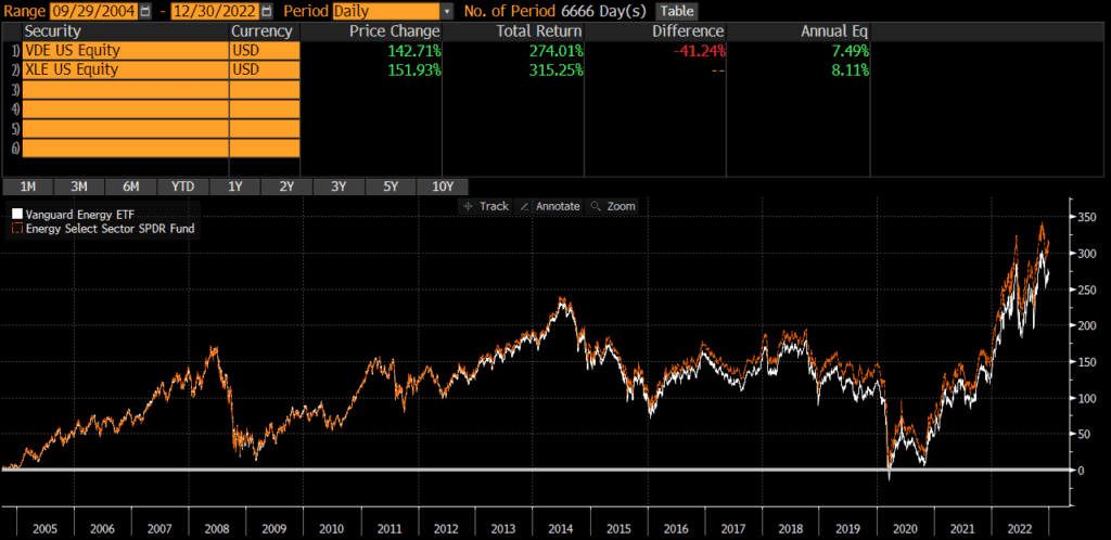
XLE was launched back in 1998, while VDE was launched in 2004. Since the VDE’s launch, the two funds have performed somewhat similarly, with an annualized difference of .62%. The cumulative performance differential has compounded though and sits at 2.6%.

Interestingly, the funds pretty much moved in tandem until 2012 and that performance differences has compounded since then.

Portfolio Exposures: VDE vs XLE

XLE tracks the Energy Select Sector Index, which is essentially a sub-index of the S&P 500 (which is predominantly composed of large-caps). It has changed over the years, but the index that VDE currently tracks is includes more mid-caps and small-caps (even though it is also predominantly large-caps).

Geographic Exposure

Both VDE and XLE hold essentially 100% stocks, so I will not dig into country exposures or market classification here. For all intents and purposes, the two funds have identical geographic exposures.

Market Cap Exposure

As the below data illustrates, XLE primarily holds large-caps, while VDE is a bit more diversified in terms of market cap. Despite this difference, both funds are market-cap weighted and risk/return is overwhelmingly driven by the large-cap exposure.

XLEVDE
Large Cap86%75%
Mid Cap15%15%
Small Cap0%9%
Source: ThoughtfulFinance.com, Morningstar (data as of 1/31/2023 for VDE & 2/10/2023 for XLE)

Sector Exposure

VDE and XLE are energy ETFs and so their holdings are 100% energy stocks.

Practical Factors: VDE vs XLE

Transaction Costs

As ETFs, both XLE and VDE are free to trade on many platforms. Bid-ask spreads for both VDE and XLE are extremely low and volume is sufficient to prevent most individual investors from “moving the market.”

Expenses

The expense ratio for both XLE and VDE is .10%. At these low levels of expense ratios, small differences in expense ratios does not typically matter anyways. Something to keep in mind if one fund or the other decides to reduce fees.

Tax Efficiency & Capital Gain Distributions

Neither VDE nor XLE has ever made a capital gain distribution and I do not expect either fund to make capital gains distributions moving forward (since they are ETFs). In my opinion, these two funds are equally tax-efficient.

Options Strategies

The one factor that may sway someone towards XLE is if they are managing some type of option strategy, such as covered calls. The options market for XLE is much more active than for VDE. Of course, if someone wants to trade options without triggering tax consequences in another part of their portfolio, perhaps VDE is the better pick for the non-option holding.

Bottom Line: VDE vs XLE

VDE and XLE are fairly similar in most ways and the decision to use one versus the other depends on an investor’s preference for small-caps or large-caps. I believe investors’ time is better spent evaluating and thinking through more material decisions.

Investors looking for other energy vehicles might consider Fidelity’s energy ETF (read my post comparing FENY and VDE here) or Vanguard’s mutual fund version of VDE, VENAX.

VCR vs XLY: Nearly identical (until recently)

The Vanguard Consumer Discretionary Index Fund ETF (VCR) and State Street’s The Consumer Discretionary Select Sector SPDR Fund (XLY) are two of the largest consumer discretionary sector ETFs and two of the most popular among individual investors. Many investors compare VCR vs XLY because they are so similar. The funds are quite similar in many respects, but performance has deviated quite a bit lately.

A quick reminder that this site does NOT provide investment recommendations. Fund comparisons (such as this one) are not conducted to identify the “best” fund (since that will vary from investor to investor based on investor-specific factors). Rather, these fund comparison posts are designed to identify and distinguish between the fund details that matter versus the ones that don’t.

The Short Answer

The primary difference between the funds is that XLY is a large-cap fund, while VCR includes mid-caps and small-caps.

The Longer Answer

Historical Performance: VCR vs XLY

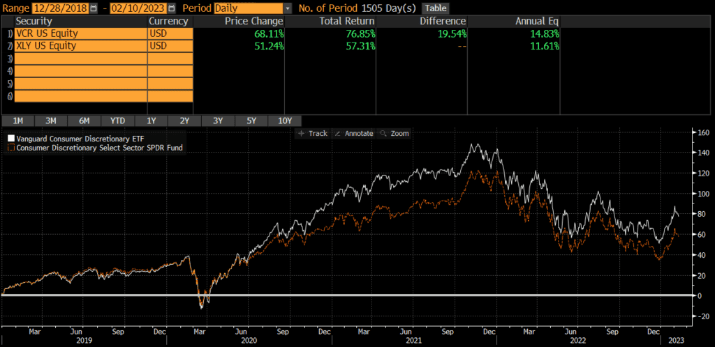
XLY was launched back in 1998, while VCR was launched in 2004. Since the VCR’s launch, the two funds have performed similarly, with an annualized difference of .46%. The cumulative performance differential over that timeframe is only 2.6%.

Interestingly, the funds pretty much moved in tandem until 2018 when some changes were made to indices and many index providers moved some mega-cap stocks from the tech sector to the consumer discretionary sector. Then the market environment of 2020 and 2021 caused further differences. If we look at performance from 2019 through early 2023, we find that the annualized performance difference is much wider at over 3% annually.

Portfolio Exposures: VCR vs XLY

XLY tracks the Consumer Discretionary Select Sector Index, which is essentially a sub-index of the S&P 500 (which is predominantly composed of large-caps). It has changed over the years, but the index that VCR currently tracks is includes more mid-caps and small-caps (even though it is also predominantly large-caps).

Geographic Exposure

Both VCR and XLY hold essentially 100% stocks, so I will not dig into country exposures or market classification here. For all intents and purposes, the two funds have identical geographic exposures.

Market Cap Exposure

As the below data illustrates, XLY primarily holds large-caps, while VCR is a bit more diversified in terms of market cap. Despite this difference, both funds are market-cap weighted and risk/return is overwhelmingly driven by the large-cap exposure.

XLYVCR
Large Cap84%72%
Mid Cap16%19%
Small Cap0%8%
Source: ThoughtfulFinance.com, Morningstar (data as of 1/31/2023 for VCR & 2/10/2023 for XLY)

Sector Exposure

VCR and XLY are consumer discretionary ETFs and so their holdings are 100% consumer discretionary stocks.

Practical Factors: VCR vs XLY

Transaction Costs

As ETFs, both XLY and VCR are free to trade on many platforms. Bid-ask spreads for both VCR and XLY are extremely low and volume is sufficient to prevent most individual investors from “moving the market.” Investors looking for a mutual fund may want to read my comparison of VCR vs VCDAX (VCR’s mutual fund share class).

Expenses

The expense ratio for both XLY and VCR is .10%. At these low levels of expense ratios, small differences in expense ratios does not typically matter anyways. Something to keep in mind if one fund or the other decides to reduce fees.

Tax Efficiency & Capital Gain Distributions

Neither VCR nor XLY has ever made a capital gain distribution and I do not expect either fund to make capital gains distributions moving forward (since they are ETFs). In my opinion, these two funds are equally tax-efficient.

Options Strategies

The one factor that may sway someone towards XLY is if they are managing some type of option strategy, such as covered calls. The options market for XLY is much more active than for VCR. Of course, if someone wants to trade options without triggering tax consequences in another part of their portfolio, perhaps VCR is the better pick for the non-option holding.

Bottom Line: VCR vs XLY

VCR and XLY are fairly similar in most ways and the decision to use one versus the other depends on an investor’s preference for small-caps or large-caps. I believe investors’ time is better spent evaluating and thinking through more material decisions.

For those interested in other consumer discretionary ETFs, check out my comparison of Fidelity’s consumer discretionary ETF FDIS vs VCR.

Scroll to Top