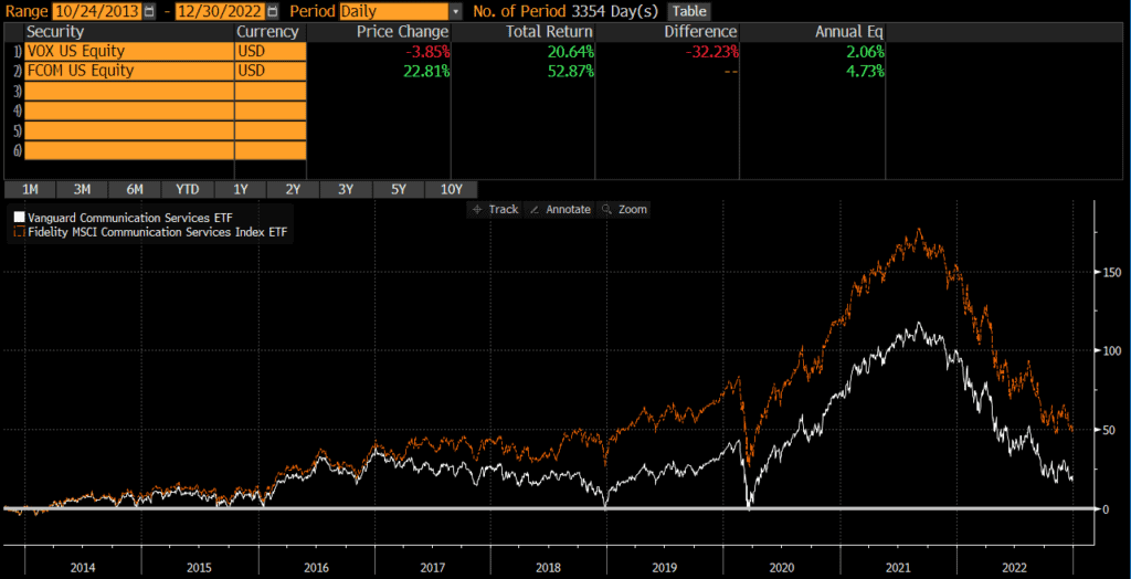
Fund Comparison

VOX vs XLC

The Vanguard Communication Services Index Fund ETF (VOX) and State Street’s The Communication Services Select Sector SPDR Fund (XLC) are two of the largest communication services sector ETFs and two of the most popular among individual investors. Many investors compare VOX vs XLC because they are so similar. The funds are quite similar with one important difference.

A quick reminder that this site does NOT provide investment recommendations. Fund comparisons (such as this one) are not conducted to identify the “best” fund (since that will vary from investor to investor based on investor-specific factors). Rather, these fund comparison posts are designed to identify and distinguish between the fund details that matter versus the ones that don’t.

The Short Answer

The primary difference between these funds is that XLC is a large-cap fund, while VOX includes more mid-caps and small-caps.

The Longer Answer

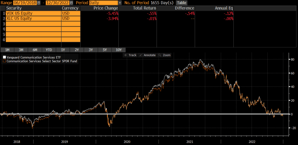
Historical Performance: VOX vs XLC

VOX was launched back in 2004, while XLC was launched in 2018 (when many index providers spun several major communication services stocks out of the information technology sector). Since the XLC’s launch, the two funds have performed nearly identically, with an annualized difference of only .12%!

Portfolio Exposures: VOX vs XLC

XLC tracks the Communication Services Select Sector Index, which is essentially a sub-index of the S&P 500 (which is predominantly composed of large-caps). It has changed over the years, but the index that VOX currently tracks is includes more mid-caps and small-caps.

Geographic Exposure

Both VOX and XLC hold essentially 100% stocks, so I will not dig into country exposures or market classification here. For all intents and purposes, the two funds have identical geographic exposures.

Market Cap Exposure

As the below data illustrates, XLC primarily holds large-caps, while VOX holds more mid-caps and includes small-caps. Despite this difference, both funds are market-cap weighted and risk/return is overwhelmingly driven by the large-cap exposure.

XLCVOX
Large Cap80%67%
Mid Cap19%22%
Small Cap0%10%
Source: ThoughtfulFinance.com, Morningstar (data as of 1/31/2023 for VOX & 2/10/2023 for XLC)

Sector Exposure

VOX and XLC are communication services ETFs and so their holdings are 100% communication services stocks.

Practical Factors: VOX vs XLC

Transaction Costs

As ETFs, both XLC and VOX are free to trade on many platforms. Bid-ask spreads for both VOX and XLC are extremely low and volume is sufficient to prevent most individual investors from “moving the market.” Investors looking for an ETF version of VOX should read my post comparing VOX and VTCAX.

Expenses

The expense ratio for both XLC and VOX is .10%. At these low levels of expense ratios, small differences in expense ratios does not typically matter anyways. Something to keep in mind if one fund or the other decides to reduce fees.

Tax Efficiency & Capital Gain Distributions

Neither VOX nor XLC has ever made a capital gain distribution and I do not expect either fund to make capital gains distributions moving forward (since they are ETFs). In my opinion, these two funds are equally tax-efficient.

Options Strategies

The one factor that may sway someone towards XLC is if they are managing some type of option strategy, such as covered calls. The options market for XLC is much more active than for VOX. Of course, if someone wants to trade options without triggering tax consequences in another part of their portfolio, perhaps VOX is the better pick for the non-option holding.

Bottom Line: VOX vs XLC

Given XLC’s short history, it may be too early to say, but VOX and XLC appear identical in nearly every way and I would not spend too much time comparing them or trying to decide which is better. I believe investors’ time is better spent evaluating and thinking through more material decisions.

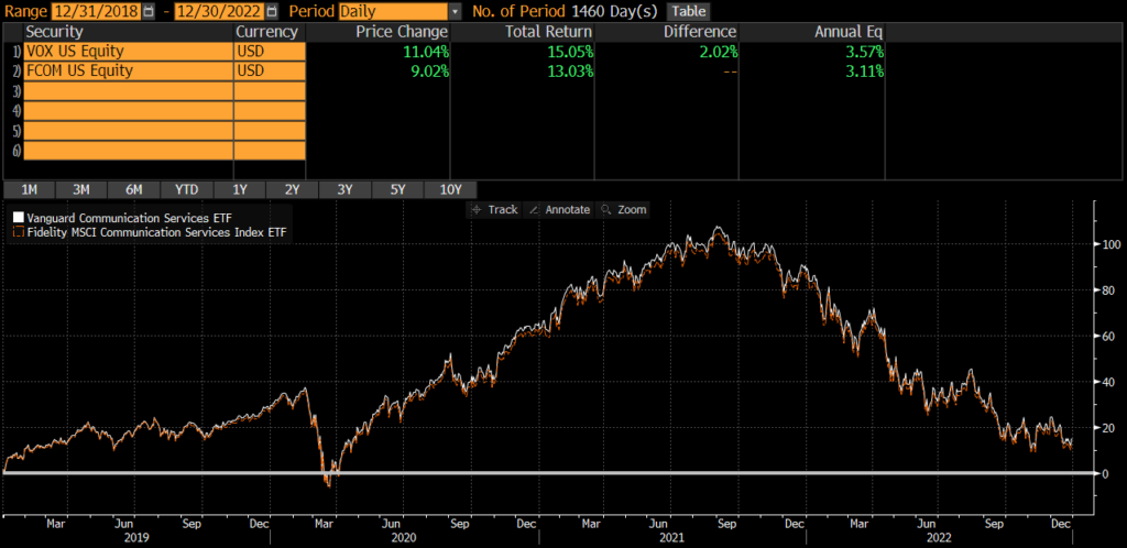
Investors may also want to read my comparison of VOX vs FCOM (Fidelity’s communication services ETF).

VPU vs XLU

The Vanguard Utilities Index Fund ETF (VPU) and State Street’s The Utilities Select Sector SPDR Fund (XLU) are two of the largest utilities sector ETFs and two of the most popular among individual investors. Many investors compare VPU vs XLU because they are so similar. The funds are quite similar with one important difference.

A quick reminder that this site does NOT provide investment recommendations. Fund comparisons (such as this one) are not conducted to identify the “best” fund (since that will vary from investor to investor based on investor-specific factors). Rather, these fund comparison posts are designed to identify and distinguish between the fund details that matter versus the ones that don’t.

The Short Answer

The primary difference between the funds is that XLU is a large-cap and mid-cap fund, while VPU includes more small-caps. Despite this difference, risk and return has been identical and I consider these two funds identical and interchangeable. This conclusion is quite similar to the conclusion when comparing VPU vs FUTY (Fidelity’s utilities ETF).

The Longer Answer

Historical Performance: VPU vs XLU

XLU was launched back in 1998, while VPU was launched in 2004. Since the VPU’s launch, the two funds have performed identically, with an annualized difference of only .03%!

Portfolio Exposures: VPU vs XLU

XLU tracks the Utilities Select Sector Index, which is essentially a sub-index of the S&P 500 (which is predominantly composed of large-caps). It has changed over the years, but the index that VPU currently tracks is includes more mid-caps and small-caps.

Geographic Exposure

Both VPU and XLU hold essentially 100% stocks, so I will not dig into country exposures or market classification here. For all intents and purposes, the two funds have identical geographic exposures.

Market Cap Exposure

As the below data illustrates, XLU primarily holds large-caps and mid-caps, while VPU is a bit more diversified in terms of market cap. Despite this difference, both funds are market-cap weighted and risk/return is overwhelmingly driven by the large-cap exposure.

XLUVPU
Large Cap49%44%
Mid Cap51%47%
Small Cap0%8%
Source: ThoughtfulFinance.com, Morningstar (data as of 1/31/2023 for VPU & 2/10/2023 for XLU)

Sector Exposure

VPU and XLU are Utilities ETFs and so their holdings are 100% Utilities stocks.

Practical Factors: VPU vs XLU

Transaction Costs

As ETFs, both XLU and VPU are free to trade on many platforms. Bid-ask spreads for both VPU and XLU are extremely low and volume is sufficient to prevent most individual investors from “moving the market.” Investors looking for a mutual funds, should read about VPU and VUIAX (VPU’s mutual fund share class).

Expenses

The expense ratio for both XLU and VPU is .10%. At these low levels of expense ratios, small differences in expense ratios does not typically matter anyways. Something to keep in mind if one fund or the other decides to reduce fees.

Tax Efficiency & Capital Gain Distributions

VPU has never made a capital gain distribution and XLU has not made one since 2000. I do not expect either fund to make capital gains distributions moving forward. In my opinion, these two funds are equally tax-efficient.

Options Strategies

The one factor that may sway someone towards XLU is if they are managing some type of option strategy, such as covered calls. The options market for XLU is much more active than for VPU. Of course, if someone wants to trade options without triggering tax consequences in another part of their portfolio, perhaps VPU is the better pick for the non-option holding.

Bottom Line: VPU vs XLU

VPU and XLU are identical in nearly every way and I would not spend any time comparing them or trying to decide which is better. I believe investors’ time is better spent evaluating and thinking through more material decisions.

VIS vs XLI

The Vanguard Industrials Index Fund ETF (VIS) and State Street’s The Industrial Select Sector SPDR Fund (XLI) are two of the largest industrial sector ETFs and two of the most popular among individual investors. Many investors compare VIS vs XLI because they are so similar. The funds are quite similar with one important difference.

A quick reminder that this site does NOT provide investment recommendations. Fund comparisons (such as this one) are not conducted to identify the “best” fund (since that will vary from investor to investor based on investor-specific factors). Rather, these fund comparison posts are designed to identify and distinguish between the fund details that matter versus the ones that don’t.

The Short Answer

The primary difference between the funds is that XLI is a large-cap fund, while VIS includes mid-caps and small-caps. Despite this difference, risk and return has been nearly identical and I consider these two funds identical and interchangeable.

The Longer Answer

Historical Performance: VIS vs XLI

XLI was launched back in 1998, while VIS was launched in 2004. Since the VIS’s launch, the two funds have performed incredibly similarly, with an annualized difference of only .03%! The cumulative performance differential over that timeframe is only 2.6%.

Portfolio Exposures: VIS vs XLI

XLI tracks the Industrial Select Sector Index, which is essentially a sub-index of the S&P 500 (which is predominantly composed of large-caps). It has changed over the years, but the index that VIS currently tracks is includes more mid-caps and small-caps (even though it is also predominantly large-caps).

Geographic Exposure

Both VIS and XLI hold essentially 100% stocks, so I will not dig into country exposures or market classification here. For all intents and purposes, the two funds have identical geographic exposures.

Market Cap Exposure

As the below data illustrates, XLI primarily holds large-caps, while VIS is a bit more diversified in terms of market cap. Despite this difference, both funds are market-cap weighted and risk/return is overwhelmingly driven by the large-cap exposure.

XLIVIS
Large Cap68%53%
Mid Cap32%33%
Small Cap0%14%
Source: ThoughtfulFinance.com, Morningstar (data as of 1/31/2023 for VIS & 2/10/2023 for XLI)

Sector Exposure

VIS and XLI are Industrials ETFs and so their holdings are 100% Industrials stocks.

Practical Factors: VIS vs XLI

Transaction Costs

As ETFs, both XLI and VIS are free to trade on many platforms. Bid-ask spreads for both VIS and XLI are extremely low and volume is sufficient to prevent most individual investors from “moving the market.”

Expenses

The expense ratio for both XLI and VIS is .10%. At these low levels of expense ratios, small differences in expense ratios does not typically matter anyways. Something to keep in mind if one fund or the other decides to reduce fees.

Tax Efficiency & Capital Gain Distributions

VIS has never made a capital gain distribution and XLI has not made one since 1999. I do not expect either fund to make capital gains distributions moving forward. In my opinion, these two funds are equally tax-efficient.

Options Strategies

The one factor that may sway someone towards XLI is if they are managing some type of option strategy, such as covered calls. The options market for XLI is much more active than for VIS. Of course, if someone wants to trade options without triggering tax consequences in another part of their portfolio, perhaps VIS is the better pick for the non-option holding.

Bottom Line: VIS vs XLI

VIS and XLI are identical in nearly every way and I would not spend any time comparing them or trying to decide which is better. I believe investors’ time is better spent evaluating and thinking through more material decisions.

VFH vs XLF: Comparison By An Expert

The Vanguard Financials Index Fund ETF (VFH) and State Street’s The Financial Select Sector SPDR Fund (XLF) are two of the largest financial sector ETFs and two of the most popular among individual investors. Many investors compare VFH vs XLF because they are so similar. The funds are quite similar with one important difference.

A quick reminder that this site does NOT provide investment recommendations. Fund comparisons (such as this one) are not conducted to identify the “best” fund (since that will vary from investor to investor based on investor-specific factors). Rather, these fund comparison posts are designed to identify and distinguish between the fund details that matter versus the ones that don’t.

The Short Answer

The primary difference between the funds is that XLF is a large-cap fund, while VFH includes mid-caps and small-caps.

Choosing XLF vs VFH is essentially a very small bet on whether larger cap or smaller cap stocks will outperform, which has been an inconsequential decision except during the 2007-2009 crisis.

The Longer Answer

Historical Performance: VFH vs XLF

XLF was launched back in 1998, while VFH was launched in 2004. Since the VFH’s launch, the two funds have performed incredibly similarly, with an annualized difference of .81%. The cumulative performance differential over that timeframe is roughly 34%.

However, there is more to the story here. Much of XLK’s relative underperformance was during the 2007-2009 financial crisis, when the large financial institutions crashed, taken over by the government, diluted, etc. If we chart the two ETFs from the end of 2009, they have identical performance of 10.60% annualized!

Portfolio Exposures: VFH vs XLF

XLF tracks the Financial Select Sector Index, which is essentially a sub-index of the S&P 500 (which is predominantly composed of large-caps). It has changed over the years, but the index that VFH currently tracks is includes more mid-caps and small-caps (even though it is also predominantly large-caps).

Geographic Exposure

Both VFH and XLF hold essentially 100% stocks, so I will not dig into country exposures or market classification here. For all intents and purposes, the two funds have identical geographic exposures.

Market Cap Exposure

As the below data illustrates, XLF primarily holds large-caps, while VFH is a bit more diversified in terms of market cap. Despite this difference, both funds are market-cap weighted and risk/return is overwhelmingly driven by the large-cap exposure.

XLFVFH
Large Cap82%64%
Mid Cap18%21%
Small Cap0%11%
Source: ThoughtfulFinance.com, Morningstar (data as of 1/31/2023 for VFH & 2/10/2023 for XLF)

Sector Exposure

VFH and XLF are financials ETFs and so their holdings are 100% financial stocks.

Practical Factors: VFH vs XLF

Transaction Costs

As ETFs, both XLF and VFH are free to trade on many platforms. Bid-ask spreads for both VFH and XLF are extremely low and volume is sufficient to prevent most individual investors from “moving the market.”

Expenses

The expense ratio for both XLF and VFH is .10%. At these low levels of expense ratios, small differences in expense ratios does not typically matter anyways. Something to keep in mind if one fund or the other decides to reduce fees.

Tax Efficiency & Capital Gain Distributions

Neither VFH nor XLF has ever made a capital gains distribution and I do not expect them to make any moving forward. In my opinion, these two funds are equally tax-efficient.

Options Strategies

The one factor that may sway someone towards XLF is if they are managing some type of option strategy, such as covered calls. The options market for XLF is much more active than for VIS. Of course, if someone wants to trade options without triggering tax consequences in another part of their portfolio, perhaps VIS is the better pick for the non-option holding.

Bottom Line: VFH vs XLF

VFH and XLF are pretty similar and I would not spend too much time comparing them or trying to decide which is better. I believe investors’ time is better spent evaluating and thinking through more material decisions.

Investors looking for additional vehicles may want to consider Fidelity’s financials ETF and should read my comparison of FNCL vs VFH. Those looking for a mutual fund should read my comparison of VFH vs VFAIX (which is the mutual fund share class of VFH).

VGT vs XLK: An Expert’s Opinion

The Vanguard Information Technology Index Fund ETF (VGT) and State Street’s The Technology Select Sector SPDR Fund (XLK) are two of the largest information technology sector ETFs and two of the most popular among individual investors. Many investors compare VGT vs XLK because they are so similar. The funds are quite similar with one important difference.

A quick reminder that this site does NOT provide investment recommendations. Fund comparisons (such as this one) are not conducted to identify the “best” fund (since that will vary from investor to investor based on investor-specific factors). Rather, these fund comparison posts are designed to identify and distinguish between the fund details that matter versus the ones that don’t.

The Short Answer

The primary difference between the funds is that XLK is a large-cap fund, while VGT includes mid-caps and small-caps. Despite this difference, risk and return has been nearly identical and I consider these two funds identical and interchangeable.

The Longer Answer

Historical Performance: VGT vs XLK

XLK was launched back in 1998, while VGT was launched in 2004. Since the VGT’s launch, the two funds have performed incredibly similarly, with an annualized difference of only .08%! The cumulative performance differential over that timeframe is roughly 10%.

Portfolio Exposures: VGT vs XLK

XLK tracks the Technology Select Sector Index, which is essentially a sub-index of the S&P 500 (which is predominantly composed of large-caps). It has changed over the years, but the index that VGT currently tracks is includes more mid-caps and small-caps (even though it is also predominantly large-caps).

Geographic Exposure

Both VGT and XLK hold essentially 100% stocks, so I will not dig into country exposures or market classification here. For all intents and purposes, the two funds have identical geographic exposures.

Market Cap Exposure

As the below data illustrates, XLK primarily holds large-caps, while VGT is a bit more diversified in terms of market cap. Despite this difference, both funds are market-cap weighted and risk/return is overwhelmingly driven by the large-cap exposure.

XLKVGT
Large Cap93%84%
Mid Cap5%12%
Small Cap0%5%
Source: ThoughtfulFinance.com, Morningstar (data as of 1/31/2023 for VGT & 2/10/2023 for XLK)

Sector Exposure

VGT and XLK are information technology ETFs and so their holdings are 100% information technology stocks.

Practical Factors: VGT vs XLK

Transaction Costs

As ETFs, both XLK and VGT are free to trade on many platforms. Bid-ask spreads for both VGT and XLK are extremely low and volume is sufficient to prevent most individual investors from “moving the market.”

Expenses

The expense ratio for both XLK and VGT is .10%. At these low levels of expense ratios, small differences in expense ratios does not typically matter anyways. Something to keep in mind if one fund or the other decides to reduce fees.

Tax Efficiency & Capital Gain Distributions

Neither VGT nor XLK has ever made a capital gains distribution and I do not expect them to make any moving forward. In my opinion, these two funds are equally tax-efficient.

Options Strategies

The one factor that may sway someone towards XLK is if they are managing some type of option strategy, such as covered calls. The options market for XLK is much more active than for VGT. Of course, if someone wants to trade options without triggering tax consequences in another part of their portfolio, perhaps VGT is the better pick for the non-option holding.

Bottom Line: VGT vs XLK

VGT and XLK are identical in nearly every way and I would not spend any time comparing them or trying to decide which is better. I believe investors’ time is better spent evaluating and thinking through more material decisions.

VCR vs FDIS: Comparison (of very slight differences)

The Vanguard Consumer Discretionary Index Fund ETF (VCR) and the Fidelity MSCI Consumer Discretionary Index ETF (FDIS) are two of the largest consumer discretionary sector ETFs and two of the most popular among individual investors. Many investors compare VCR vs FDIS because they are so similar. Although the funds have some major historical differences, I expect that they will be much more similar moving forward.

A quick reminder that this site does NOT provide investment recommendations. Fund comparisons (such as this one) are not conducted to identify the “best” fund (since that will vary from investor to investor based on investor-specific factors). Rather, these fund comparison posts are designed to identify and distinguish between the fund details that matter versus the ones that don’t.

The Short Answer

VCR and FDIS track the same index and there is no material difference between the funds. They are identical and interchangeable in my opinion.

There is a long-term performance differential, although that mainly relates to the different indices that each fund tracked and how VCR and FDIS handled changes to the underlying index. Barring further changes, performance is likely to be similar, if not identical.

The Longer Answer

Historical Performance: VCR vs FDIS

VCR was launched back in 2004, while FDIS was launched on October 21, 2013. Since then, the two funds have performed quite similarly, with an annualized difference of nearly .21% (and 4.1% cumulatively)!

However there is more than meets the eye here. In 2018, MSCI made some changes to their classifications which impacted the consumer discretionary indices. Vanguard and Fidelity handled these changes in slightly different ways. If we track the two ETFs from the beginning of 2019, we find a smaller differential, with an annualized difference of only .05%.

Consequently, from a performance perspective, I view VGT and FTEC as identical and interchangeable.

Portfolio Exposures: VCR vs FDIS

Both VCR and FDIS track the same index, the MSCI US Investable Market Consumer Discretionary 25/50 Index. Consequently, the two funds have identical geographic, market-cap, and industry exposures.

A Note On Portfolio Construction

VCR implements a “full replication” strategy in which the fund holds stocks in the same proportions of the index. FDIS practices a representative or sampling strategy that allows holdings to deviate from the index weights a bit, but uses an algorithm to keep the risk and return relatively close to the index.

Geographic Exposure

Both VCR and FDIS hold essentially 100% stocks, so I will not dig into country exposures or market classification here. For all intents and purposes, the two funds have identical geographic exposures.

Market Cap Exposure

As mentioned above, both funds track the same index and have materially identical market cap exposures.

Sector Exposure

VCR and FDIS are consumer discretionary ETFs and so their holdings are 100% consumer discretionary stocks.

Practical Factors: VCR vs FDIS

Transaction Costs

As ETFs, both FDIS and VCR are free to trade on many platforms. Bid-ask spreads for both VCR and FDIS are extremely low and volume is sufficient to prevent most individual investors from “moving the market.” Investors looking for a mutual fund may want to read my comparison of VCR vs VCDAX (VCR’s mutual fund share class).

Expenses

FDIS has a lower expense ratio at .08%, compared to VCR’s .10%. Although VCR is 25% more expensive, we’re talking about 2 basis points. At these low levels of expense ratios, the difference doesn’t matter.

Tax Efficiency & Capital Gain Distributions

Neither VCR nor FDIS has ever made a capital gains distribution and I do not expect them to make any moving forward. In my opinion, these two funds are equally tax-efficient.

From a tax-loss harvesting perspective, investors may want to avoid using these two funds as substitutes for one another since they could be considered “substantially identical” (given that they track the same index and are identical in many ways).

Bottom Line: VCR vs FDIS

VCR and FDIS are materially identical in nearly every way. I would not spend any time comparing them or trying to decide which is better.

For further reading, checking out my comparison of VCR vs XLY (State Street’s consumer discretionary ETF).

VOX vs FCOM: Identical, except for one major difference

The Vanguard Communication Services Index Fund ETF (VOX) and the Fidelity MSCI Communication Services Index ETF (FCOM) are two of the largest communication services sector ETFs and two of the most popular among individual investors. Many investors compare VOX vs FCOM because they are so similar. Although the funds have some major historical differences, I expect that they will be much more similar moving forward.

A quick reminder that this site does NOT provide investment recommendations. Fund comparisons (such as this one) are not conducted to identify the “best” fund (since that will vary from investor to investor based on investor-specific factors). Rather, these fund comparison posts are designed to identify and distinguish between the fund details that matter versus the ones that don’t.

The Short Answer

VOX and FCOM track the same index, although VOX follows a “full replication” strategy and FCOM uses a representative strategy which may account for performance differences. Read more about these two approaches below.

The Longer Answer

Historical Performance: VOX vs FCOM

VOX was launched back in 2004, while FCOM was launched on October 21, 2013. Since then, the two funds have performed quite differently, with an annualized difference of nearly 2.7% (and 32%+ cumulatively)!

However there is more than meets the eye here. In 2018, MSCI made some changes to their classifications which impacted the communication services indices. Vanguard and Fidelity handled these changes in slightly different ways. However, if we track the two ETFs from the beginning of 2019, we find a smaller differential, with an annualized difference of only .46%. This is still a somewhat wide difference for two funds that track the same index and may be attributable to differences in portfolio construction methodology.

Portfolio Exposures: VOX vs FCOM

Both VOX and FCOM track the same index, the MSCI US Investable Market Communication Services 25/50 Index. Consequently, the two funds have identical geographic, market-cap, and industry exposures.

A Note On Portfolio Construction

VOX implements a “full replication” strategy in which the fund holds stocks in the same proportions of the index. FCOM practices a “representative” strategy that allows holdings to deviate from the index weights a bit, but uses an algorithm to keep the risk and return relatively close to the index. This may explain the difference in performance between VOX and FCOM, but I have not researched further.

Geographic Exposure

Both VOX and FCOM hold essentially 100% stocks, so I will not dig into country exposures or market classification here. For all intents and purposes, the two funds have identical geographic exposures.

Market Cap Exposure

As mentioned above, both funds track the same index and have materially identical market cap exposures.

Sector Exposure

VOX and FCOM are communication services ETFs and so their holdings are 100% communication services stocks.

Practical Factors: VOX vs FCOM

Transaction Costs

As ETFs, both FCOM and VOX are free to trade on many platforms. Bid-ask spreads for both VOX and FCOM are extremely low and volume is sufficient to prevent most individual investors from “moving the market.” Investors looking for a mutual fund should read my post on VOX and its mutual fund share class VTCAX.

Expenses

FCOM has a lower expense ratio at .08%, compared to VOX’s .10%. Although VOX is 25% more expensive, we’re talking about 2 basis points. At these low levels of expense ratios, the difference doesn’t matter.

Tax Efficiency & Capital Gain Distributions

Neither VOX nor FCOM has ever made a capital gains distribution and I do not expect them to make any moving forward. In my opinion, these two funds are equally tax-efficient.

From a tax-loss harvesting perspective, investors may want to avoid using these two funds as substitutes for one another since they could be considered “substantially identical” (given that they track the same index and are identical in many ways).

Bottom Line: VOX vs FCOM

VOX and FCOM are identical in nearly every way, except for portfolio construction. I don’t think either fund is a bad choice, but I would personally probably go with VOX (if I had to choose, which I don’t). Investors may also want to check out my comparison of VOX vs XLC (State Street’s communication services ETF).

VGT vs FTEC: More Similar Than Ever Before

The Vanguard Information Technology Index Fund ETF (VGT) and the Fidelity MSCI Information Technology Index ETF (FTEC) are two of the largest information technology sector ETFs and two of the most popular among individual investors. Many investors compare VGT vs FTEC because they are so similar. Although the funds have slight historical differences, I expect that they will be much more similar moving forward.

A quick reminder that this site does NOT provide investment recommendations. Fund comparisons (such as this one) are not conducted to identify the “best” fund (since that will vary from investor to investor based on investor-specific factors). Rather, these fund comparison posts are designed to identify and distinguish between the fund details that matter versus the ones that don’t.

The Short Answer

VGT and FTEC track the same index and there is no material difference between the funds. They are identical and interchangeable in my opinion.

There is a long-term performance differential, although that mainly relates to how each fund handled changes to the underlying index. Barring further changes, performance is likely to be similar, if not identical.

The Longer Answer

Historical Performance: VGT vs FTEC

VGT was launched back in 2004, while FTEC was launched on October 21, 2013. Since then, the two funds have performed incredibly similarly, with an annualized difference of only .31%! The cumulative performance differential over that timeframe has compounded to about 10% too!

However there is more than meets the eye here. In 2018, MSCI made some changes to their classifications which impacted the information technology indices. Vanguard and Fidelity handled these changes in slightly different ways. However, if we track the two ETFs from the beginning of 2019, we find near identical performance, with an annualized difference of only .06%.

Consequently, from a performance perspective, I view VGT and FTEC as identical and interchangeable.

Portfolio Exposures: VGT vs FTEC

Both VGT and FTEC track the same index, the MSCI US Investable Market Information Technology 25/50 Index. Consequently, the two funds have identical geographic, market-cap, and industry exposures.

Geographic Exposure

Both VGT and FTEC hold essentially 100% stocks, so I will not dig into country exposures or market classification here. For all intents and purposes, the two funds have identical geographic exposures.

Market Cap Exposure

As mentioned above, both funds track the same index and have materially identical market cap exposures.

Sector Exposure

VGT and FTEC are information technology ETFs and so their holdings are 100% information technology stocks.

Practical Factors: VGT vs FTEC

Transaction Costs

As ETFs, both FTEC and VGT are free to trade on many platforms. Bid-ask spreads for both VGT and FTEC are extremely low and volume is sufficient to prevent most individual investors from “moving the market.”

Expenses

FTEC has a lower expense ratio at .08%, compared to VGT’s .10%. Although VGT is 25% more expensive, we’re talking about 2 basis points. At these low levels of expense ratios, the difference doesn’t matter.

Tax Efficiency & Capital Gain Distributions

Neither VGT nor FTEC has ever made a capital gains distribution and I do not expect them to make any moving forward. In my opinion, these two funds are equally tax-efficient.

From a tax-loss harvesting perspective, investors may want to avoid using these two funds as substitutes for one another since they could be considered “substantially identical” (given that they track the same index and are identical in many ways).

Bottom Line: VGT vs FTEC

VGT and FTEC are identical in nearly every way. I would not spend any time comparing them or trying to decide which is better.

VPU vs FUTY: Comparison (by a human)

The Vanguard Utilities Index Fund ETF (VPU) and the Fidelity MSCI Utilities Index ETF (FUTY) are two of the largest Utilities sector ETFs and two of the most popular among individual investors. Many investors compare VPU vs FUTY because they are so similar, although differences are difficult to find.

A quick reminder that this site does NOT provide investment recommendations. Fund comparisons (such as this one) are not conducted to identify the “best” fund (since that will vary from investor to investor based on investor-specific factors). Rather, these fund comparison posts are designed to identify and distinguish between the fund details that matter versus the ones that don’t.

The Short Answer

VPU and FUTY track the same index and there is no material difference between the funds. They are identical and interchangeable in my opinion. This conclusion is quite similar to the conclusion when comparing VPU vs XLU (the State Street utilities ETF).

The Longer Answer

Historical Performance: VPU vs FUTY

VPU was launched back in 2004, while FUTY was launched on October 21, 2013. Since then, the two funds have performed identically, with an annualized difference of only .04%! The cumulative performance differential over that timeframe has only been about .8% too! From a performance perspective, VPU and FUTY are identical and interchangeable.

Portfolio Exposures: VPU vs FUTY

Both VPU and FUTY track the same index, the MSCI US Investable Market Utilities 25/50 Index. Consequently, the two funds have identical geographic, market-cap, and industry exposures.

Geographic Exposure

Both VPU and FUTY hold essentially 100% stocks, so I will not dig into country exposures or market classification here. For all intents and purposes, the two funds have identical geographic exposures.

Market Cap Exposure

As mentioned above, both funds track the same index and have materially identical market cap exposures.

Sector Exposure

VPU and FUTY are Utilities ETFs and so their holdings are 100% Utilities stocks.

Practical Factors: VPU vs FUTY

Transaction Costs

As ETFs, both FUTY and VPU are free to trade on many platforms. Bid-ask spreads for both VPU and FUTY are extremely low and volume is sufficient to prevent most individual investors from “moving the market.” Those looking for a mutual fund wrapper should read my comparison of VPU vs VUIAX.

Expenses

FUTY has a lower expense ratio at .08%, compared to VPU’s .10%. Although VPU is 25% more expensive, we’re talking about 2 basis points. At these low levels of expense ratios, the difference doesn’t matter.

Tax Efficiency & Capital Gain Distributions

Neither VPU nor FUTY has ever made a capital gains distribution and I do not expect them to make any moving forward. In my opinion, these two funds are equally tax-efficient.

From a tax-loss harvesting perspective, investors may want to avoid using these two funds as substitutes for one another since they could be considered “substantially identical” (given that they track the same index and are identical in many ways).

Bottom Line: VPU vs FUTY

VPU and FUTY are identical in nearly every way. I would not spend any time comparing them or trying to decide which is better.

VAW vs FMAT

The Vanguard Materials Index Fund ETF (VAW) and the Fidelity MSCI Materials Index ETF (FMAT) are two of the largest materials sector ETFs and two of the most popular among individual investors. Many investors compare VAW vs FMAT because they are so similar, although differences are difficult to find.

A quick reminder that this site does NOT provide investment recommendations. Fund comparisons (such as this one) are not conducted to identify the “best” fund (since that will vary from investor to investor based on investor-specific factors). Rather, these fund comparison posts are designed to identify and distinguish between the fund details that matter versus the ones that don’t.

The Short Answer

VAW and FMAT track the same index and there is no material difference between the funds. They are identical and interchangeable in my opinion.

The Longer Answer

Historical Performance: VAW vs FMAT

VAW was launched back in 2004, while FMAT was launched on October 21, 2013. Since then, the two funds have performed identically, with an annualized difference of only .01%! The cumulative performance differential over that timeframe has only been about .13% too! From a performance perspective, VAW and FMAT are identical and interchangeable.

Portfolio Exposures: VAW vs FMAT

Both VAW and FMAT track the same index, the MSCI US Investable Market Materials 25/50 Index. Consequently, the two funds have identical geographic, market-cap, and industry exposures.

Geographic Exposure

Both VAW and FMAT hold essentially 100% stocks, so I will not dig into country exposures or market classification here. For all intents and purposes, the two funds have identical geographic exposures.

Market Cap Exposure

As mentioned above, both funds track the same index and have materially identical market cap exposures.

Sector Exposure

VAW and FMAT are materials ETFs and so their holdings are 100% materials stocks.

Practical Factors: VAW vs FMAT

Transaction Costs

As ETFs, both FMAT and VAW are free to trade on many platforms. Bid-ask spreads for both VAW and FMAT are extremely low and volume is sufficient to prevent most individual investors from “moving the market.”

Expenses

FMAT has a lower expense ratio at .08%, compared to VAW’s .10%. Although VAW is 25% more expensive, we’re talking about 2 basis points. At these low levels of expense ratios, the difference doesn’t matter.

Tax Efficiency & Capital Gain Distributions

Neither VAW nor FMAT has ever made a capital gains distribution and I do not expect them to make any moving forward. In my opinion, these two funds are equally tax-efficient.

From a tax-loss harvesting perspective, investors may want to avoid using these two funds as substitutes for one another since they could be considered “substantially identical” (given that they track the same index and are identical in many ways).

Bottom Line: VAW vs FMAT

VAW and FMAT are identical in nearly every way. I would not spend any time comparing them or trying to decide which is better.

Scroll to Top